Register for #GIJC25
November 20, 2025 • 09:00
-
day
days
-
hour
hours
-
min
mins
-
sec
secs

Accessibility Settings

color options

monochrome muted color dark

reading tools

isolation ruler

Posts

707 posts

Data Journalism

Data Journalism Top 10: Hawaii’s Disappearing Beaches, Stolen Paintings, Investigating Disappearances, Herd Immunity Calculator

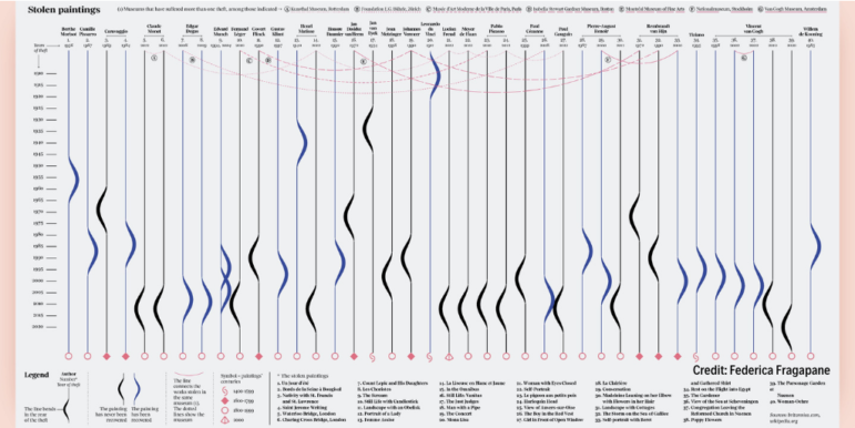
Hawaii’s scenery can be breathtaking, with cliff-rimmed white-sand beaches and surf-worthy waves. But our NodeXL #ddj mapping (Dec. 28-Jan. 3) found ProPublica highlighting dramatic erosion of the island state’s beaches over the past century. Also in this edition, we feature an interactive graphic to calculate the time to achieve COVID-19 herd immunity based on the US vaccination rate, a global vaccine distribution tracker, Federica Fragapane’s visualization of stolen paintings, and a compilation of 2020’s best data visualization lists.

Data Journalism

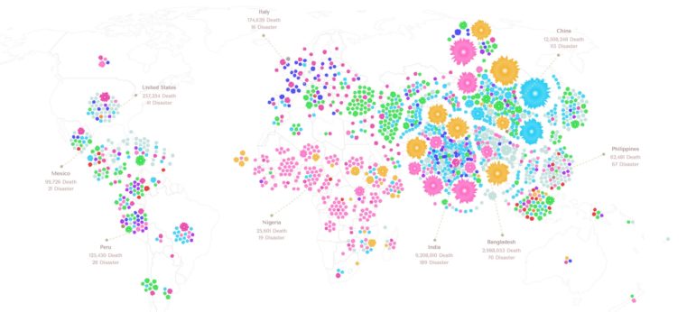
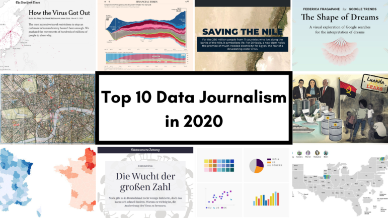
Data Journalism Top 10 for 2020: COVID-19, Saving the Nile, Shape of Dreams, Visualizations for the Colorblind

For those unfamiliar with GIJN’s Top 10 Data Journalism roundup, each week we select the most popular data journalism items on Twitter. We do this by using NodeXL to map use of the terms #ddj and data journalism, and then add a bit of old-fashioned human curation to highlight the most compelling items. At the end of the year, we survey the entire period and pick the best from hundreds of tweets. This year — the year of the pandemic — in which the coronavirus dominated public conversation and news headlines, our mapping reflects that reality.

Data Journalism

Data Journalism Top 10: Chocolate Box Audit, Vaccine Lineup, COVID-19 Antigen Testing, Scraping Is Not a Crime

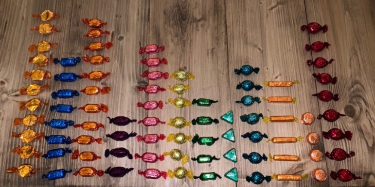
As the United Kingdom begins its rollout of the first COVID-19 vaccine this week, the world is watching with bated breath. Our NodeXL #ddj mapping from November 30 to December 6 found Bloomberg tracking the development of nine of the most promising vaccines around the world, The New York Times creating an interactive for Americans to establish where they are in the line before they can get vaccinated, and Spain’s El Pais examining the advantages of using antigen testing for COVID-19 infections. Meanwhile, ITV News’ Stephen Hull did a fun data analysis of the assorted chocolates in a Quality Street tin.

Data Journalism

Data Journalism Top 10: Scented Candles, COVID Risk Simulator, Trump’s Final Regs, Sigma Awards

Are scented candles a casualty of the coronavirus crisis? Our NodeXL #ddj mapping from November 23 to 29 found researcher Kate Petrova’s data analysis revealing that scented candles have suffered a blow in online reviews and a decrease in ratings, possibly linked to the coronavirus’ ability to affect people’s sense of smell. Elsewhere, Germany’s Zeit Online created a COVID-19 infection risk calculator, the COVID Tracking Project explained how holidays and weekends disrupt the recording and publishing of virus data, and Reuters analyzed the shortcomings of the coronavirus contact tracing system in England. Meanwhile, the Sigma Awards, which celebrate the world’s best data journalism, have opened for entries.

Data Journalism

Data Journalism Top 10: Thanksgiving Dangers, Vaccine Tracker, Crosswords Diversity, Golf Swings, Facebook Fact-checks

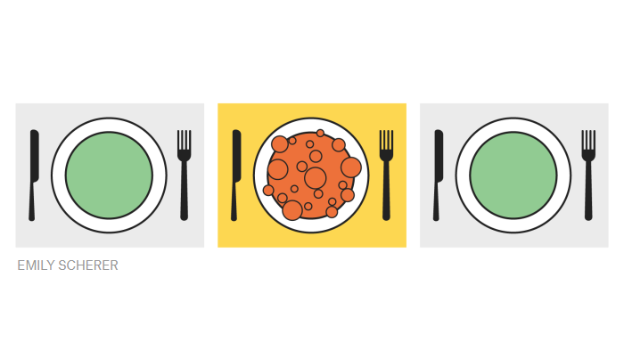
Around the world, people are toning down their celebrations in a bid to mitigate spread of the coronavirus. The latest casualty: Thanksgiving. Our NodeXL #ddj mapping from November 16 to 22 found FiveThirtyEight’s timely piece explaining the risk of COVID-19 transmission from even small Thanksgiving dinner gatherings. Also popular: The New York Times tracking the status of all vaccine trials in progress, and The Pudding analysis of race and gender in crossword puzzles from five major US news publications.

Online Investigative Techniques — GIJN Webinars and Workshops with Henk van Ess

GIJN is pleased to announce four free digital events for journalists on cutting-edge online investigative techniques. They will be led by the globally-renowned data journalist, open source reporting expert and trainer, Henk van Ess. The December webinars are open to all and last for 90 minutes. The January workshops are limited to a maximum of 25 people, by application only and will last five hours.

GIJN Webinar — Investigating the Pandemic: Behind the COVID-19 Vaccine Race

GIJN’s webinar “Behind the COVID-19 Vaccine Race” is the second event to mark the publication of our new guide, “Investigating Health and Medicine.” In this webinar, we are pleased to present a noted physician specializing in vaccine development and an award-winning health journalist. Together, they will cut through the fog to show what red flags to look for both before and after a vaccine is approved.

Data Journalism

Data Journalism Top 10: Simple Google Searches, COVID Contracts, Mining Indigenous Land, Nashville Hot Spots, Blackstone in Berlin

Have you ever noticed how your Google search results now appear with boxes of information extracted from the websites by the search engine? Our NodeXL #ddj mapping from November 9 to 15 found The Markup’s new “Simple Search” browser extension, which allows you to view the best results in the “traditional” Google search format. We also discovered a visualization of the connection between members of the ruling British Conservative Party and COVID-19 contracts, InfoAmazonia’s investigation into mining requests in protected Indigenous land in the Amazon, and German daily Der Tagesspiegel showing that the American private equity group Blackstone is a major private property owner in the German capital, Berlin.

Reporting Tools & Tips

GIJN Webinar — Investigating Health and Medicine: Strategies and Tips for Better Reporting

This GIJN webinar, “Investigating Health and Medicine,” open to everyone and free, is produced as part of the Misinformation in Medicine Summit, a two-day event convened by DataLEADS and hosted by the Google News Initiative as a part of the APAC Trusted Media Summit 2020. At the session, GIJN will also launch a major new reporting guide, “Investigating Health and Medicine.”