
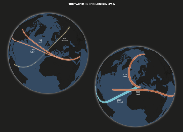
Portions of Spain will experience three solar eclipses from 2026 through 2028. Image: Screenshot, El Orden Mundial
Spain’s Solar Eclipses, Russia-Ukraine Drone Warfare, ICE Detention Camp Overcrowding, and Tracking the Spread of Fake News
As large swaths of Europe and parts of North America and Africa prepared for a solar eclipse this week, news outlets sought to capture the rare astronomical event that many people may never see again in their lifetime. El Orden Mundial’s visual story explored why Spain is one of the exceptions, with the country set to experience two more eclipses within two years. Our roundup of the Top 10 in Data journalism, looking at stories from July 23 to August 11, also includes a Reuters graphical illustration showing how drones are transforming fighting on the frontlines in Ukraine, an ARIJ investigation examining civilian-to-combatant casualty ratios in the Middle East under different US presidents, and a Straits Times analysis modeling how early debunking can stop the spread of misinformation.
Spain’s Total Eclipses
On August 12, a total solar eclipse was visible across parts of Europe, with news organizations mapping its path and where and how to watch it. El Orden Mundial’s visual story explored why the total eclipse was particularly significant for Spain, which is set to experience an unusual sequence of solar eclipses over the next two years, with another total eclipse in 2027 followed by an annular eclipse in 2028. Using a globe-projection map (above), reporters visualized every eclipse from 1900 to 2030, showing how their paths moved across the Earth, while a radial calendar chart plotted each eclipse by year and month, distinguishing between total, annular, and hybrid events and those visible from Spain. The story also looked back at the 1905 total eclipse, when international expeditions to Spain studied “mysterious” shadow bands — rippling stripes of light and dark that appear around totality.
Other coverage includes this Reuters piece and this New York Times piece.
UAVs Reshaping the Russia-Ukraine War
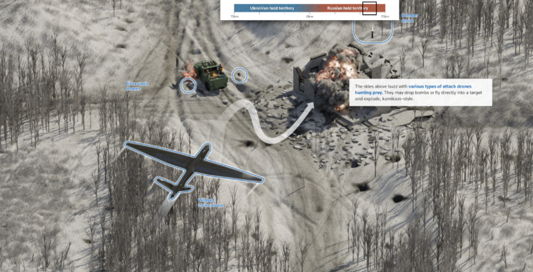
Image: Screenshot, Reuters
The war in Ukraine has become increasingly dominated by unmanned aerial vehicles, with cheap drones crowding the skies and reshaping how soldiers fight, move, and evade detection. A Reuters graphical reconstruction takes readers into the “kill zone,” stretching 15 kilometers (9.3 miles) into Russian-held territory, across the front line and 15 kilometers into Ukrainian-held land. Drawing on accounts from Ukrainian soldiers, drone pilots, and commanders, military experts and verified battlefield videos, the piece shows how small teams hide in dugouts while drones hunt for targets. The scrolling graphic illustrates camouflage positions, concealed basements, supply runs and Russian infiltration tactics, with low cloud and heavy fog providing cover for troops moving through Ukrainian defenses. Verified videos show drones being intercepted and anti-drone netting set alight, illustrating how both sides are adapting to an increasingly technology-driven war.
Mapping Civilian Toll of US Airstrikes Across Yemen, Syria, Iraq, and Somalia
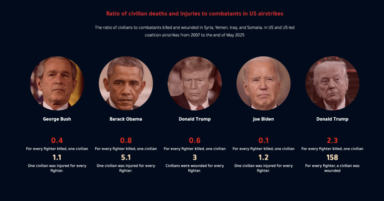
Image: Screenshot, ARIJ
More than 3,336 civilians were killed or wounded in 884 US and coalition air operations across Yemen, Syria, Iraq, and Somalia, according to an ARIJ investigation that analyzed Airwars data from 2007 to 2025. Reporters found children accounted for 42% of the known civilian casualties, with the civilian-to-combatant casualty ratio changing sharply between US administrations and reaching 2.3-to-1 during Donald Trump’s second term, and casualties (killed and injured) in total reaching 5.3 for every alleged fighter killed. Using maps and a series of charts, the investigation drew on personal stories, traced where casualties occurred, compared strikes and their outcomes under different presidents, and examined when attacks were most lethal, finding civilian deaths and injuries were higher during nighttime and early-morning strikes. The analysis also examined how changes to military rules and AI-assisted targeting affected civilian harm, raising questions over the precision promised of automated weapons.
Tracking the Spread of Fake News — and How to Stop It
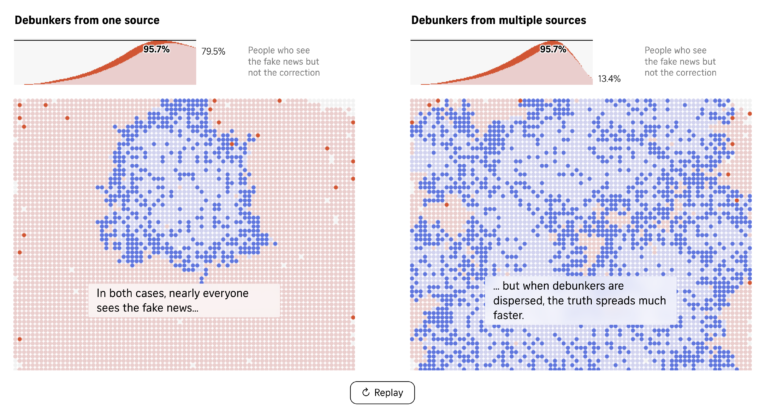
Image: Screenshot, The Straits Times
Misinformation is spreading at greater speed and scale as the internet, social media, and AI make false claims easier to produce and share. The Straits Times adapted a rumor-spreading and debunking model developed by researchers to simulate how false claims and corrections move through an online community much like an infectious disease spreads. Using an interactive grid in which each cell represents a person, the story visualized how users move between states, from being unexposed, to spreading misinformation, spreading a correction, no longer spreading misinformation, or no longer spreading a correction. Simulations tested how the timing and distribution of debunkers would affect the spread, showing that corrections introduced earlier had the potential to sharply limit exposure, while debunkers operating from multiple locations were more effective than a single source. The model was also adapted to explore how faster-spreading AI-generated misinformation could make timely debunking increasingly difficult.
Mapping Epstein’s Flight Network
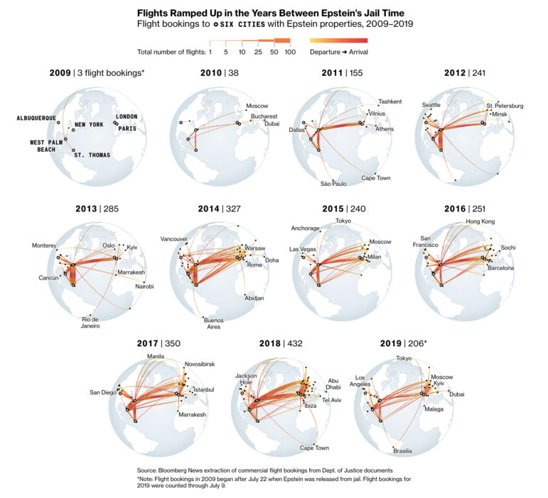
Image: Screenshot, Bloomberg
US financier Jeffrey Epstein used the modelling industry and a network of recruiters to bring young women into his orbit, moving them between Europe, the US, and the Caribbean, where his private island was located. Bloomberg analyzed documents released by the US Department of Justice, tracing more than 3,700 commercial flights booked by Epstein’s staff between 2009 and 2019. The analysis revealed how the travel network expanded and became increasingly concentrated around Eastern Europe, Paris, and New York, aided by model scouts, agents, drivers, pilots, and concierge services. Reporters built a database from more than 22,000 potential itinerary records, using AI to extract flight details and passenger names. A Gantt chart cross-referenced women’s travel windows with Epstein’s own movements and appointments, while the analysis showed bookings almost doubled between 2016 and 2018, just one year before his final arrest.
How India’s Biomass Could be Turned into Biochar
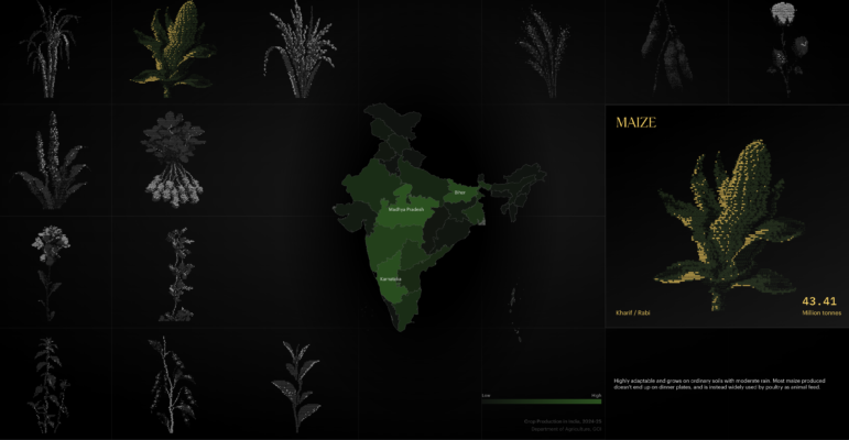
Image: Screenshot, alt-carbon
India produces around 750 million tons of agricultural biomass each year, much of which is burned in fields, releasing toxic gases and contributing to severe air pollution. Alt carbon’s visual story explored how this waste could instead be turned into biochar, a carbon-rich form of charcoal made by heating organic material that can be added to soil. Using illustrations and scroll-triggered maps, the piece traces India’s dependence on agriculture, showing on a map where certain crops are grown, with one in two Indians earning a living from farming. It then goes on to compare the scale of pollution in cities including New Delhi, Ghaziabad, and Amritsar, before using 3D modelling to show how crop stalks, husks and stems can be processed through a biochar machine.
Overcrowding in ICE Detention Centers
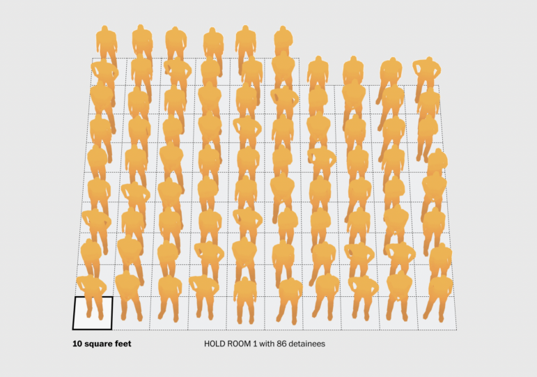
Image: Screenshot, The Washington Post
Trump administration officials directed the US Immigration and Customs Enforcement agency (ICE) to ramp up arrests, leading to temporary holding rooms being packed far beyond capacity — and nowhere was this phenomenon more apparent than at 26 Federal Plaza in Manhattan. The Washington Post analyzed ICE data from 177 temporary holding facilities nationwide, alongside internal emails, text messages, court records, and detainee testimonies, to track how overcrowding spread during US President Donald Trump’s second term. A bar chart compared monthly detention populations over time at the 177 ICE hold rooms, while a 3D reconstruction of Hold Room 1 at 26 Federal Plaza showed how the space was used as detainee numbers rose from around eight to more than 80. An accompanying scale graphic visualized how much space each person had, falling from about 410 square feet per person when Trump came to office at the start of 2025 to roughly 10 square feet at the room’s peak overcrowding.
Foreign Ownership of Minerals and Water in Argentina
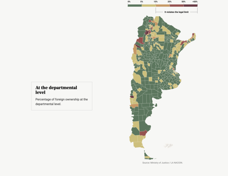
Image: Screenshot, La Nación
About 13.2 million hectares (51,000 square miles) of rural land in Argentina is foreign-owned — equivalent to almost 5% of the country’s continental territory, according to La Nación, which examined where ownership is concentrated and the resources at stake. Reporters mapped foreign ownership at provincial and departmental levels, highlighting the 31 departments where it exceeds the current 15% legal limit and identifying areas where foreign-owned land overlaps with freshwater, minerals, forests, waterways, and border zones. A ranked table lists the departments with the highest foreign ownership, led by San Carlos in Salta at 59.8%, while a scroll-driven map examined concentrations across Patagonia, the northwest, and the northeast. The story also compared existing land restrictions with proposed reforms under President Javier Milei that could raise the ownership cap and remove protections around strategic resources.
Mapping China’s Maritime Presence Around Taiwan
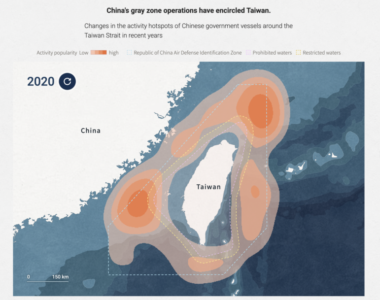
Image: Screenshot, CommonWealth magazine (Taiwan)
The Democratic Republic of China’s coast guard is expanding its presence around Taiwan and across the First Island Chain, using what experts described as a growing “gray zone” strategy to assert control. Taiwan’s CommonWealth Magazine analyzed 1.8 billion ship signals to map Communist Chinese government vessels from January to July 2026, tracing their movements around Taiwan, the Diaoyu Islands, the South China Sea ,and disputed waters near Japan, South Korea, and the Philippines. Reporters matched these Chinese vessel names to MMSI tracking data, removed unreliable tracks, and used verified locations to map activity hotspots. A chart compared harassment incidents in waters around Taiwan from 2024 to 2026, while the investigation found Communist Chinese vessels were increasingly moving east of Taiwan and extending across the First Island Chain.
The Risk of Climate Events
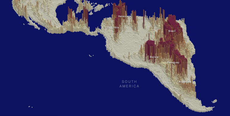
Image: Screenshot, Moody’s
Major catastrophes are getting bigger and costlier for global economies and financial systems, putting pressure on supply chains and government budgets, with Moody’s estimating US$41 trillion in potential losses from physical climate risks by 2050. Part one of a series by Moody’s on physical risks used interactive maps to visualize global wildfire risk and how it could change between 2050 and 2100, allowing readers to scroll between scenarios and regions. The story drew on Australia’s 2019-20 Black Summer bushfires, which caused $1.5 billion in insured losses, and the 2025 Los Angeles wildfires to show how heat, drought, vegetation, wind and population growth can combine to increase risk.
BONUS
Mapping the Journeys in Novels
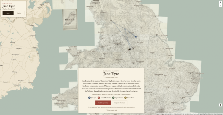
Image: Screenshot, PlotLines
Classic novels have been turned into interactive maps in PlotLines, a project that turns public domain books into interactive journeys, using AI agents to research locations, verify quotes, and reconstruct routes before a human editor reviews the finished story. Each book is published as a map, with journeys drawn along real roads, railways, and sea routes, with period maps and images used to ground locations.
Hanna Duggal is a data journalist at AJ Labs, the data, visual storytelling, and experiments team of Al Jazeera, and a GIJN contributor. She has reported on issues such as policing, surveillance, and protests using data, and reported for GIJN on data journalism in the Middle East, investigating algorithms on TikTok, and on using data to investigate what tribal lands in the US.

International Research Guide: How to Find Experts and Hidden Documents on Any Topic
Guide to Investigating Tech and AI in Modern Warfare
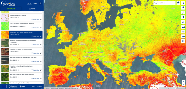
Turning Copernicus Satellite Data Into Public-Interest Climate Stories
10 Practical Tips for Verifying Scientific Claims

German Far Right’s TikTok Reach, Iran War’s Impact on Cooking Gas, Mapping the Nepal Floods, and ‘Strongest’ Country Passports
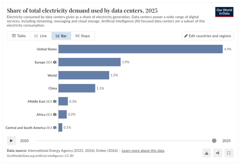
Global Data Center Energy Use, US Strike on Iran School, Russia’s Security Service Leaks, Portugal’s Ancient Trees
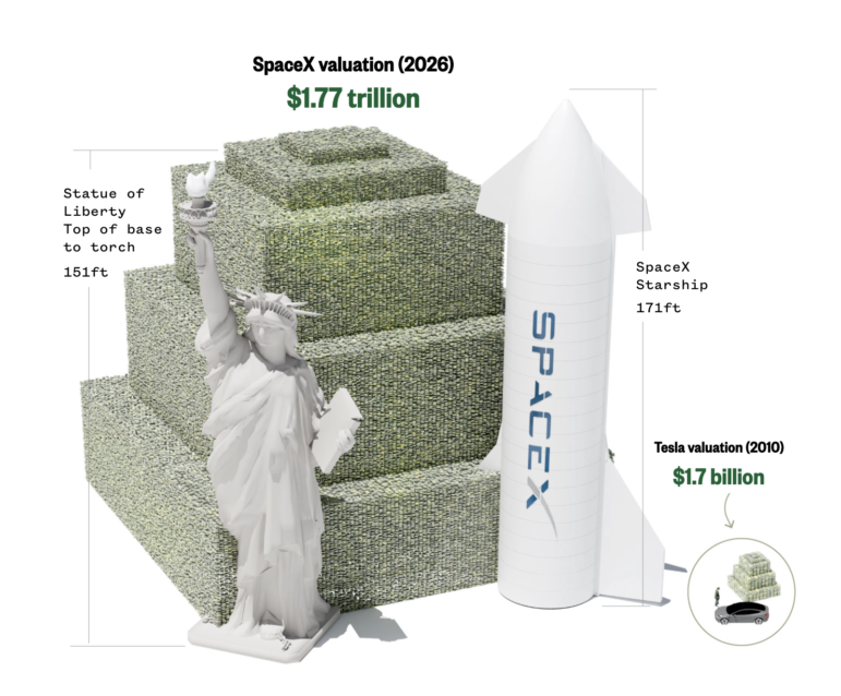
Visualizing a Trillion Dollars, India’s Warming Cities, Russian Mercenaries at Sea, and World Cup Player Physiques

Rare Earth Rivalry, Falling Birth Rates, Violence in the Sahel, and 70 Years of Eurovision Lyrics

This work is licensed under a Creative Commons Attribution-NoDerivatives 4.0 International License
Republish our articles for free, online or in print, under a Creative Commons license.
Republish this article
This work is licensed under a Creative Commons Attribution-NoDerivatives 4.0 International License
Read Next
Data Journalism Top 10
German Far Right’s TikTok Reach, Iran War’s Impact on Cooking Gas, Mapping the Nepal Floods, and ‘Strongest’ Country Passports
Also highlighting coverage of Nvidia’s role in financing AI companies, how US adults engage with AI chatbots, and a story investigating children’s care homes in the UK.
Data Journalism Top 10
Global Data Center Energy Use, US Strike on Iran School, Russia’s Security Service Leaks, Portugal’s Ancient Trees
This latest Top 10 in Data Journalism column also highlights rising drug-related deaths in Berlin, heatwave fatalities in Europe, and Hong Kong’s rapidly aging population.
Data Journalism Top 10
Visualizing a Trillion Dollars, India’s Warming Cities, Russian Mercenaries at Sea, and World Cup Player Physiques
Also highlighting how films portray Ukrainians, increasing tree cover in Spain, and how couples meet.
Data Journalism Top 10
Rare Earth Rivalry, Falling Birth Rates, Violence in the Sahel, and 70 Years of Eurovision Lyrics
Also highlighting China’s squid fishing fleet off Argentina, how redistricting is shaping America’s midterms, and why 2.1 billion people still lack safe drinking water.