
Data is woven into how journalists cover everything from local government spending to global climate change patterns, but not every newsroom has developed the editorial infrastructure to match. Image: Pixels
Developing a Data State Of Mind: Key Tips for Editors
Read this article in
Today, across print and digital newsrooms of every size, data is woven into how journalists cover everything from local government spending to global climate change patterns. Reporters use it to confirm trends, debunk myths, and answer questions that human sources would otherwise fail to.
Data journalism has been around in some form since the 1950s, but the field exploded after the millennium when online publishing made interactive databases, searchable records, and data visualization possible.
But not every newsroom has developed the editorial infrastructure to match the growing use of data in editorial stories. Editors who worked their way up the ranks in traditional newsrooms are increasingly asked to greenlight and edit stories that have spreadsheets, datasets, and statistical analysis at their core, often without formal training or a clear sense of what that process actually demands of them.
Minneapolis Star Tribune data editor MaryJo Webster has spent decades working with data and training journalists, and says that the process of developing and editing a data-driven story follows the same logic as any other reporting. You find a source, vet it, question it, and interpret the answers fairly. The questions data can answer — who is being harmed? Where is public money going? And is the policy working as promised? — are the same questions accountability journalism exists to pursue. The difference is that the source is a spreadsheet, which requires a specific set of instincts.
“It’s really important to think about data journalists or reporters who use data skills in their work as not that different from any other reporter in the room,” says Webster, the lead instructor on a four-week Knight Center course on this subject. “They’re asking questions and sharing answers. They’re just using a sort of foreign language to get answers that we can’t get in other ways.”
GIJN attended the course in order to share the key lessons for editors working with data-driven stories — advice that covers the lifecycle of a data-driven story, from assessing sources to refining the final edit and overseeing visualizations.
Developing a Data State Of Mind
At its core, data journalism is “interviewing” structured data. Information stored in rows and columns gets interrogated the same way a reporter interrogates a source, but in this case, programming languages and spreadsheets help to conduct those interviews. Often when people hear data journalism, they think it’s all math, says Webster, but it’s often about being able to translate what you see in a spreadsheet. Data can help you to answer questions that human sources either don’t know or can’t give the answer to.

MaryJo Webster, data editor at the Minnesota Star Tribune. Image: Courtesy of MaryJo Webster
Understanding data as a source rather than a supplement is what changes how editors approach it. Human sources come in different forms: the reliable go-to, the tipster, and the whistleblower. Data can also play all of those roles. Webster says data can act as the whistleblower — where it tracks something you want to find out — other times it can be a background source, which gives you a big picture, or it can be a directory to help you find people to make the center of your story. While a story built on data alone, without characters, human sources, and context, is rarely a good one, Webster points out, the data can lead you to the right places.
Data does differ from human sources in a few important ways. Sometimes it can take longer to get to know it, especially if a reporter is working with a dataset for the first time. Data is frequently flawed, which adds complexity. But you can ask as many questions as you like, and, if the data is detailed enough, the answers can be more precise than what human sources can give you.
Webster points to a Star Tribune investigation into Minneapolis city beaches on lakes as a clear example of data outperforming a human source and acting as a reliable go-to. City officials confirmed that beach closures had become more frequent, but that was the extent of what they could say. Two datasets told the rest of the story – that beach closures were becoming more common because of heavy rainfall that was causing runoff carrying bacteria into the lakes.
One thing data cannot do is explain the why, says Webster. It can reveal a pattern, but it will rarely tell you the cause. That still requires shoe-leather reporting. It’s worth noting that before launching into an analysis, a reporter should acknowledge that just because a data opportunity exists, it doesn’t always mean it should be taken. Questions for both reporters and editors to consider are:
- If there is a question that human sources genuinely cannot answer
- What level of detail is needed from the data
- Could a single number someone else has already crunched be enough for the story?
- Does another outlet already done the analysis that you could use?
- And how quickly does the story need to be published?
Sourcing Good Data
Finding good data follows the same logic as finding other sources. Beat reporters should spend time mapping what data exists around the topics they cover, such as what reports relevant government agencies produce or how a police department tracks gun violence.
What kind of data you get, whether it is summary data or raw, matters greatly. Summary data is information someone else has already processed i.e. a table showing the number of handguns recovered in schools. However, detailed data, where each row might represent a single incident, person, or crash, lets you conduct an interview yourself.
While detailed data isn’t always available, and sometimes there’s no time to obtain it, the best way to find it, is to act like a reporter — call people, ask agencies how things are tracked, follow the paper trail behind any big number because summary data usually always points back to a richer original dataset, according to Webster. It’s sometimes a good idea to ask for a meeting with the people collecting the data to get an insight into their methodology; alternatively, reporters can get an analyst to comment on the dataset.
This is also the point at which bulletproofing data has to begin. Before requesting anything, reporters need to understand what the data actually contains, how it was collected, what is excluded, and whether anything has changed over time that would affect the numbers.
The time frame is another decision that needs to happen early. The general rule is to get as much historical data as possible, five to ten years where feasible, but a few complications consistently arise, says Webster. For example, the COVID-19 pandemic distorted almost every dataset that covers 2020, regardless of topic, and treating 2020 as a normal baseline would skew any trend analysis.
Equally important is thinking about the “universe of data” a reporter wants, i.e. if they are looking at a car crash databases that only includes accidents where someone was injured, killed, or caused significant property damage, but the reporter wants to know how often cars hit buildings they would likely find that dataset too narrow.
Sometimes, no suitable dataset exists at all but when that happens, it is possible to build one. In March 2020, when Argentina closed its borders during the COVID-19 pandemic, journalists at La Nación knew that more than 21,000 Argentines were stranded abroad, many in situations of acute vulnerability. Rather than relying on the government’s limited estimates, they built their own database by launching a public Google form that collected structured information, location, age, vulnerability factors, return ticket status, and amplified it across social media. They also tracked down the Instagram accounts that stranded travellers had created and contacted them directly. The resulting database let the team map concentrations of stranded people by country, identify those in the most precarious situations, and produce reporting that gave the crisis a scale and a human face that official sources could not provide.
Data journalist Natalia Louzau, who worked on the project and was a guest speaker on the Knight Center course, said there are a number of key lessons they learned in the process:
- Design with the final product in mind; the questions you want the database to answer should determine the fields you collect.
- Collect dynamic information rather than static, date of birth rather than current age, so the data remains usable years later.
- Standardize data entry from the start, using fixed categories rather than free text wherever possible, so the database does not become a cleaning problem before it becomes a story.
- And do not assume a database needs to be large to be valuable. La Nación’s Who’s Who in Congress database had just 330 rows. It was enough to tell readers things about their elected representatives that had never been compiled in one place before.
La Nación’s Who’s Who in Congress database. Image: Screenshot, La Nación
Bulletproofing
Bulletproofing a data story cannot wait until the fact-checking stage at the end. Problems with data take time to resolve, so the process needs to begin the moment a reporter identifies their dataset.
The two things that matter most are whether the data is sound and whether the analysis is correct. Webster’s advice to reporters and their editors is to treat new data the way you would treat a whistleblower — with interest, but with caution. “Have coffee with it,” says Webster. Ask how it was collected, how often it is updated, what it includes, and what it leaves out. Scroll through the columns. Look for anything that seems off. Check whether there are codes that need translating, inconsistent values, missing fields. If the agency that produced the data has a codebook or methodology document, use it. Do not assume you know what a field means until you have confirmed it.
Webster says one of the most useful habits a data reporter can develop is keeping a data diary, a running record of every source used, every cleaning decision made, every column added or transformed during the analysis. It is the paper trail that makes it possible to verify findings, catch errors, and defend the work if it is challenged after publication. Editors should be asking for it, and asking whether the data analysis is being developed in parallel with human reporting.
In addition, having a data memo can serve a different but complementary purpose. The memo acts as a summary where the key findings, the surprises, the limitations, and notes on what the data shows compares to what human sources are saying, is presented. It should be simple and focused, and editors should interrogate it. When a finding looks remarkable, the right instinct is pushback: Is this too good to be true? Has anyone disputed it? Is the analysis comparing like with like, or have external factors such as population shifts gone unaccounted for? Has the methodology of the underlying dataset changed over the period being analyzed? If another outlet or researcher has run the same analysis independently, do the findings match? Webster also suggests writing out the methodology in plain language. If it sounds too complicated to explain clearly, that is usually a sign something needs to be looked at again.
Editing the Data Story
The most common failing in a data story is when good analysis is presented badly. Long runs of statistics. Numbers in every paragraph. Findings reported without any indication of whether they are surprising, typical, or alarming. Webster says this causes readers to disengage fast.
- It’s better to have fewer numbers, used well, than too many. This means limiting any single paragraph to two or three numbers at most (another rule of thumb is no more than eight numerals in total). The goal is to explain what the data reveals, not to display it.
- Webster suggests paraphrasing statistics the way you would paraphrase a long quote.
- It’s also worth noting that reporters shouldn’t shy away from rounding where it is honest. “Roughly half” communicates more clearly than “48.7%” in most contexts, and decimals imply a precision that data, by its nature, cannot always guarantee. Webster suggests avoiding them entirely for things that cannot be divided, people being the obvious example.
- Use proportions or ratios rather than raw figures where comparisons are the point.
- It’s also a good point to avoid making readers do the maths. Convert rates for them. The story should carry the reader to the finding.
Webster says every analysis should have a star number, the single finding that cuts closest to the heart of the story. It is the equivalent of the strongest quote from a human source. Data journalists can be reluctant to let the rest go, but for readers, a story built around one clear finding is more powerful than one that tries to present everything. Whatever the star number is, make sure the reader knows what to make of it. A figure means nothing until the story has given the context.
On Visualizations
If the story includes charts or maps, the first question an editor should ask is whether the visual is communicating something or simply displaying data. There is a difference.
CJ Sinner, the director of graphics and data visuals at the Star Tribune, says:
- Readers process charts better when they include a strong narrative title, clear annotations, and direct labels rather than a separate legend that requires the eye to travel back and forth. The chart’s job is to do the work for the reader.
- Color matters too. Use bolder, more saturated colors for the most important figures, and use them deliberately rather than decoratively. Red carries associations with negative values, green with positive. Sometimes two shades of a single color do more for a comparison than a palette of several, but be mindful of accessibility issues for readers with reduced color perception capabilities. Alignment keeps a visual clean. Proximity of items on a chart signals relationships. These are design choices that should be implemented for every reader to follow a story.
- Match the chart type to what the data is actually doing, such as line charts for trends over time.
- In addition to colors and types of charts, the words used on the visualization matter too. Must-do’s include: Label the axes. Spell out names rather than abbreviating them. Annotate the moments that matter such as recessions on an oil price chart, a policy change on a crime trend, and avoid burying important information in tooltips that readers may never think to click.
The final test is whether the visual earns its place. If the same information would land more clearly in a single sentence, cut the chart. If the chart reveals something a sentence cannot, make sure it is built for a general reader to understand.
Hanna Duggal is the writer of GIJN’s Top Ten in Data Journalism column, and a data journalist at AJ Labs, the data, visual storytelling, and experiments team of Al Jazeera. She has reported on issues such as policing, surveillance, and protests using data, and reported for GIJN on data journalism in the Middle East, investigating algorithms onTikTok, and on using data to investigate tribal lands in the US.

Tech Focus Project

Introduction to Investigative Journalism: Data Journalism

No Coding Required: A Step-by-Step Guide to Scraping Websites With Data Miner
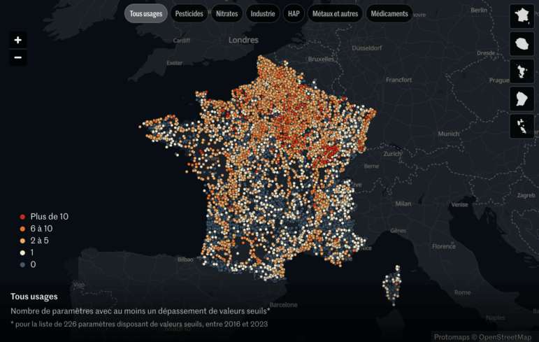
How a Le Monde Team Uncovered 300 Contaminants in France’s Groundwater

From Data to Storytelling: Concept and Design Tips from the Financial Times’ John Burn-Murdoch

How Middle Eastern Data Outlets Use Data to Challenge Narratives and Advance Accountability

Cheap Drones Reshaping Warfare, Strait of Hormuz as Energy Chokehold, Starvation Strategy in Sudan, an Iceberg’s Final Journey

Confront Them With the Numbers: This Former Physicist’s Path to Investigative Data Journalism

This work is licensed under a Creative Commons Attribution-NoDerivatives 4.0 International License
Republish our articles for free, online or in print, under a Creative Commons license.
Republish this article
This work is licensed under a Creative Commons Attribution-NoDerivatives 4.0 International License
Read Next
Data Journalism
From Data to Storytelling: Concept and Design Tips from the Financial Times’ John Burn-Murdoch
The chief data reporter for the Financial Times discusses how he considers the use of text, color, and annotation to aid visual storytelling through charts and graphics.
Data Journalism MENA Focus Week
How Middle Eastern Data Outlets Use Data to Challenge Narratives and Advance Accountability
Data journalism in the Middle East has been driven by organizations that have produced collaborations and projects that combine innovative techniques with nuanced local knowledge.
Data Journalism Top 10
Cheap Drones Reshaping Warfare, Strait of Hormuz as Energy Chokehold, Starvation Strategy in Sudan, an Iceberg’s Final Journey
Our round-up also highlights India’s highly polluted Yamuna River, a flash flood in Argentina’s Bahía Blanca, and how good (or bad) humans are at identifying AI-generated music.
10 Questions
Confront Them With the Numbers: This Former Physicist’s Path to Investigative Data Journalism
Anna Behrend is a self-taught data journalist who has found in data-driven reporting and visualization a way to combine her academic background in science with her creative interests.