
GIJN’s Data Journalism Top 10: Visualizing Philosophy, El Salvador’s Violence, the UK’s John Bercow, Mexican Bikes, and Russian Data

Step-By-Step Guide for Journalists on the Basics of Google Sheets

Tipsheet for Using Ocean Data in Your Investigations

No Coding Required: A Step-by-Step Guide to Scraping Websites With Data Miner

GIJC23 – The Future of Data Journalism: New Analytical Tools, Data Visualization, and AI
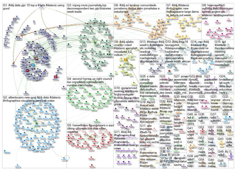
What’s the global data journalism community tweeting about this week? Our NodeXL #ddj mapping from October 28 to November 3 finds The Economist’s summary of a great year in print data journalism, a visualization by Deniz Cem Önduygu of key arguments in Western philosophy, Datajournalism.com’s guide to editing, and BBC News’ analysis of outgoing House of Commons Speaker John Bercow’s career in numbers, Hassel Fallas’ look at Mexican bikes, and Novaya Gazeta on Russian data.
The Economist’s Year of Print Graphics
From China to the United States, encompassing maps to histograms, The Economist covered a wide range of topics using a variety of graphics in its first year of data journalism in print. Alex Selby-Boothroyd, head of data journalism at The Economist, recounts their greatest hits and offers some lessons learned along the way.
Philosophy Summarized and Visualized
Visual communication designer Deniz Cem Önduygu created a visual summary of some key ideas in the history of Western philosophy. By clicking on an idea, readers can see other linked arguments, read what’s been said on a particular subject, and find different perspectives. If a statement agrees with or expands on an old one, they’re connected with a green line. If it disagrees with or refutes an old statement, they’re connected with a red line.
Guide to Editing Data Journalism
Good data editing requires critical thinking, project management skills, and a better-than-average understanding of the content, context, and organization of the data. Maud Beelman and Jennifer LaFleur wrote a quick guide for editors and journalists to help manage and bulletproof data investigations, including 10 questions every editor should ask.
A Speaker’s Career by the Numbers
“It’s as if he goes to bed every night, reads a thesaurus, inwardly digests it and then spews it out the next day.” So said a British Member of Parliament of outgoing United Kingdom House of Commons Speaker John Bercow, as quoted in The New York Times. The BBC analyzed 100 years of Hansard (the official Parliamentary record) to compare Bercow’s speech with his predecessors.
Impunity for Violence Against Women
Seven years after El Salvador established a groundbreaking First Comprehensive Law for a Life Free of Violence against Women (Ley Especial para una Vida Libre de Violencia para las Mujeres), the outcomes do not seem encouraging. ElSalvador.com found that last year, the Supreme Court received 1,346 cases of expressions of violence against women. And of those cases, only 11% were brought before a judge and 1% had a conviction.
Data Journalism in Russia
Novaya Gazeta devotes a whole department exclusively to data journalism, which is rare in Russia. Alesya Marokhovskaya, a data journalist from its data team, talked to Radioportal about security measures and the work of the data department, including an investigation into the travels of Russian oligarch Yevgeny Prigozhin.
Biking Curiosities
Data journalist Hassel Fallas looked into the public bicycle rental service in Jalisco, Mexico. Her data analysis revealed the busiest bicycle stations, peak hours, common users, and frequent routes.
Creative Student Visualizations
Alberto Cairo, Knight Chair in Visual Journalism at the University of Miami, highlighted the interesting work being done by his students—some of which have already been long-listed in the Information is Beautiful Awards.
https://twitter.com/LaughlinPaul/status/1189531236206829569
British Polls Tracker
BBC News is running a poll tracker based on polls conducted by members of the British Polling Council, which measures how people say they are going to vote at the next general election.
Visualizing Thuringia’s Election Outcome
The 2019 state election in Thuringia, Germany, last month saw the country’s Left party winning big, but at press time there was no majority for any conceivable coalitions. Funke Mediengruppe visualized the election outcome in graphics and maps.
Thanks, once again, to Marc Smith of Connected Action for gathering the links and graphing them. The Top Ten #ddj list is curated weekly.
 Eunice Au is GIJN’s program coordinator. Previously, she was a Malaysia correspondent for Singapore’s The Straits Times, and a journalist at the New Straits Times. She has also written for The Sun, Malaysian Today, and Madam Chair.
For a look at Marc Smith’s mapping on #ddj on Twitter, check out this map.
Step-By-Step Guide for Journalists on the Basics of Google Sheets
Tipsheet for Using Ocean Data in Your Investigations
No Coding Required: A Step-by-Step Guide to Scraping Websites With Data Miner
GIJC23 – The Future of Data Journalism: New Analytical Tools, Data Visualization, and AI

This work is licensed under a Creative Commons Attribution-NoDerivatives 4.0 International License
Republish our articles for free, online or in print, under a Creative Commons license.
Republish this article
This work is licensed under a Creative Commons Attribution-NoDerivatives 4.0 International License
Read Next

Data Journalism
Making Trillions Make Sense: How Reuters Visualized the AI Economy
How do you make a trillion dollars feel real to someone who has never seen that much money? Vineet Khare and Mayank Bhatt faced that very challenge for their data-driven investigation into AI investment.

Data Journalism
How the Hindu Is Embedding AI Into Its Data Journalism
LLMs are quietly reshaping data journalism workflows at The Hindu, helping reporters process vast document sets, write scripts and build interactive tools.

Data Journalism
Developing a Data State Of Mind: Key Tips for Editors
Data is woven into how journalists cover everything from local government spending to global climate change patterns, but for editors without a specialist background, it can be daunting.

Data Journalism
2026 Sigma Awards for Data Journalism Open for Entries – Deadline Extended
The Sigma Awards celebrate the best data journalism from around the world. Submissions are now open for data projects published in 2025.