Data Journalism Top 10: Bitcoin’s Energy Impact, LGBTQ Rights in Africa, Pensions & Lattes, Taylor Swift’s Big Tour
Read this article in

Step-By-Step Guide for Journalists on the Basics of Google Sheets

Tipsheet for Using Ocean Data in Your Investigations

No Coding Required: A Step-by-Step Guide to Scraping Websites With Data Miner

GIJC23 – The Future of Data Journalism: New Analytical Tools, Data Visualization, and AI
For more than nine years, GIJN has published a weekly Data Journalism Top 10 column using a combination of NodeXL’s analysis of #ddj posts on Twitter and our own human curation. This week, in the wake of Twitter shutting off free access to its API, disrupting our reports from NodeXL, we are bringing you our pick of data stories based entirely on human curation. For future columns, we invite data journalists around the world to send us your compelling data stories for a chance to be featured. We are hugely grateful for the extraordinary support we’ve received from our friends at NodeXL over the past decade. We look forward to continuing to collaborate with them in different forms moving forward.
This week, we highlight The New York Times’ investigation into the energy and environmental impacts of bitcoin mining, Reuters’ look at anti-homosexuality laws across the African continent, Tages Anzeiger’s mapping of Switzerland’s residential density, and La Nacion’s visualization of Lionel Messi’s decorated football career.
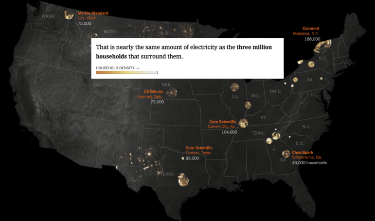
The Real Cost of Bitcoin
Miners of bitcoin, the world’s largest cryptocurrency, have found a welcome home in parts of the United States, where places like former smelting factories can be repurposed into vast computing warehouses. But this investigation by the New York Times found that the proliferation of large-scale crypto mining has led to additional energy demands on the nation’s power grid equivalent to another New York City. That comes at a cost — from higher electricity bills to “enormous” carbon pollution. Reporters behind the project cross-referenced financial disclosures, land records, and satellite imagery to create the first nationwide picture of the 34 biggest operations, and commissioned studies to evaluate the impact on energy prices and the environment.
Estimating the Losses of War
Russia’s Ministry of Defense has not released its annual data on disability and survivor’s pensions for 2022, which could give an indication of the extent of losses of the Russian army in the war against Ukraine. IStories, the Russian independent investigative media site in exile, looked at alternative data sources — the Federal Register of Disabilities and the Pension Fund — in an attempt to determine how many military men were killed or disabled in the war. Basing on those sources, journalists calculated that more than eight thousand Russian volunteers and mercenaries have died or been wounded so far. According to the US Center for Strategic and International Studies (CSIS) the numbers are much more stunning: Russia’s total losses in killed and wounded during the year of full-scale war ranged from 200 to 250 thousand people.
Mapping Density
Switzerland is known for its vast mountain ranges, beautiful lakes, and green meadows. But of course population density varies sharply across the country: in the center of Geneva 29,000 people live in each square kilometer, while in the village of Avers in Graubünden, the figure is closer to two. Using data from the Federal Statistical Office, a team at the Swiss newspaper Tages Anzeiger created a map to show how population density varies from city to city. Readers are able to enter their own addresses to see how their neighborhoods compare to the rest of the country. Nationally, Geneva is the most densely populated. Comparing to cities around the world, it found that Zurich had 20,277 people per square kilometer, less than half the number of people living in the same space in the Spanish city of Barcelona, where there are 52,767.
African Anti-Homosexuality Laws
Hostility towards the LGBTQ community in Uganda is nothing new. But last month, the country’s parliament passed a bill that would criminalize people identifying as LGBTQ and mandate a death sentence for certain kinds of same-sex activity. If the country’s president signs off on the legislation, it will create one of the most severe criminal statutes on this issue in Africa, Reuters reports. The team behind this story mapped out the state of LGBTQ rights across the continent showing countries where homosexuality is illegal, can lead to a life prison sentence, and punishable by death (three countries). The report also looked into the colonial histories of the region to explore if that legacy has impacted current laws and opinions.
Pension Funds Visualized Through Lattes
Most people like coffee more than talking about pensions. So the Guardian harnessed the power of lattes to graphically illustrate why men in Australia tend to have more money in their pension pots than women (the quick answer? Small losses early in a career can lead to big losses later on.) In the example they use, an Australian woman takes two stints of parental leave — thus losing out on her employer’s pension contributions — and works part-time on her return while juggling her child care responsibilities, which impacts her long-term wage growth. All this leaves a big hole in her pension savings: a 24% gap compared to someone who continued to work full time.
Super Messi
The footballer Lionel Messi tends to draw breathless enthusiasm from sports fans and journalists alike. He joined the squad of the Argentine national soccer team with “the strength of a hurricane,” writes Cristian Grosso for Argentine daily La Nación, who goes on to give the footballer’s career a graphic examination. He logs Messi’s appearances by year, tournament, opponent, and manager. You can look into the data behind how he scores (90 of his 100 goals for the country were with his left foot, two with his head). There is even a graphic breaking down his favorite places to “punish the goalkeeper” from the penalty box. What position does Messi play? the reporter asks. “Magician.”
Suicides Across the World
Our World in Data — from Global Change Data Lab, a UK-based nonprofit — is a repository for datasets published to make “progress against the world’s largest problems.” It recently updated and redesigned its 2016 project on suicide: rates have declined in many countries in recent years, the researchers found, but remain high in some countries in Southern Africa and Eastern Europe. While deaths by suicide are under-reported in many places, the project shows how the statistics have changed over time on a global interactive map, with data searchable by country, age, and gender. Researcher Saloni Dattani says that where there have been declines in suicide rates, they have been “driven in part by greater awareness and help for people at risk, improvements in mental health treatment, and restrictions on some of the methods of suicide.”
Breaking Down Taylor Swift’s US Tour
Pop icon Taylor Swift — who broke the Spotify record for the most-streamed artist in a single day last year — is on the road. She’s playing 52 shows across 20 different cities in the US. Carlie Procell, together with her colleague Veronica Bravo, decided to visualize the tour for USA Today: mapping where she’ll be playing, how far she is through the tour list, and charting the songs from the main set list by album. Since Swift is also playing two surprise songs unique to each show, they also decided to interrogate her 192-song catalog — including the 150 not on the main set list — to see which ones might feature among the surprises. And don’t miss this tweet thread by a Swiftie (an affectionate nickname for Swift’s fans) who mapped the pathways and stops Swift takes on stage during her current tour.
Virtual Kitchens
“Virtual restaurants” — eateries listed by food delivery apps with no physical store — are on the rise in the United States. A data analysis by NBC News indicated that more than one in five eateries from a sample of 1,656 Uber Eats listings in New York City appear to be virtual outlets, a trend that is repeated in 12 other cities that NBC examined. These online listings are sometimes alter egos of existing restaurants. The report brought up the ethics of such practices, and highlighted an example from a customer who felt that he got “catfished” when he found out that the true identity of his favorite sandwich place on UberEats was in reality an ubiquitous American diner franchise.
Analyzing Mask Mandate Efficacy
Cochrane, a British nonprofit doing independent research into data about health care, released a meta-analysis (a study of studies) earlier this year on the effectiveness of physical interventions (including masks) to reduce the spread of acute respiratory viruses. The authors’ findings sparked debate among both supporters and critics of mask mandates, with both sides claiming the report supported their own argument. The Economist’s data team dug deeper into the report and visualized the findings of the studies examined in the meta-analysis while highlighting flaws that cast doubt on the results.
Bonus: A Peek Into Axios Visual
Jared Whalen, visual journalist at Axios, shared in a tweet thread a list of “newsroom engineering” hacks done by the Axios Visuals team in the past year that make work better, more efficient, and fun. From a complete Svelte rebuild of its legacy newsroom chartpmaking tool to creating a Zoom shuffle bot for daily meetings, check out the cool things they got up to.
https://twitter.com/jared_whalen/status/1643756842114326531
GIJN’s Data Journalism Top 10 list is curated weekly. Send your suggestions to us.
 Laura Dixon is an associate editor at GIJN and a freelance journalist from the UK. She has reported from Colombia, the US, and Mexico, and her work has been published by The Times, The Washington Post, and The Atlantic. She has received fellowships from the IWMF and the Pulitzer Center.
 Eunice Au is GIJN’s global team manager based in Budapest, Hungary. Previously, she was a Malaysia correspondent for Singapore’s The Straits Times, and a journalist at Malaysia’s New Straits Times. She has also written for The Sun, Malaysian Today, and Madam Chair.
Step-By-Step Guide for Journalists on the Basics of Google Sheets
Tipsheet for Using Ocean Data in Your Investigations
No Coding Required: A Step-by-Step Guide to Scraping Websites With Data Miner
GIJC23 – The Future of Data Journalism: New Analytical Tools, Data Visualization, and AI

One Name at a Time: How Die Zeit Built a Searchable Database of Nazi Party Members

Visualizing a Trillion Dollars, India’s Warming Cities, Russian Mercenaries at Sea, and World Cup Player Physiques

Rare Earth Rivalry, Falling Birth Rates, Violence in the Sahel, and 70 Years of Eurovision Lyrics

How the Hindu Is Embedding AI Into Its Data Journalism

This work is licensed under a Creative Commons Attribution-NoDerivatives 4.0 International License
Republish our articles for free, online or in print, under a Creative Commons license.
Republish this article
This work is licensed under a Creative Commons Attribution-NoDerivatives 4.0 International License
Read Next
Data Journalism
One Name at a Time: How Die Zeit Built a Searchable Database of Nazi Party Members
An online tool set up by the German newspaper Die Zeit, in cooperation with archives in Germany and in the United States, allows people to search several million Nazi Party membership cards.
Data Journalism Top 10
Visualizing a Trillion Dollars, India’s Warming Cities, Russian Mercenaries at Sea, and World Cup Player Physiques
Also highlighting how films portray Ukrainians, increasing tree cover in Spain, and how couples meet.
Data Journalism Top 10
Rare Earth Rivalry, Falling Birth Rates, Violence in the Sahel, and 70 Years of Eurovision Lyrics
Also highlighting China’s squid fishing fleet off Argentina, how redistricting is shaping America’s midterms, and why 2.1 billion people still lack safe drinking water.
Data Journalism
How the Hindu Is Embedding AI Into Its Data Journalism
LLMs are quietly reshaping data journalism workflows at The Hindu, helping reporters process vast document sets, write scripts and build interactive tools.