Image: Screenshot
Data Journalism Top 10: Sweltering Cities, Digital Inequity, Climate & Sleep, COVID & Schools
Read this article in
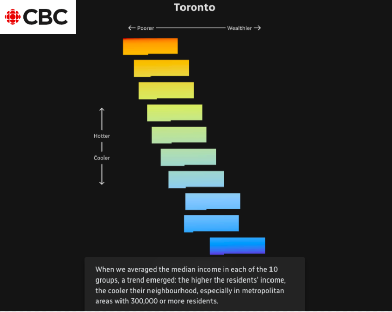
The CBC examined how “heat islands” in the country’s major cities had different impacts based on income. Image: Screenshot
As parts of the world endure record-breaking high temperatures, a highlight from the world of data journalism this week involves an analysis of how “heat islands” in Canadian cities vary based on economic strata. The project by the Canadian Broadcasting Corporation (CBC) also assessed how urban heat affects people differently according to their incomes. Our weekly NodeXL and human curation of the most popular data journalism stories on Twitter also looks at visualizations of how climate change affects our sleep, the global spread of Pegasus spyware, digital inequity in the United States, and how the coronavirus pandemic impacted school children in Latin America.
Sweltering Cities
When it comes to our cities, not all residents experience heat waves in the same way. CBC News analyzed and visualized data on Canadian cities to examine the impact of global warming on those living in the country’s metropolises. Among their findings: People on low incomes and immigrants suffer more from climate change since they are more likely to live in the warmest urban areas and locations with fewer green spaces, which help lower the temperature. To identify these so-called “heat islands,” journalists used land surface temperature estimates from satellite image data which they cross-referenced with urban sociological data. The CBC also visualized how the heat will intensify in the coming years and how a better distribution of green spaces or improved housing could help save lives.
Too Hot to Sleep?
The Financial Times has analyzed the impact of rising temperatures on how we sleep and created a series of charts that illustrate how warmer nights are becoming more common and impacting productivity. Wristband data from people in 68 countries shows that rising temperatures are not only significantly affecting the quality of sleep, but, as with the above heat island example, that it is the poorest who are affected the most. Since sleep deprivation has an impact on productivity “these population-wide numbers illustrate the high economic cost that can be associated with sleep deprivation as a result of rising temperatures.”
Global Spread of Pegasus Spyware
A year after it first revealed the use of Pegasus spyware to monitor journalists, activists, and political opponents around the world, the nonprofit Forbidden Stories has compiled and visualized all available information about the project into a series of maps. It reveals the number of Pegasus victims by country, plus a breakdown showing the countries where governments have confirmed using the software and those that have not. According to the data, the phones of 50,000 people in 50 countries may have been targeted, with the largest number — 15,000 — in Mexico.
Digital Inequity in the US
Microsoft released a Digital Equity Data Dashboard visualizing access to affordable internet and devices across the US. According to the dashboard’s detailed data, 97% of people in the rural county of Ferry, Washington, don’t access the internet at broadband speeds, while over a third of households don’t have a desktop or laptop. Finally, the charts show that the digital divide between the haves and have-nots not only exists in rural areas but also in cities like Los Angeles. The dashboard allows users to examine a city neighborhood-by-neighborhood, detailing which areas most urgently need digital investment.
COVID-19’s Educational Emergency
Peruvian investigative outlet OjoPúblico has analyzed the impact of the coronavirus pandemic on school learning in Latin America, a region that experienced extensive lockdowns due to the coronavirus pandemic. The report, based on a study by the World Bank, details huge knowledge gaps among children, and notes how this was particularly acute in places where virtual learning was not an option. OjoPúblico also visualized the number of days that classes were closed or partially closed across the continent — totaling 775 days in Ecuador, 750 in Bolivia, and 742 in Peru.
Fallen Russian Troops
The Russian independent newspaper Novaya Gazeta — which has changed its name to Novaya Gazeta. Europe now that is operating in exile — examined the compensation payments being made to the families of soldiers who have died or been injured in the war in Ukraine. According to the outlet, the amounts paid to next of kin of Russian military casualties exceeded 113 billion rubles ($US1.95 billion) — funds that could be derived from skyrocketing oil and gas revenues. These figures suggest that the Russian military could have lost roughly 10% of its initial troop strength of 190,000 servicemen.
How (Un)popular is Joe Biden?
Data outlet FiveThirtyEight publishes a constantly updating graphic showing the approval — and disapproval — ratings of US presidents. Using a selection of polls, the outlet compared the popularity of President Joe Biden with past Democratic presidents over the same period of their terms dating back to 1945. It reveals how Biden is struggling more than nearly all of his predecessors at this stage of his administration. The methodology is explained in this post.
Remembering Victims of a Pogrom
It’s been 80 years since the Vel d’Hiv pogrom, in which Paris police rounded up 13,000 Jews and then deported them to extermination camps like Auschwitz. To pay homage to the victims, the Fondation pour la Mémoire de la Shoah published an interactive map revealing where 11,500 adults and children were arrested on July 16 and 17, 1942, before being forced into the Velodrome d’Hiver and taken away on convoys to the concentration camps. The information needed to draw up the map comes from the work of historians Serge Klarsfeld, Sabine Zeitoun, and Laurent Joly.
Women at Work in India
Nonprofit outlet IndiaSpend has dug into the available statistics on women in the labor market. By cross-referencing several sources of data, the newspaper shows that female share of labor participation in the country has increased in recent years. But despite this apparent progress, there are some nuances to the overall picture: the economic distress caused by the COVID-19 pandemic pushed many women to accept any type of work, even labor that was very low paid.
For the Bookshelf
The team at Datajournalism.com has compiled a list of the best books on data journalism, for some interesting summer reading (if you’re in the northern hemisphere) or just adding to your reading list. Among them are timeless must-reads like The Functional Art: An Introduction to Information Graphics and Visualization by Alberto Cairo or Facts are Sacred: The Power of Data by Simon Rogers.
Thanks again to Marc Smith and Harald Meier of Connected Action for gathering the links and graphing them. The Top Ten #ddj list is curated weekly.
 Marthe Rubio is GIJN’s French editor. After working for five years in Spain and Argentina, she is now based in France. She worked for two years on the data team of Argentina’s La Nación. She has also published in Slate and Libération and worked as a correspondent in Buenos Aires for French newspapers Le Figaro and Mediapart.
For a look at NodeXL’s mapping on #ddj and data journalism on Twitter, check out this map.
GIJN Guide to Investigating Foreign Lobbying
Guide to Investigating Caste

Gathering Evidence and Documents in Conflict and War Zones — A MENA Case Study

Tipsheet: How Journalists Can Use a UN Process to Evaluate National Human Rights Records

How The Pudding Used Data Visualizations to Recontextualize the Story of Climate Change

Using Data Sources to Track Harmful Climate Crisis-Fueled Algal Blooms

Lessons Learned: 10 Common Mistakes in Data Journalism

Investigating India: How Smaller, Independent News Outlets Are Digging into Politics in a Key Election Year

This work is licensed under a Creative Commons Attribution-NoDerivatives 4.0 International License
Republish our articles for free, online or in print, under a Creative Commons license.
Republish this article
This work is licensed under a Creative Commons Attribution-NoDerivatives 4.0 International License
Read Next
Climate Data Journalism
How The Pudding Used Data Visualizations to Recontextualize the Story of Climate Change
What does climate change feel like? How will your city’s climate shift, 50 years from now? Data scientist Derek Taylor explains his latest piece.
Data Journalism Reporting Tools & Tips
Using Data Sources to Track Harmful Climate Crisis-Fueled Algal Blooms
For the SEJ’s Reporter’s Toolbox: datasets and sources useful for tracking the harmful impact of climate change-fueled algal blooms.
Data Journalism News & Analysis
Lessons Learned: 10 Common Mistakes in Data Journalism
GIJN asked speakers and attendees in the NICAR conference hallways for the data journalism gaps they see and for under-covered topic areas newsrooms can address.
Data Journalism Investigating Institutions News & Analysis
Investigating India: How Smaller, Independent News Outlets Are Digging into Politics in a Key Election Year
Smaller investigative news outlets have been behind challenging and impactful accountability reporting leading up to the country’s elections.