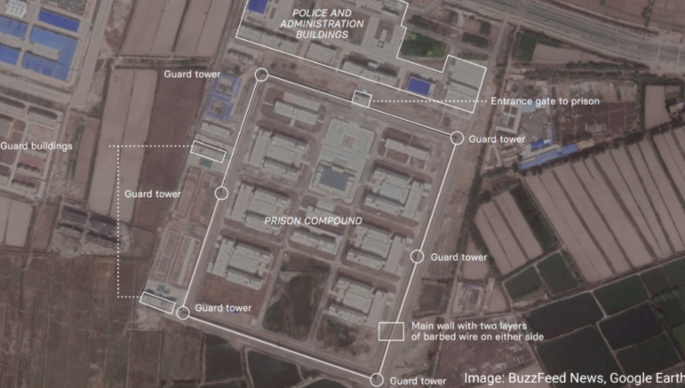
La arquitecta británica Alison Killing le contó a GIJC21 cómo dos colegas y ella descubrieron la red secreta de centros de detención para musulmanes de China, como la que se ve en la imagen, mapeando lugares censurados en una plataforma satelital. Imagen: Cortesía, Alison Killing
9 Essential Mapping Tools for Journalists in 2022
Read this article in
BuzzFeed created visual maps revealing China’s vast detention center network in Xinjiang province, as part of its Pulitzer Prize-winning investigation. Image: Courtesy of Alison Killing
Maps are popular ways to visualize data and are a good way to add context to geographically-based datasets. They can also be beautiful and offer a different view of our world.
Learning to make appealing and informative maps to support your journalism is well worth doing. The good news is that there are significantly more mapping tools available today than there were five years ago and many of them have become very powerful. The downside is that it can be difficult to choose the right tool for the job.
The list of mapping tools below is far from exhaustive but they are the tools we use most often in our visualization work.
Most of these tools are easy to use — add some data, plot some points — but some, mostly towards the end of the list, do require some programming knowledge.
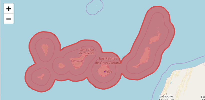
1. My Maps
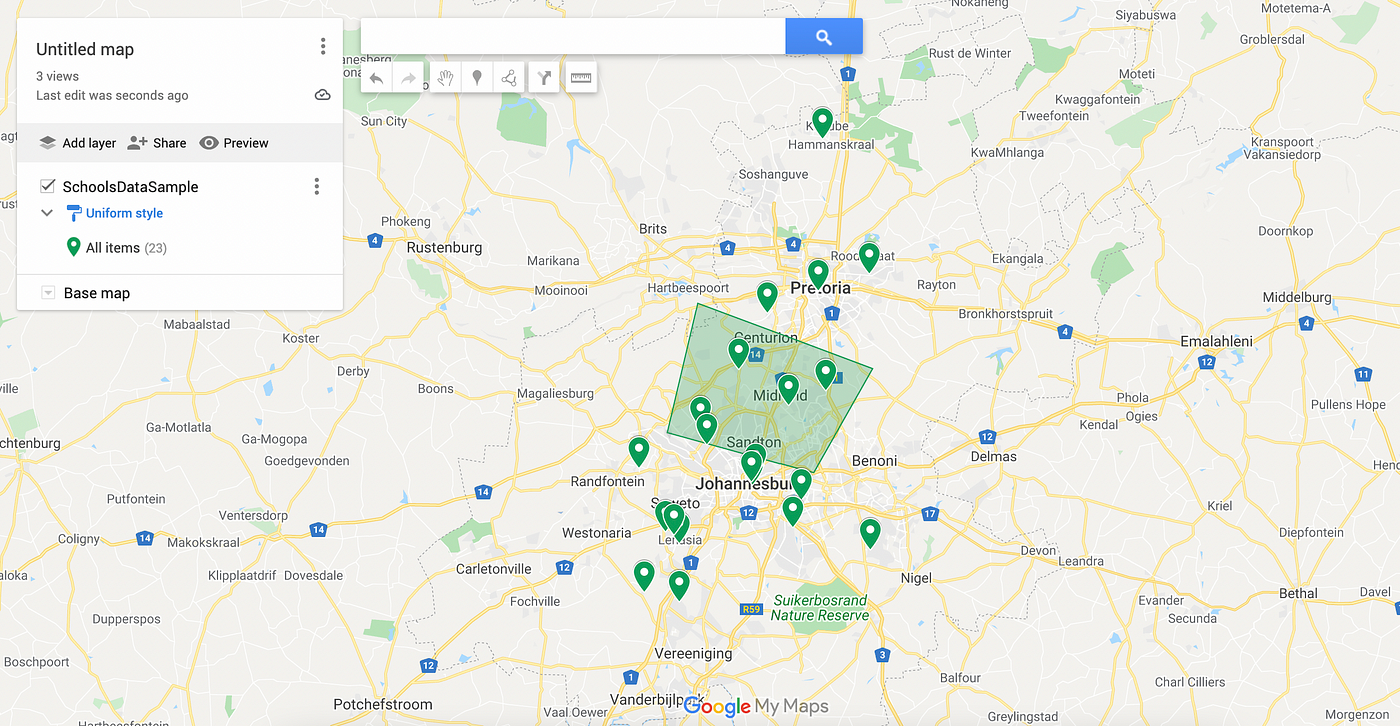
Ease of use: Easy.
Useful for: Mapping points on a map, simple visualizations.
Google’s My Maps is one of the easiest ways to get started making maps. If you have a dataset with columns for addresses or GPS coordinates you’re ready to make a map. Import your dataset, select the column you want to use as the marker location and create the map. You can also draw polygons on the map to indicate areas of interest or even add direction information to maps. My Maps doesn’t have many options for customizing the design of maps but you can choose from a limited selection of base maps and marker colours. Maps can be shared either via a link or embedded on a website.
Pros: Very easy to create and share maps.
Cons: Limited customisation and design options.
2. BatchGeo
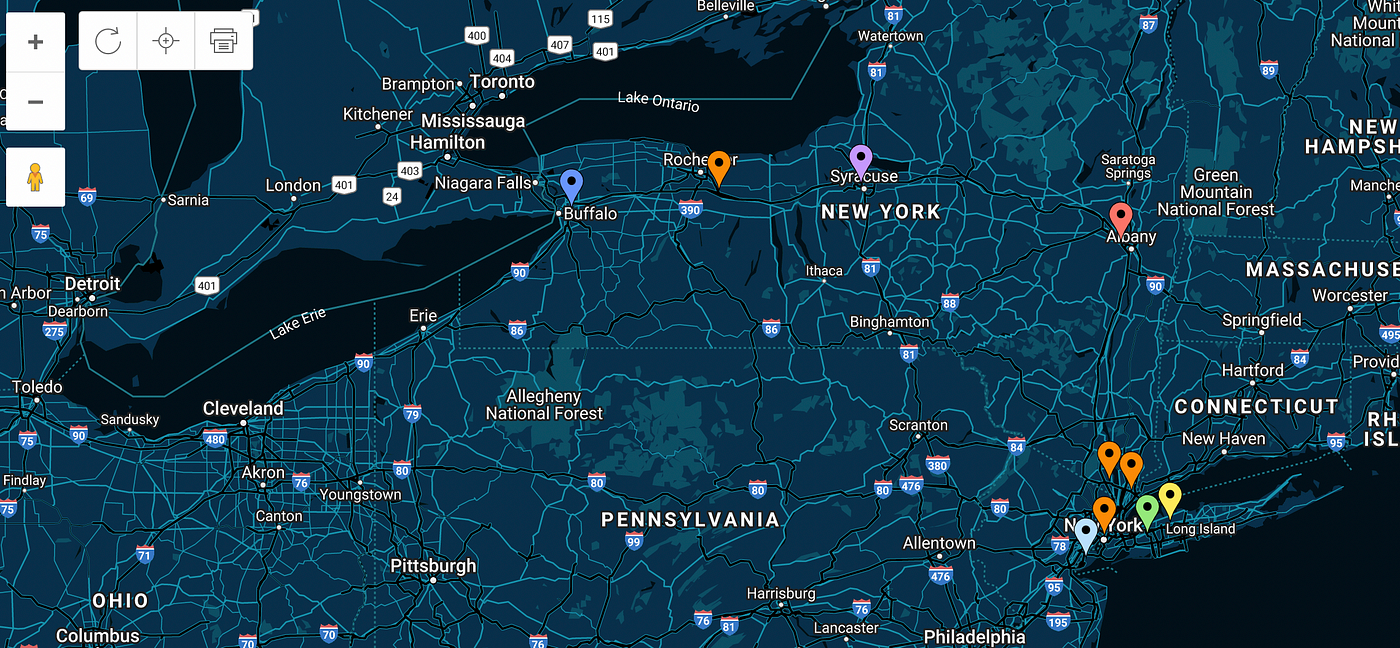
Ease of use: Easy.
Useful for: Mapping points on a map, simple visualizations.
BatchGeo does a pretty simple job but it does it well. Like Google My Maps, all you need to get started is a dataset with columns for addresses or GPS coordinates. BatchGeo will geocode these and add these points to the map. If you specify a column it will automatically group the points using different colored markers. BatchGeo maps can be embedded on a website or shared via a link. A selection of base maps is available to customize maps and marker colors can be changed. BatchGeo has fewer features than My Maps but makes more presentable maps.
Pros: Very easy to use and share maps, more attractive than My Maps.
Cons: Limited customization and design options.
3. Batch GeoCoder for Journalists
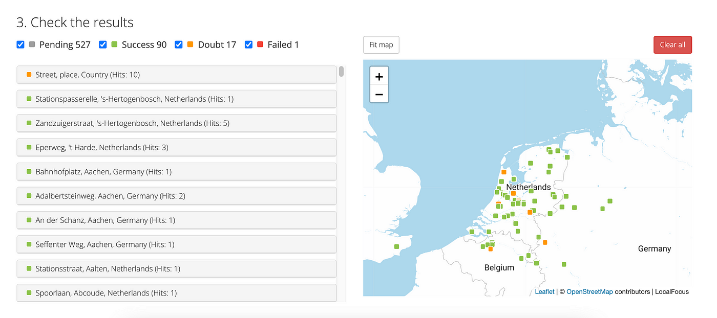
Ease of use: Easy.
Useful for: Looking up GPS coordinates for a long list of places.
Not to be confused with BatchGeo above, Batch GeoCoder is made to bulk convert place names to geographic data. GeoCoder is not specifically designed to plot those points in a final visualization. There are many ways to find GPS coordinates for maps. You can do a search for places on Google Maps and copy the latitude and longitude coordinates from the URL, for example. But if you’re trying to look up tens of places or even hundreds, that method is not scaleable. Batch GeoCoder for Journalists is one of a handful of tools that automates finding the geographic position of things. It’s as simple as pasting in a collection of places and running the encoder. The result is a list of places with geographic positions. Those points that are ambiguous or not found will also be marked so you can refine them, or fix them manually.
Pros: Very easy to use.
Cons: Works better with very specific countries than it does with global searches.
4. GeoTools
Ease of use: Easy.
Useful for: Multiple functions, including extracting specific pieces of maps, calculating and comparing sizes of geographic areas, and more.
GeoTools is a small collection of mapping tools that are easy to use and can help in planning your next project. There are four tools in the collection, though Radius and How Big are very similar. Both of these let you create a circle with either a radius or an area and plot that on a map. This is useful for gauging how big an area of land might be. Reprojector lets you upload data for an area and then drag that around the world to compare its size to other points on the map. Perhaps the most useful of the tools is Gimme Geodata, which makes it easy to select a point on a map and then download various map shapes from that. For example, you could download the data for a municipality and then download the data for a ward within that municipality.
Pros: Easy to use, good for exploring.
Cons: Results are downloaded as geoJSON files, so you’ll need some other tool to visualize the data.
5. Ogre
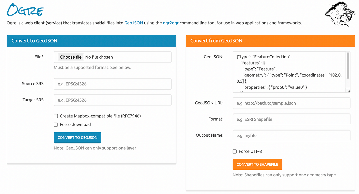
Ease of use: Medium.
Useful for: Convert shapefiles into GeoJSON files and back again.
Many of the tools on this list, including MapShaper and QGIS, will convert between map formats, but if you’re looking for something that specializes in converting map data between shapefile and GeoJSON formats, Ogre is worth a try. Ogre has a relatively limited set of features, but does also have an API so you can also access its conversion functions in your applications.
Pros: Easy to use.
Cons: Limited set of functions.
6. MapShaper.org
Ease of use: Medium (some of the more advanced features are quite technical).
Useful for: Exploring map data, converting between formats, reducing map sizes, and creating subsets of maps.
MapShaper is one of our favorite utility tools. It has an extensive set of functions that make it easy to do anything from previewing maps to converting between map formats to filtering out portions of a map. MapShaper opens most map formats, including shapefiles, geoJSON, and TopoJSON files, and can export to these formats as well as SVG and CSV files. These exported maps can be opened in other tools like Illustrator or Figma to add final designs. The most common use case for MapShaper in our work is to simplify detailed shapefiles so they are better suited to being viewed in a browser or to split more complex maps into smaller parts. If you have a basic grasp of programming, MapShaper also has an excellent collection of built-in command-line tools for more advanced map manipulation.
Pros: Powerful map manipulations, excellent for reducing map sizes and exporting in new formats.
Cons: Advanced features need some programming knowledge.
7. Leaflet.js
Ease of use: Medium to hard.
Useful for: Programming interactive web-based maps online using Javascript.
Leaflet is a Javascript library for mapping and it’s our go-to tool when we need a heavily customized map. You will need to be able to program in Javascipt to get the best out of Leaflet, but the advantage is that you can make just about any map imaginable. Being Javascript-based, Leaflet also works well with most other libraries, which makes the options for customizing your maps endless. Combine those with this handy basemap chooser and your maps will be unique.
Pros: You can make highly customized maps for the web.
Cons: You need some programming experience.
8. QGIS
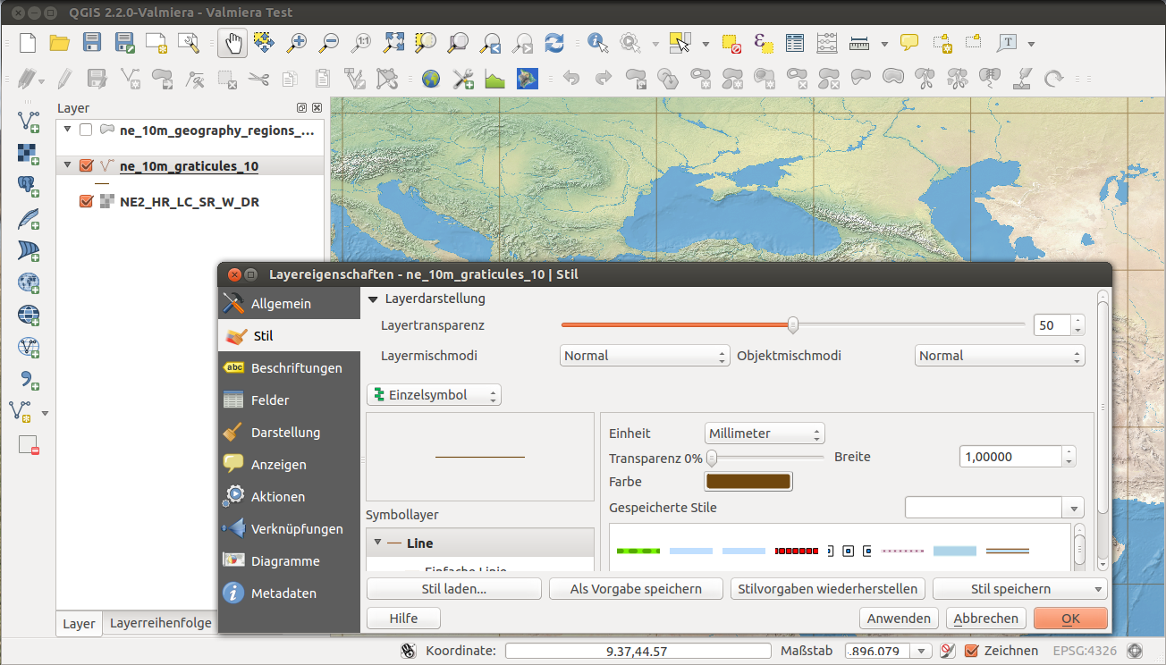
Ease of use: Medium to hard, depending on your needs
Use for: Editing & analyzing maps, building up more complex maps, or editing the data in maps, as well as many other functions.
If you’re ready for some serious mapping then QGIS is the tool for you. QGIS (formerly known as Quantum GIS) is open source software and has, over the past couple of years, become the go-to tool for anyone looking to dive deeper into mapping without needing to spend money on proprietary software. QGIS has a lot more features than most of the other tools in this list. As a result, the learning curve for QGIS is pretty steep if this is your first stab at serious mapping, but there are many great guides available, including QGIS’s own documentation. QGIS can be used to analyze and edit almost all forms of map and spatial data and supports vector and raster layers. For beginners, QGIS might be most useful for editing maps and the associated data. It’s also useful for pulling out specific features from more complex maps into secondary maps. More advanced users will enjoy the options for doing highly detailed map editing and being able to build up new maps from multiple sources. If you’re serious about mapping, take some time to learn QGIS.
Pros: Powerful and professional-level mapping tools.
Cons: A little daunting getting started if you’re unfamiliar with the language of maps.
9. Other Options
There is an ever-increasing selection of mapping tools available, which makes it difficult to select just a few, so number 9 on this list is a collection of other tools that could come in handy when making maps.
MapStack is an easy-to-use tool from Stamen that makes beautiful map styles and images that work well as illustrations. Color Brewer is the go-to tool for finding the right color scheme for your map. Both Flourish and DataWrapper have good built-in mapping tools. Most online tools don’t have detailed low-level map data built in, but most will allow you to add your own data. CartoDB is always a good tool for mapping, though most of its best features now require a subscription, which may make it inaccessible for many.
If you’re looking to get a bit deeper into designing maps with something like Leaflet, then it’s worth checking out the base map styles and examples at Leaflet Provider Demo and the Leaflet Plugins directory.
Most of Google’s map visualization tools have now converged in Google Earth Pro, which is free and extremely powerful. Making a flyover map in which you animate the map to visit a list of different sites is now pretty simple in Google Earth Pro.
Conclusion
This is far from a comprehensive list of mapping tools, but it is hopefully a useful starting place for anyone getting into mapping.
This story was first published on Medium and is reposted here with permission of the author. It is an update to a 2017 post on the same topic.
Additional Resources
Mapping Migration Deaths with GIS Modeling
Powering Up Geo-Journalism for Investigative Environmental Reporting
Mapping Tools and Tipsheets for Journalists
 Alastair Otter works with GIJN on IT and data journalism. He is also a managing partner of Media Hack Collective, a data journalism initiative based in Johannesburg, where he programs interactive data visualizations and manages a number of online media sites.

Investigating Latin America’s Global Reach Of Illicit Activities

The Investigative Agenda for Climate Change Journalism

GIJC23 – Measuring Impact
GIJC23 – What Does AI Have to Do with Investigative Journalism? Everything!

Journalism in the Crucible: Seven Key Takeaways from 2025 Harry Evans Truth Tellers Summit

Editor’s Pick: Top 10 Data Journalism Projects of 2024

‘Shining a Light Where There Are Shadows’: Latin American Outlets Innovating With Data

Why Investigative Journalists Should Report on Lax Oversight and Fraud in Research Data

This work is licensed under a Creative Commons Attribution-NoDerivatives 4.0 International License
Republish our articles for free, online or in print, under a Creative Commons license.
Republish this article
This work is licensed under a Creative Commons Attribution-NoDerivatives 4.0 International License
Read Next
News & Analysis
Journalism in the Crucible: Seven Key Takeaways from 2025 Harry Evans Truth Tellers Summit
In London, leading reporters and editors met to discuss the challenges reporters face today, from legal threats to security risks to a combative new president in the White House.
Data Journalism Top 10 Editor's Picks News & Analysis
Editor’s Pick: Top 10 Data Journalism Projects of 2024
Highlights from a year of data journalism columns, from elections to the Olympics and the evolution of the love song.
Data Journalism LATAM Focus News & Analysis
‘Shining a Light Where There Are Shadows’: Latin American Outlets Innovating With Data
Data journalism is helping outlets across the region carry out innovative projects that reveal the stories hidden in large volumes of data.
News & Analysis
Why Investigative Journalists Should Report on Lax Oversight and Fraud in Research Data
Uri Simonsohn, a behavioral scientist who coauthors the Data Colada blog, urges reporters to ask researchers about preregistration and expose opportunities for academic fraud.