Image: Screenshot, Atlas of the Invisible
Why Dynamic Data Visualization Is Key to Covering Climate Change
Read this article in

Step-By-Step Guide for Journalists on the Basics of Google Sheets

Tipsheet for Using Ocean Data in Your Investigations

No Coding Required: A Step-by-Step Guide to Scraping Websites With Data Miner

GIJC23 – The Future of Data Journalism: New Analytical Tools, Data Visualization, and AI
Like many people, the first graph I ever saw explaining climate change was in a school geography textbook. It showed the “hockey stick” curve of the Earth’s surface temperature over time, which has become one of the world’s most recognizable line graphs.
Despite relatively minor fluctuations, the line on the graph depicting global surface temperature remains almost horizontal across centuries, before suddenly inclining to an almost vertical trajectory over the past 50 years. Since 1970 the rate of global temperature increase has hit an unprecedented 1.7 degrees Celsius (about 3 degrees Fahrenheit) per century.
One challenge of understanding the information contained in this hockey stick graph — and this is a gift to climate-change deniers — is the inclusion of the gray fuzz of “uncertainty data”: outlying data points that can be cherry-picked to raise doubts about the mass of evidence supporting a general warming trend.
Global Surface Warming: the Hockey Stick

Changes in global surface temperatures reconstructed for the past 2,000 years (left), with a focus (right) on observed changes since 1850, overlaid with simulations for natural factors and human-and-natural factors. Graphic: IPCC report 2021
Uncertainty is a complex thing to communicate in a single chart. In 2018, the UK-based climate scientist Ed Hawkins chose to omit it altogether when he presented his “warming stripes” graphic to help clearly visualize key trends in climate data. Hawkins explained that the warming stripes were designed to remove all superfluous information, leaving behind only the undeniable scientific evidence of a steadily warming world.
Climate Change in Warming Stripes

A series of stripes, shifting from blue on the left to red on the right, represents warming global temperatures over time. Image: Wikimedia
If getting to grips with all the data and complexity in the hockey stick required a long read, Hawkins’ climate stripes give us the headline. The stripes are now a global phenomenon, having appeared on the lapels of US senators, the ties of TV weather presenters, and the front cover of The Economist.
As calls for change grow louder in light of the latest IPCC (Intergovernmental Panel on Climate Change) report, and in the run-up to the COP26 conference in Glasgow, UK, this November, it’s time to focus on how data visualization can help people grasp the challenges that lie ahead.
The Power of Maps
One misconception about the climate crisis is that warming will be uniform across the world. Deniers cite cold fronts or blizzards as evidence that warming is exaggerated, or hark back to past heatwaves — such as that experienced by the UK in 1976 when temperatures exceeded 35 degrees C — as proof that the scientists have got it wrong.
Apart from this misleading conflation of weather (daily conditions) and climate (long-term conditions,) this kind of argument misses the complex patchwork of effects that interact to create what gets reported in the headline figures.
Maps can be an invaluable weapon against this misunderstanding. For the first time, the IPCC has released an “interactive atlas” with its latest report, allowing audiences to pan and zoom through the data itself. But if you give the IPCC’s atlas a try, you can see how it’s hard to capture complexity for a specialist audience while retaining simplicity for a global audience.
Most users are unlikely to closely engage with towering datasets named “CMIP5” or “APHRODITE,” or with the mass of code that constitutes the IPCC-WG1 repository on Github. Although it’s a step in the right direction, what is needed are more universally accessible visualizations that are able to show where we’re heading in no uncertain terms.
With that in mind, when I set out to map global warming for a new book entitled “Atlas of the Invisible,” my co-author Oliver Uberti and I chose to combine the most important lessons from the warming stripes with the intricacies of geographical context.
This intriguingly named “Peirce quincuncial” projection, which you can see below, is a type of 2D map that flattens the Earth into a grid of 130 mini maps called tiles. Like all projections, it’s not a perfect representation of the 3D Earth, since some areas are stretched more than others. But it lets us create a series of tiles representing the planet in each year from 1890 to 2019, colored by how and where temperatures deviated from a reliable baseline measured between 1961 and 1990. Blue areas represent temperature anomalies between -2 degrees C and 0 degrees C, while red areas represent anomalies between 0 and 3 degrees C and gray represents insufficient data.
Heat Gradient Tile Maps

“Peirce quincuncial” maps detailing climate change from 1890 to 2019. Image: Courtesy of James Cheshire, “Atlas of the Invisible”
Reading the images from left to right (below) reveals that while heatwaves and cold spells speckle the grid, tiles representing the current century are increasingly filled with warm tones. For example, compare the few pink splotches in 1976 when the UK experienced its famous heatwave to years later in 2006 and 2016, when ruddy hues spanned the globe. In fact, the ten hottest years on record have occurred since 2005.
Heat Gradient Map: Specific Years

A visualization of increasing global temperatures from 1976 to 2016. Source: MET Office Hadley Centre HadCRUT 4.6. Image: Courtesy of James Cheshire, “Atlas of the Invisible”
Time to Think Local
When mitigation targets aim to keep the overall global temperature increase at an average of below 1.5 or 2 degrees C, we need data visualizations to remind us that there can still be large local variations even when such targets are achieved — with the warming creating drastic and often devastating conditions for those living in affected areas.
Generalized warming will inevitably affect some places far worse than others, causing knock-on effects like sea-level rises and storms in different areas. For proof, look to the 2021 summer heatwave experienced by many parts of Europe yet escaped by the UK, or the “heat dome” that scorched British Columbia in June, or the Arctic, where temperatures are rising at twice the global rate.
Even within cities, conditions can vary from neighborhood to neighborhood. Across the US, global warming is compounding the legacy of racist housing policies enacted through a process known as redlining. This rated the “investment risk” of urban areas, condemning many black neighborhoods to a “hazardous” rating and thus to reduced infrastructure and increased poverty.
As The New York Times has expertly mapped, such areas saw a lack of investment in — among other things — green spaces and street trees. This has resulted in some historically redlined neighborhoods suffering summers that are up to 7 degrees C warmer compared to their non-redlined counterparts.
Maps reveal these social injustices in the UK, too. Local authorities are under pressure to turn a blind eye to flood risk maps in order to permit thousands of “affordable” homes to be built for those priced out of higher ground.
The power of maps lies in their ability to show us simultaneously that as global average temperatures rise, local conditions threaten to become ever more extreme. We now need to better harness that power to inspire action.![]()
This article was written by James Cheshire and was originally published by The Conversation. It is republished here through a Creative Commons license.
Additional Resources
New Data Tools and Tips for Investigating Climate Change
Investigating Climate Change: A New GIJN Guide
Think You Know Your Data Visualization? Take GIJN’s Quiz to Find Out
Feast Your Eyes on 15 Stunning DataViz Examples
 James Cheshire is Professor of Geographic Information and Cartography in the University College, London Department of Geography and Director of the UCL Q-Step Centre. He is the recipient of a number of major awards from the Royal Geographical Society, the North American Cartographic Information Society, and British Cartographic Society. He was President of the Society of Cartographers between 2017 and 2019.
Step-By-Step Guide for Journalists on the Basics of Google Sheets
Tipsheet for Using Ocean Data in Your Investigations
No Coding Required: A Step-by-Step Guide to Scraping Websites With Data Miner
GIJC23 – The Future of Data Journalism: New Analytical Tools, Data Visualization, and AI

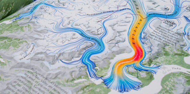
Turning the Threat to a Distant Glacier into a Local Story Through Data Visualization

One Name at a Time: How Die Zeit Built a Searchable Database of Nazi Party Members

Making Trillions Make Sense: How Reuters Visualized the AI Economy

How the Hindu Is Embedding AI Into Its Data Journalism

This work is licensed under a Creative Commons Attribution-NoDerivatives 4.0 International License
Republish our articles for free, online or in print, under a Creative Commons license.
Republish this article
This work is licensed under a Creative Commons Attribution-NoDerivatives 4.0 International License
Read Next
Climate Data Journalism
Turning the Threat to a Distant Glacier into a Local Story Through Data Visualization
New York Times climate and environmental graphics reporter Mira Rojanasakul discusses how her team visualized the sea level rise threat from the melting Thwaites Glacier in Antarctica.
Data Journalism
One Name at a Time: How Die Zeit Built a Searchable Database of Nazi Party Members
An online tool set up by the German newspaper Die Zeit, in cooperation with archives in Germany and in the United States, allows people to search several million Nazi Party membership cards.
Data Journalism
Making Trillions Make Sense: How Reuters Visualized the AI Economy
How do you make a trillion dollars feel real to someone who has never seen that much money? Vineet Khare and Mayank Bhatt faced that very challenge for their data-driven investigation into AI investment.
Data Journalism
How the Hindu Is Embedding AI Into Its Data Journalism
LLMs are quietly reshaping data journalism workflows at The Hindu, helping reporters process vast document sets, write scripts and build interactive tools.