
Data Journalism Top 10: Beauty Biz Bias, Suez Blockage, Facebook Fail, Migrants at the Border, Europe’s Theaters
Read this article in
For nearly a week, a giant container ship stranded in the Suez Canal blocked one of the busiest trade routes in the world, drawing global press attention. The Ever Given, a Rotterdam-bound vessel, was finally freed from the shoreline on Monday. The drama turned up, not surprisingly, in our NodeXL #ddj mapping from March 22 to 28, which tracks the most popular data journalism stories on Twitter. Of special note: this visual piece by the Reuters Graphics team on the incident’s striking impact on global trade. In this edition, we also feature an examination of bias in the beauty industry by The Pudding, a look at how the pandemic has changed society by Al Jazeera, and a guide to drawing data visualizations by DataJournalism.com.
Beauty Business Bias
For years, critics have chastised the beauty industry for its lack of diversity and for excluding women of color. The Pudding found a creative approach to studying the underlying biases in the business. Its team examined 130 products on the cosmetic websites Sephora and Ulta that use a sequential number system to label its shade, and found that the system largely prioritizes lighter shades.
Suez Blockage
Last week, the Ever Given, a quarter-mile-long container ship, got stuck in the Suez Canal after running aground. It took six days to free the vessel and reopen the waterway connecting the Mediterranean and the Red Sea. The scale of the disruption on one of the world’s busiest waterways is difficult to put into words, but this visual story from Reuters Graphics does it well, showing what happened and why the Suez Canal is so important to world trade.
How the Pandemic Changed the World
From mental health and air travel to education and global poverty, the coronavirus pandemic has affected almost every aspect of life over the past year. Al Jazeera created a series of infographics to give an overview of how our world has been transformed. Among the graphs: details on the number of days spent in lockdown around the world, how the rich have grown richer, and how job losses have hit young people the hardest.
Misinformation on Facebook
In February, Facebook announced a ban on false statements about COVID-19 and vaccines, promising that such posts would be deleted from its platform. First Draft‘s team checked whether any of the false claims specified in the announcement were still circulating online and, if so, how many users saw them. The investigation found at least 3,200 posts, attracting 142,049 likes, shares, and comments. In this article, Lydia Morrish and Carlotta Dotto explain their methodology and discuss some of the ethical and technical challenges they faced.
Mapping Europe’s Theaters
It’s probably been a while since you last saw a play at the theater. Here’s a cool project from data analyst Milos Popovic to get you excited about your next opportunity to see a live play. In celebration of World Theater Day, Popovic mapped all European theaters — from Norway’s coastline venues to southern Italy’s city center auditoriums.
European Gigabit Society
The pandemic has underscored the importance of a solid internet connection. For the European Union, achieving this will be a priority throughout the next decade. But developing high capacity infrastructure in all 27 member states has proven to be a major challenge. An analysis by Osservatorio Balcani Caucaso Transeuropa, a think tank based in Italy, shows significant disparities between individual nations as well as between urban and rural areas.
Migration in the Americas
The US has seen an increase in crossings at its southern border with Mexico, prompting speculation that the policies of President Joe Biden’s administration have caused the rise. But this analysis by The Washington Post found evidence that the seasonal increase follows a predictable pattern, which has coincided with a backlog of demand of people who couldn’t previously enter the US because of 2020’s coronavirus-related border closure.
Drawing Data
Photoshop, Illustrator, Python, Tableau — there are numerous tools and platforms used by graphic designers to create data visualizations. But the software can be both expensive and difficult to master. The good news is you don’t always need it to create complex charts. You can just draw them, much like visualization pioneers W. E. B. Du Bois and Florence Nightingale did in the 19th century. DataJournalism.com’s Amelia McNamara shows how with this colorful guide.
Measuring Rainfall
Self-isolation has helped us learn new things during the COVID-19 pandemic. Some people tried cooking for the first time. Others created fascinating artwork. And in the UK, thousands of volunteers dedicated themselves to an unlikely activity — digitizing the nation’s old rainfall records. More than 16,000 people joined the Rainfall Rescue project to transcribe 65,000 pages of data. In a Twitter thread, project leader Professor Ed Hawkins said that by making the numbers computer-friendly, the initiative has enabled researchers to examine rainfall in great detail to better understand flood and drought risks.
New Data Journalism Handbook
Ready to dive into the world of data journalism? A great way to get started is with “The Data Journalism Handbook: Towards a Critical Data Practice,” published last week and edited by Liliana Bounegru and Jonathan Gray. The handbook, which is free to download as an eBook, includes more than 50 chapters written by leading researchers and practitioners who examine data sets, data infrastructure, and data stories around the world. Don’t miss our own modest contribution: a chapter on the #ddj hashtag and this very column, by GIJN’s Eunice Au and sociologist Marc Smith.
Thanks again to Marc Smith and Harald Meier of Connected Action for gathering the links and graphing them. The Top Ten #ddj list is curated weekly.
 Peter Georgiev is GIJN’s social media and engagement editor. Previously, he was part of NBC News’ investigative unit in New York. He also worked as a correspondent for Bulgarian National Television and his reporting has been published by the Guardian, Deutsche Welle, and other international outlets.
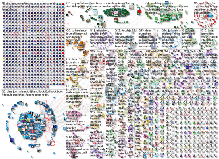
For a look at NodeXL’s mapping on #ddj and data journalism on Twitter, check out this map.

Document of the Day: Visual Vocabulary

GIJN Guide to Investigating Foreign Lobbying

Guide to Investigating Caste

Gathering Evidence and Documents in Conflict and War Zones — A MENA Case Study

Data Journalism Top 10: Wagner’s Corporate Network, Barbie’s Career History, and Spain’s Election Results
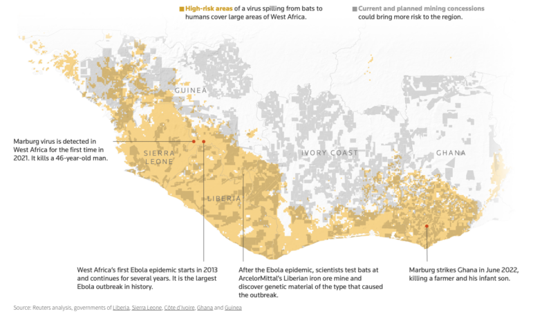
Data Journalism Top 10: Bats and the Next Pandemic, China’s Electric Battery Dominance, and Brazil’s Healthcare ‘Holes’
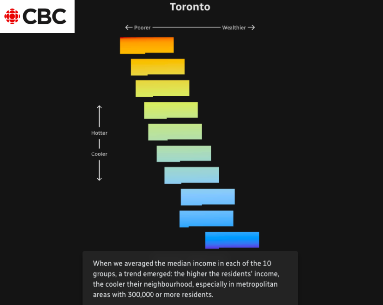
Data Journalism Top 10: Sweltering Cities, Digital Inequity, Climate & Sleep, COVID & Schools
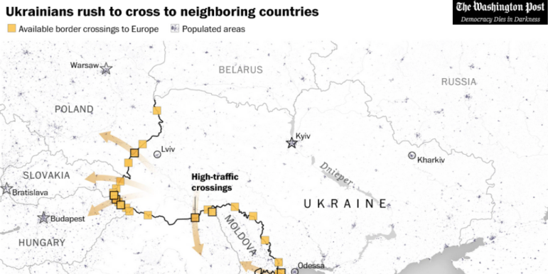
Data Journalism Top 10: Tracking Russia’s War, Ukraine’s Refugees, COVID-19 Polarization, Clothing Waste, Banh Mi

This work is licensed under a Creative Commons Attribution-NoDerivatives 4.0 International License
Republish our articles for free, online or in print, under a Creative Commons license.
Republish this article
This work is licensed under a Creative Commons Attribution-NoDerivatives 4.0 International License
Read Next
Data Journalism Data Journalism Top 10
Data Journalism Top 10: Wagner’s Corporate Network, Barbie’s Career History, and Spain’s Election Results
GIJN’s weekly round-up of the Top 10 in Data Journalism looks at the Wagner Group’s vast corporate network in Russia, the many careers of Barbie, and Spain’s surprising election results.
Data Journalism Data Journalism Top 10
Data Journalism Top 10: Bats and the Next Pandemic, China’s Electric Battery Dominance, and Brazil’s Healthcare ‘Holes’
GIJN’s weekly, curated look at the Top 10 in Data Journalism highlights bats and predicting the location of the next pandemic, China’s electric battery dominance, and mapping out Brazil’s healthcare “holes.”
Data Journalism
Data Journalism Top 10: Sweltering Cities, Digital Inequity, Climate & Sleep, COVID & Schools
As parts of the world endure record-breaking temperatures, a highlight from the world of data journalism this week involves an analysis of how “heat islands” in Canadian cities vary based on economic strata. Our weekly Top Ten in Data Journalism also looks at the global spread of Pegasus spyware, digital inequity in the US, and how the COVID-19 pandemic affects school children in Latin America.
Data Journalism
Data Journalism Top 10: Tracking Russia’s War, Ukraine’s Refugees, COVID-19 Polarization, Clothing Waste, Banh Mi
Our weekly round-up of the most popular data journalism stories on Twitter features an item from The Washington Post on refugees crossing Ukraine’s borders, an examination of vaccine hesitancy in the US, a look at how the coronavirus pandemic has changed life in the UK, and mapping the price of the Vietnamese staple of bánh mì in Australia.