
Data Journalism Top 10: Scented Candles, COVID Risk Simulator, Trump’s Final Regs, Sigma Awards
Read this article in
Are scented candles a casualty of the coronavirus crisis? Our NodeXL #ddj mapping from November 23 to 29 found researcher Kate Petrova’s data analysis revealing that scented candles have suffered a blow in online reviews and a decrease in ratings, possibly linked to the coronavirus’ ability to affect people’s sense of smell. Elsewhere, Germany’s Zeit Online created a COVID-19 infection risk calculator, the COVID Tracking Project explained how holidays and weekends disrupt the recording and publishing of virus data, and Reuters analyzed the shortcomings of the coronavirus contact tracing system in England. Meanwhile, the Sigma Awards, which celebrate the world’s best data journalism, have opened for entries.
COVID-19 Infection Risk Simulator
What is the risk of being infected with COVID-19 if you share a space with an infected person at home, in the classroom, or in a restaurant? Inspired by a piece in Spanish newspaper El País, Zeit Online designed an interactive risk calculator based on a model developed by the Max Planck Institute for Chemistry. Users can adjust the conditions, with variables for the amount of time spent in same room, room size, number of people, wearing of masks, ventilation, height, speaking time, and volume, to see the probability of being infected via aerosol transmission. The story is available in German and English.
Tracking Trump’s Last Minute Regulations
With the inauguration of US President-elect Joe Biden set for January 20, time is running out for the Trump administration. As Trump loyalists try to push through dozens of policy changes before the handover, ProPublica is tracking the most controversial of these “midnight regulations.” Among those already finalized: allowing federal death row inmates to be executed by means other than lethal injection (such as shooting squads and gas), ending Medicare drug rebates, and restricting immigrant work visas by raising minimum wage requirements for some visa holders.
Scented Candles and COVID-19
Scientific illustrator Terri Nelson wondered if online reviews of fragranced products would be affected by the coronavirus’ ability to rob people of their sense of smell. Her finding: There were many angry reviews complaining that the scented candles they had bought had no smell. Nelson jokingly tweeted her observations and associated the negative reviews with COVID-19, which led curious researcher Kate Petrova to investigate the hypothesis. Petrova scraped about 20,000 reviews of the most popular scented and unscented candles and found that the ratings for scented candles have indeed fallen during the pandemic. The Washington Post published a piece on her data analysis. And here’s another take on perfume reviews by PhD student Moritz Wagner.
Sigma Awards Open for Entries
The Sigma Awards celebrate the best in data journalism around the world. Established last year in the wake of the now-discontinued Data Journalism Awards, the second edition of the Sigma Awards is open for entries until February 1. There’s a $5,000 cash prize to be split among the winners.
Holiday Disruption and COVID-19 Data
Holidays and weekends can result in a backlog of testing and reporting of COVID-19 infections, which causes the numbers to decrease and then, a few days later, to “catch up.” To determine how holidays, such as Thanksgiving, could potentially affect COVID-19 data, Erin Kissane, co-founder of the The Atlantic’s COVID Tracking Project, wrote an explainer based on US data from previous weekends and holidays.
https://twitter.com/tracyvwilson/status/1333145538427047936
Flaws in a COVID-19 Tracing System
England entered another lockdown on November 5 due to rising COVID-19 infections. According to a Reuters story, “With more than 12,000 additional deaths by Nov. 19 in the second wave, Britain is recording nearly four times more deaths per capita than Germany, though not as many as Spain or France.” Reuters analyzed the efficacy of the nation’s test and contact tracing system and discovered shortcomings and indications that lessons from the first wave were not learned.
Considering Rules for Data Visualization
At the Graphic Hunters online conference last month, Datawrapper designer and blogger Lisa Charlotte Rost gave a talk about the rules of data visualization, why some of the rules seem to contradict each other, and when to break them to design better visualizations.
Trump’s Empty Schedule
Aside from pushing through last-minute rules (see above), what has outgoing US President Donald Trump been doing since he lost the November election? According to research by The New York Times, he has attacked the legitimacy of the election more than 400 times since Election Day and went golfing at least six times. His public calendar seems particularly empty, with official activities recorded on the president’s calendar for only eight days between November 4 and 23.
https://twitter.com/eroston/status/1331241569798729729
Tips for Talking about Data in Audio Stories
“I spend a lot of time stripping scripts of details that reporters have put in…” explained economist and journalist Tim Harford, author of How to Make the World Add Up. “We can’t give people all the numbers; we can’t tell all the stories — so what’s interesting here?” Harford shared tips on creating compelling data-driven stories for radio and podcasts.
The Latino Vote: Not a Monolith
The strong Latino vote for Donald Trump in parts of Florida and Texas surprised pollsters, going against an assumption that Latinos would turn out for his Democratic opponent, Joe Biden. Bloomberg examined the vote precinct-by-precinct in three key US counties to analyze the shift in the Latino vote and identify possible factors behind the trend.
Thanks again to Marc Smith and Harald Meier of Connected Action for gathering the links and graphing them. The Top Ten #ddj list is curated weekly.
 Eunice Au is GIJN’s program manager. Previously, she was a Malaysia correspondent for Singapore’s The Straits Times, and a journalist at the New Straits Times. She has also written for The Sun, Malaysian Today, and Madam Chair.
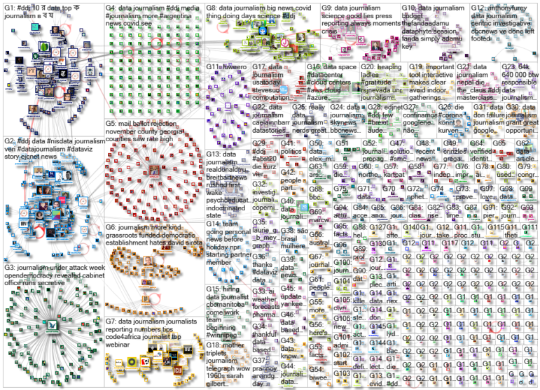
For a look at NodeXL’s mapping on #ddj and data journalism on Twitter, check out this map.

Basic Data Journalism Tips for Editors

My Favorite Tools: Venezuela’s Lisseth Boon on Design and Data Visualization

Document of the Day: Visual Vocabulary

GIJN Guide to Investigating Foreign Lobbying

From Data to Storytelling: Concept and Design Tips from the Financial Times’ John Burn-Murdoch
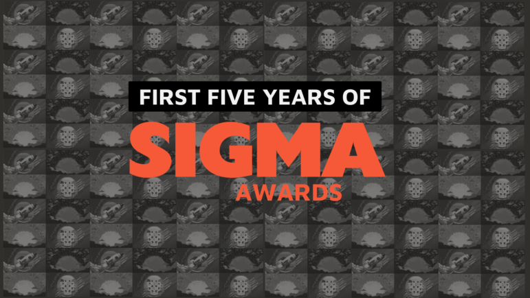
Looking Back on Five Years: How the Sigma Awards Have Rallied and Inspired Data Journalism Excellence

From Flammable Buildings to Slavery’s Hidden Legacy to Tainted Groundwater: Projects from 10 Countries Win GIJN’s 2025 Sigma Awards

Announcing the Sigma Awards 2025 Shortlist

This work is licensed under a Creative Commons Attribution-NoDerivatives 4.0 International License
Republish our articles for free, online or in print, under a Creative Commons license.
Republish this article
This work is licensed under a Creative Commons Attribution-NoDerivatives 4.0 International License
Read Next
Data Journalism
From Data to Storytelling: Concept and Design Tips from the Financial Times’ John Burn-Murdoch
The chief data reporter for the Financial Times discusses how he considers the use of text, color, and annotation to aid visual storytelling through charts and graphics.
Data Journalism
Looking Back on Five Years: How the Sigma Awards Have Rallied and Inspired Data Journalism Excellence
After five years and 2,875 project entries from more than 100 countries, the Sigma Awards have become a catalyst for innovation and forever changed the face of data journalism.
Awards, Grants, & Fellowships Data Journalism
From Flammable Buildings to Slavery’s Hidden Legacy to Tainted Groundwater: Projects from 10 Countries Win GIJN’s 2025 Sigma Awards
Ten outstanding data-driven journalism projects, from as many countries, were chosen by a diverse Prize Committee of 17 judges from 498 entries from 80 countries.
Awards, Grants, & Fellowships Data Journalism
Announcing the Sigma Awards 2025 Shortlist
GIJN, the new home of the Sigma Awards, is proud to announce the 2025 shortlist for the best data journalism projects and portfolios in the past year.