Data Journalism Top 10: Mapping the Pandemic, Shrinking Japan, Data Recipes, Extreme Temps, Google Election Searches, FinCEN Files
How fast is the coronavirus spreading in countries around the world? Our NodeXL #ddj mapping from September 14 to 20 finds data visualization designer Jan Willem Tulp simulating the speed of COVID-19 infections and German television news program ZDF heute mapping how the pandemic traversed the globe. Meanwhile, Thibi Recipes explores tutoring data journalism as if you’re following a cooking recipe, the Financial Times reports on climate extremes, and ICIJ and Buzzfeed bare suspect financial data.
How Fast COVID-19 Spreads
Want to get a glimpse of how fast the coronavirus is spreading by country around the world? Data viz designer Jan Willem Tulp created a cool (albeit scary) simulation project to show the speed of COVID-19 infections, both visually and through sound. The ticker-timer visualizations for the top three most affected countries — United States, India, and Brazil — are especially alarming.
Japan’s Shrinking Population
The Financial Times took a look at Japan following the resignation of Premier Shinzo Abe, assessing the challenges facing his successor, Yoshihide Suga. One graphic from the story, produced by Chris Campbell, was particularly striking. It shows how Japan’s population has shrunk since the 1950s and how drastically the numbers are projected to ebb in the next eight decades.
Data Journalism Recipe
Inspired by the ubiquity of step-by-step cooking recipes, Thibi Recipes, a data and design consultancy based in Southeast Asia, wants to break down the process of data journalism in the same manner. Its first “data journalism recipe” walks journalists through the process of building a so-called scrollytelling map — that shows animated changes over time — using Google Sheets, Tableau, and Webflow.
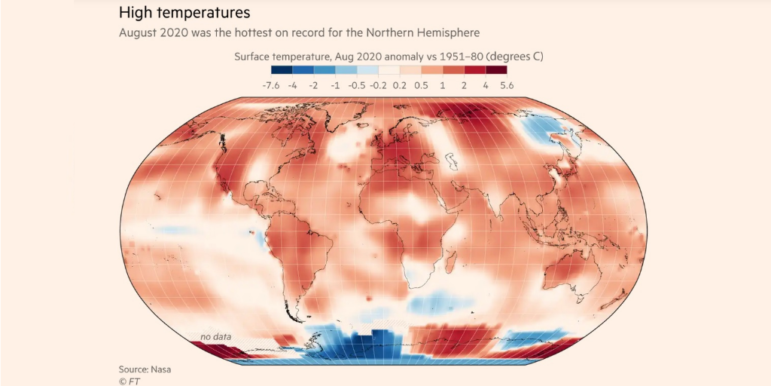
Extreme Temps
“Where we really see the clearest and biggest sign of climate change is in extreme temperatures,” Friederike Otto, head of the Environmental Change Institute at the University of Oxford, told the Financial Times. The newspaper visualized anomalies in surface temperatures compared to historical temperatures across the globe, and the results showed that most of the world is warming up.
FinCEN Files
Take 110 media partners in 88 countries, led by the International Consortium of Investigative Journalists and BuzzFeed News. Throw in thousands of leaked US financial intelligence reports, and then mix for 16 months. What do you get? The latest big data leak-infused financial scandal, showing how banks and regulators allowed dirty money to flow unchecked around the globe despite evident red flags. Explore the FinCEN Files data and some of the notorious names linked to the reports, including Paul Manafort and embattled Brazilian firm Odebrecht.
Google Search Trends in US Election
Curious what Americans are asking Google’s search engine ahead of the November elections? You can explore their search interests on Google Trends, with filters by state, key political issues, and political party.
Pop-Up Cycle Paths in Berlin
A court in Berlin this month ordered the city’s authorities to remove eight pop-up bicycle paths that had been introduced during the coronavirus pandemic. The reason? The roads were not dangerous enough for cyclists to even warrant creating bicycle lanes in the first place. However, German newspaper Der Tagesspiegel pointed out that data from its earlier survey showed that the routes in question were not particularly safe. (In German.)
Hate Crimes Debate
Paul Krugman, the American economist, journalist and Nobel laureate, tweeted earlier this month that in the aftermath of the September 11, 2001, terrorist attacks in the US, “there wasn’t a mass outbreak of anti-Muslim sentiment and violence.” His comment sparked an outrage, and he attempted to explain his tweet by showing that hate crimes against Blacks far outnumbered hate crimes against Muslims, using data from the Federal Bureau of Investigation (FBI). But data journalists were quick to point out that Krugman’s interpretation of the data was skewed, as it failed to factor in the huge difference in the size of the Black and Muslim populations.
Exploring El Salvador’s Conflict
From 1980 to 1992, El Salvador was embroiled in a civil war that ravaged the country and claimed the lives of tens of thousands of people. Morning newspaper El Diario de Hoy compiled a database and created a digital memorial honoring the victims of the conflict. Explore the database by each massacre event or by victim. (In Spanish.)
Mapping COVID-19 Across Continents
German television news program ZDF heute mapped how the coronavirus pandemic has traversed the globe over the past eight months. The graphics show how the global health crisis first flared up in Asia, then moved to Europe, onwards to North America, and later to South America, before returning back to Europe. (In German.)
Thanks again to Marc Smith and Harald Meier of Connected Action for gathering the links and graphing them. The Top Ten #ddj list is curated weekly.
 Eunice Au is GIJN’s program manager. Previously, she was a Malaysia correspondent for Singapore’s The Straits Times, and a journalist at the New Straits Times. She has also written for The Sun, Malaysian Today, and Madam Chair.
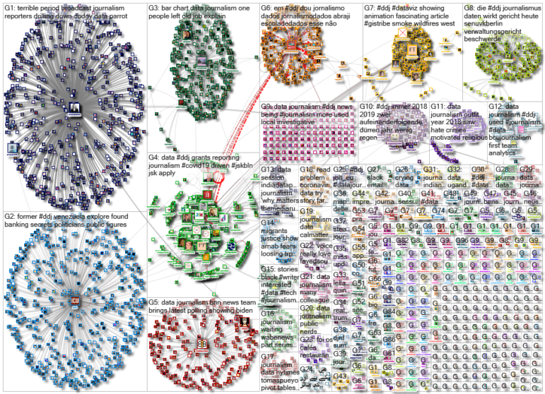
For a look at NodeXL’s mapping on #ddj and data journalism on Twitter, check out this map.

Guide to Mapping Analysis Using QGIS

My Favorite Tools: Venezuela’s Lisseth Boon on Design and Data Visualization

Three “Musts” for Today’s Investigative Journalist

Tipsheet on Partnering with Civil Society Organizations and Non-Governmental Organizations

Turning the Threat to a Distant Glacier into a Local Story Through Data Visualization

How The Pudding Used Data Visualizations to Recontextualize the Story of Climate Change

How Data Journalism Is Changing the Face of Africa

Using Data Sources to Track Harmful Climate Crisis-Fueled Algal Blooms

This work is licensed under a Creative Commons Attribution-NoDerivatives 4.0 International License
Republish our articles for free, online or in print, under a Creative Commons license.
Republish this article
This work is licensed under a Creative Commons Attribution-NoDerivatives 4.0 International License
Read Next
Climate Data Journalism
Turning the Threat to a Distant Glacier into a Local Story Through Data Visualization
New York Times climate and environmental graphics reporter Mira Rojanasakul discusses how her team visualized the sea level rise threat from the melting Thwaites Glacier in Antarctica.
Climate Data Journalism
How The Pudding Used Data Visualizations to Recontextualize the Story of Climate Change
What does climate change feel like? How will your city’s climate shift, 50 years from now? Data scientist Derek Taylor explains his latest piece.
Africa Focus Data Journalism
How Data Journalism Is Changing the Face of Africa
Data journalism in Africa has made a powerful impact, from holding leaders accountable to refuting myths around domestic violence. But the field faces formidable challenges.
Data Journalism Reporting Tools & Tips
Using Data Sources to Track Harmful Climate Crisis-Fueled Algal Blooms
For the SEJ’s Reporter’s Toolbox: datasets and sources useful for tracking the harmful impact of climate change-fueled algal blooms.