
GIJN’s Data Journalism Top 10: 3D Animation, Brexit Borders, Bad Research, NY Subway
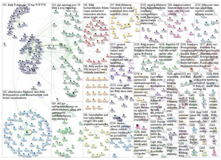
What’s the global data journalism community tweeting about this week? Our NodeXL #ddj mapping from September 2 to 8 finds Folha de S.Paulo’s beautiful 3D animation of the Brazil National Museum’s restoration efforts, the Guardian’s real-time visualization of Irish border crossings, NZZ’s look at China’s bad research impacting scientists worldwide, and The New York Times calculating the variability of New York City’s subway commute times.
Explaining Fire Damage and Restoration with 3D
In September 2018, Brazil’s National Museum and its massive collection of artifacts were destroyed in a huge blaze. One year on, Folha de S.Paulo built a 3D animation to show the fire damage and explain restoration efforts. The 3D project was inspired by The New York Times’ visual explainer of the Notre Dame fire.
Real-Time: Irish Border Movement
There are 72 million road vehicle crossings a year between Northern Ireland and the Republic of Ireland, according to the Northern Ireland Statistics and Research Agency (Nisra). The Guardian created a map showing the amount of border crossings in real time over an hour on an ordinary Monday, to give a tangible sense of how Brexit might impact the daily lives of those needing to cross the border regularly.
China’s Bad Research
Using data from Retraction Watch, NZZ dug into a collection of 3,309 studies that have been withdrawn in the past ten years for problematic reasons. At least 783 of those originated from China. NZZ’s analysis shows that researchers in China are often responsible for studies with questionable methods, and this piece also explains the consequences for scientists worldwide. (In German.)
The Unreliability of New York’s Subway
The New York Times created a detailed interactive visualization gauging the variability of New York City’s subway commute times. Their analysis, based on 12.6 million trip records from the Metropolitan Transportation Authority, reveals a wide and often frustrating variability in morning subway commutes. More often than not, commuters need to allocate a significant buffer time to avoid being late.
Improving Readers’ “Graphicacy”
Last month, data visualization expert Alberto Cairo wrote an op-ed on how and why people misinterpret hurricane maps in The New York Times. In a follow-up post, he addresses some of the reactions that questioned why designers didn’t just make better maps — pointing out that readers and designers have a responsibility to make an effort on both sides.
https://twitter.com/AlbertoCairo/status/1168501458121236482
Mary Spears’ DataViz Wisdom
Software developer Xan Gregg discovered a decades-old data visualization book called “Practical Charting Techniques,” written by Mary Eleanor Spear, a pioneer in graphic visual information. He gathered some of her nuggets of wisdom in this Twitter thread.
Tamil Text Analysis Tool
Working with Tamil text? Abdul Majed Raja RS posted a short tutorial on using udpipe, an R package that is capable of analyzing Tamil text.
Day of Russian Cinema
To commemorate the Day of Russian Cinema on August 27, РИА Новости took a look at how Russia’s cinema has changed since the collapse of the USSR. By analyzing the database of popular Russian movie site kinopoisk.ru, it identified the most popular genres, directors, and actors. (In Russian.)
Visualizing Data Uncertainty
Representing unknowns and visualizing uncertainty is hard. Jessica Hullman, assistant professor of computer science and journalism at Northwestern University, tackles this issue in a piece for Scientific American.
German Voter Migration
Der Tagesspiegel analyzed the migration of voters that contributed to the strength of political party AfD in Brandenburg, a German federal state. (In German.)
Thanks, once again, to Marc Smith of Connected Action for gathering the links and graphing them. The Top Ten #ddj list is curated weekly.
 Eunice Au is GIJN’s program coordinator. Previously, she was a Malaysia correspondent for Singapore’s The Straits Times, and a journalist at the New Straits Times. She has also written for The Sun, Malaysian Today and Madam Chair.
For a look at Marc Smith’s mapping on #ddj on Twitter, check out this map.

Basic Data Journalism Tips for Editors

My Favorite Tools: Venezuela’s Lisseth Boon on Design and Data Visualization

Document of the Day: Visual Vocabulary

Nils Mulvad – The story behind the data

From Data to Storytelling: Concept and Design Tips from the Financial Times’ John Burn-Murdoch

Data Don’ts: Expert Tips to Avoid Misleading Audiences With Numbers

How The Pudding Used Data Visualizations to Recontextualize the Story of Climate Change

How Data Journalism Is Changing the Face of Africa

This work is licensed under a Creative Commons Attribution-NoDerivatives 4.0 International License
Republish our articles for free, online or in print, under a Creative Commons license.
Republish this article
This work is licensed under a Creative Commons Attribution-NoDerivatives 4.0 International License
Read Next
Data Journalism
From Data to Storytelling: Concept and Design Tips from the Financial Times’ John Burn-Murdoch
The chief data reporter for the Financial Times discusses how he considers the use of text, color, and annotation to aid visual storytelling through charts and graphics.
Data Journalism
Data Don’ts: Expert Tips to Avoid Misleading Audiences With Numbers
At a NICAR 2025 panel, data journalism experts discussed nuanced number errors that watchdog reporters often make that can confuse readers and disrupt story angles.
Climate Data Journalism
How The Pudding Used Data Visualizations to Recontextualize the Story of Climate Change
What does climate change feel like? How will your city’s climate shift, 50 years from now? Data scientist Derek Taylor explains his latest piece.
Africa Focus Data Journalism
How Data Journalism Is Changing the Face of Africa
Data journalism in Africa has made a powerful impact, from holding leaders accountable to refuting myths around domestic violence. But the field faces formidable challenges.