
GIJN’s Data Journalism Top 10: Burning Amazon, Mass Shootings, Hungarian Kings
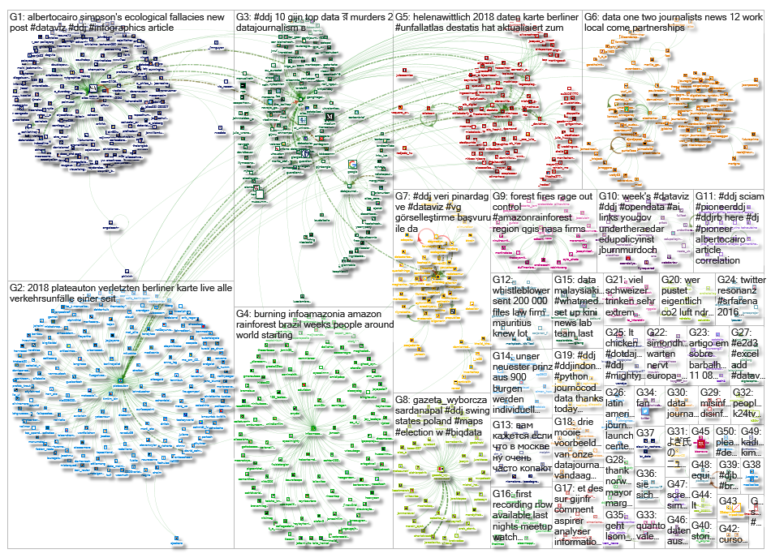
What’s the global data journalism community tweeting about this week? Our NodeXL #ddj mapping from August 19 to 25 finds Bloomberg mapping the alarming degradation of the Amazon rainforest, Alyssa Fowers discussing variations in visualizing mass shootings and their corresponding impact on readers, Data Carpentry sharing tips for organizing data in spreadsheets, and Atlatszo visualizing the succession of Hungarian kings.
Amazon Rainforest on Fire
The Amazon rainforest is burning at an unprecedented rate that is alarming the global community. Bloomberg visualized the degradation of the forest including its monthly tree loss from 2015 to this year. The team also mapped the fires observed across Brazil’s national parks and indigenous lands in 2019 as well as highlighted the key drivers behind the deforestation. For more related stories, check Álvaro Valiño’s Twitter thread.
The Emotional Journey of Creating Anything
Data visualization expert Alberto Cairo just re-purposed an old but gold infographic for his Intro to Data Visualization and Infographics class at the University of Miami. Many of you will probably be able to relate to the emotional journey of creating anything great, from the initial feelings of “This is the best idea ever!” to “This sucks I have no idea what I’m doing” and back to “Wow.”
https://twitter.com/LaughlinPaul/status/1164496214487982082
Visualizing Mass Shootings
Alyssa Fowers, a graduate student studying data visualization, wrote a blog post about the different ways to visualize mass shootings and their corresponding impact on readers. In particular, she dissects the use of bubble charts by Financial Times versus The Economist’s stacked bar chart, and commented that the latter packs more of an emotional punch. Read her thoughts here.
Basic Data Organization in Spreadsheets
In order to be able to analyze data effectively from spreadsheets, one must first structure and clean the data in a way that the computer can interpret it. Data Carpentry prepared a lesson in the basics of organizing and formatting your data in spreadsheets.
Moscow Roadworks
At the 2019 St. Petersburg International Economic Forum, Herman Gref, chairman of the executive board of Sberbank, joked that Moscow mayor Sergei Sobyanin likes to “dig up the whole city.” There is some truth in that joke, as RBC would discover in official public data. More than 130 streets in the capital have been repaired two or more times over the past four years. (In Russian.)
Succession of Hungarian Kings
The story of the succession of Hungarian kings is akin to an exciting and twisted adventure novel, complete with gruesome details. Atlatszo’s data team visualizes the family trees of past royals and presents a historic overview of how each ruler inherited the crown.
Data Fellowship
ForSet is offering a Data Communication Fellowship that consists of a yearlong online mentorship program as well as a 3-week training in Tbilisi, Georgia. Fellows will be trained in data collection, data analysis, storytelling, information design, and more. Open to journalists who reside and work in Armenia, Azerbaijan, Kazakhstan, Kyrgyzstan, the Russian Federation, Tajikistan, Turkey, Turkmenistan, or Uzbekistan. Apply here.
Mapping Accidents in Berlin
Tagesspiegel’s earlier attempts to obtain official accident records from the police was unsuccessful, but fortunately, Germany’s Federal Statistical Office eventually released that data. The team analyzed the numbers and determined the most dangerous locations, mode of transportation, and times of the day.
Six Strategies for Dataviz
A group of passionate designers, researchers, and engineers at Google came together in 2017 to create a comprehensive set of data visualization guidelines. Here are their basic six strategies for designing any chart. And here are more detailed guidelines.
Polish Senate Race
The next Polish parliamentary elections will be held on October 13 this year. Gazeta Wyborcza.pl took a look at the Poland Senate race — the safe seats and swing states — and makes some calculated predictions on what it would take to win. (In Polish.)
Thanks, once again, to Marc Smith of Connected Action for gathering the links and graphing them. The Top Ten #ddj list is curated weekly.
 Eunice Au is GIJN’s program coordinator. Previously, she was a Malaysia correspondent for Singapore’s The Straits Times, and a journalist at the New Straits Times. She has also written for The Sun, Malaysian Today and Madam Chair.
For a look at Marc Smith’s mapping on #ddj on Twitter, check out this map.

Guide to Mapping Analysis Using QGIS

Basic Data Journalism Tips for Editors

My Favorite Tools: Venezuela’s Lisseth Boon on Design and Data Visualization

Document of the Day: Visual Vocabulary

Making Trillions Make Sense: How Reuters Visualized the AI Economy

Summer Reading List for Data Journalists: For Those Who Believe in the Power of Storytelling with Numbers

From Data to Storytelling: Concept and Design Tips from the Financial Times’ John Burn-Murdoch

Data Don’ts: Expert Tips to Avoid Misleading Audiences With Numbers

This work is licensed under a Creative Commons Attribution-NoDerivatives 4.0 International License
Republish our articles for free, online or in print, under a Creative Commons license.
Republish this article
This work is licensed under a Creative Commons Attribution-NoDerivatives 4.0 International License
Read Next
Data Journalism
Making Trillions Make Sense: How Reuters Visualized the AI Economy
How do you make a trillion dollars feel real to someone who has never seen that much money? Vineet Khare and Mayank Bhatt faced that very challenge for their data-driven investigation into AI investment.
Data Journalism
Summer Reading List for Data Journalists: For Those Who Believe in the Power of Storytelling with Numbers
Featuring books spanning four continents, these recommended reads provide a global perspective on data journalism.
Data Journalism
From Data to Storytelling: Concept and Design Tips from the Financial Times’ John Burn-Murdoch
The chief data reporter for the Financial Times discusses how he considers the use of text, color, and annotation to aid visual storytelling through charts and graphics.
Data Journalism
Data Don’ts: Expert Tips to Avoid Misleading Audiences With Numbers
At a NICAR 2025 panel, data journalism experts discussed nuanced number errors that watchdog reporters often make that can confuse readers and disrupt story angles.