
GIJN’s Data Journalism Top 10: Tarantino’s Swearing, TheyDrawIt Tool, Climate Crisis
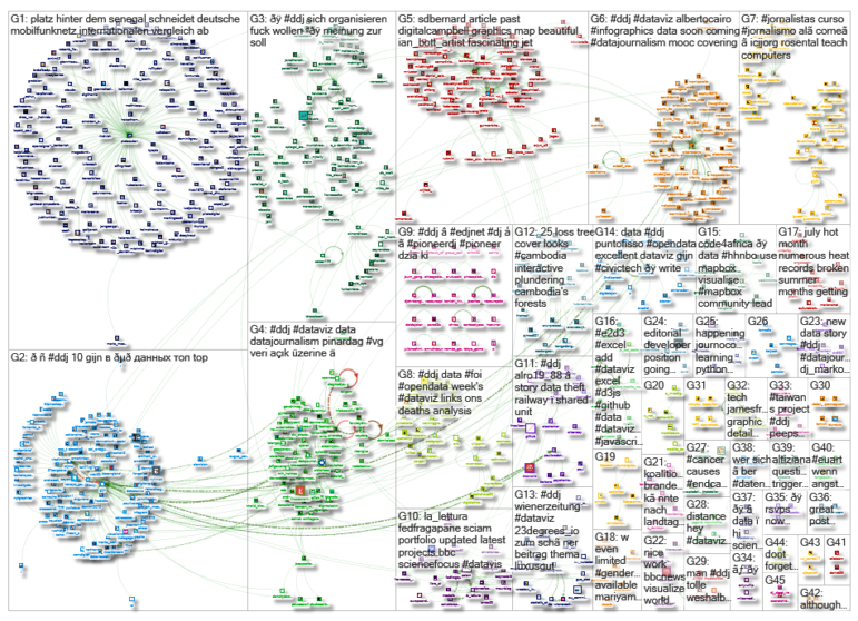
What’s the global data journalism community tweeting about this week? Our NodeXL #ddj mapping from August 5 to 11 finds Spiegel Online analyzing the typical features in Quentin Tarantino’s films, MU Collective releasing an interactive “TheyDrawIt” tool to engage and educate readers, and the conversation on climate heating up — with 101 East Al Jazeera looking into Cambodian deforestation, Neue Zürcher Zeitung analyzing Swiss forest fires, and the Financial Times digging into the impact of jet streams on the climate.
Tarantino’s Curses & Killings
Fans of the movie Pulp Fiction already know this: The movie is littered with curses and vulgar language (a whopping total of 458 instances) — typical of Quentin Tarantino’s films. Spiegel Online analyzed and visualized the amount of curse words, deaths, murder weapons, and more used in nine Tarantino films. There’s also a quiz for you to test your Tarantino knowledge here. (In German.)
TheyDrawIt Tool
Midwest Uncertainty Collective wondered what it would be like to encourage users to reflect on, and update, their beliefs as they interact with a graph. So the collective created the TheyDrawIt tool, where journalists can create line charts that allow readers to sketch their beliefs before they display the actual data.
Cutting Cambodia’s Forests
From 2001 to 2018, Cambodia lost 2.17 million hectares of tree cover — a 25% decrease, according to data analysis by Global Forest Watch. In some cases, protected areas have been completely destroyed — such as the Snuol Wildlife Sanctuary in eastern Cambodia. Al Jazeera maps out the cutting of Cambodia’s forests and looks at which countries have participated in the nation’s deforestation.
Will 2019 Break Last Year’s Heat Records?
The summer of 2018 was a summer of extremes, in terms of heat waves and record high temperatures. But just a year later, it seems as if all the records from 2018 will melt away easily in 2019. Spiegel Online compares the temperatures, aridity, and rainfall of last year and this year across Germany. (In German.)
Visualize 2019’s DataViz Survey Results
The 2019 edition of the Data Visualization survey received over 1,350 responses, and suggests that more respondents thought it was their skills and lack of time, not inadequacy of tools, that held them back. The organizers are running a competition with prizes to visualize the results by September 8. Enter here.
Geographic Data Resources
Geojournalism.org provides online resources, tutorials, and training in English and Portuguese for journalists, designers, and developers to dive into the world of data visualization using geographic data.
Data Literacy Crucial for Humanitarians
There is a need for humanitarians to build data skills. In a data literacy survey of humanitarian employees by the UN Office for the Coordination of Humanitarian Affairs (OCHA), almost all respondents (98.06%) reported that they engage in tasks related to data, with 70.11% working with data “all the time.” However, many respondents also said they faced challenges in collecting primary data and in assessing and improving its quality.
Quick, but Not Dirty, Data
Who has the best data journalism with the fastest methods? In a friendly competition, three teams of data journalists demonstrated how they produced time-driven and data-driven visual stories at this year’s Netzwerk Recherche conference. (In German.)
Forest Fires
The heat emitted from wildfires is not the only danger to humans: Soot particles and toxic gases like carbon monoxide and nitrogen oxides are also released. And the destruction of forests can cause erosion and mudslides. Neue Zürcher Zeitung takes a look at data on forest fires in Switzerland. (In English and German.)
Impact of Jet Streams on the Climate Crisis
As the world gets warmer, the behavior and impact on climate of jet streams — fast-flowing, narrow, meandering air currents in the atmosphere — is an issue hotly debated by scientists. The Financial Times asked expert scientists to explain the phenomenon in an attempt to understand this critical part of climate science.
Thanks, once again, to Marc Smith of Connected Action for gathering the links and graphing them. The Top Ten #ddj list is curated weekly.
 Eunice Au is GIJN’s program coordinator. Previously, she was a Malaysia correspondent for Singapore’s The Straits Times, and a journalist at the New Straits Times. She has also written for The Sun, Malaysian Today and Madam Chair.
For a look at Marc Smith’s mapping on #ddj on Twitter, check out this map.


