
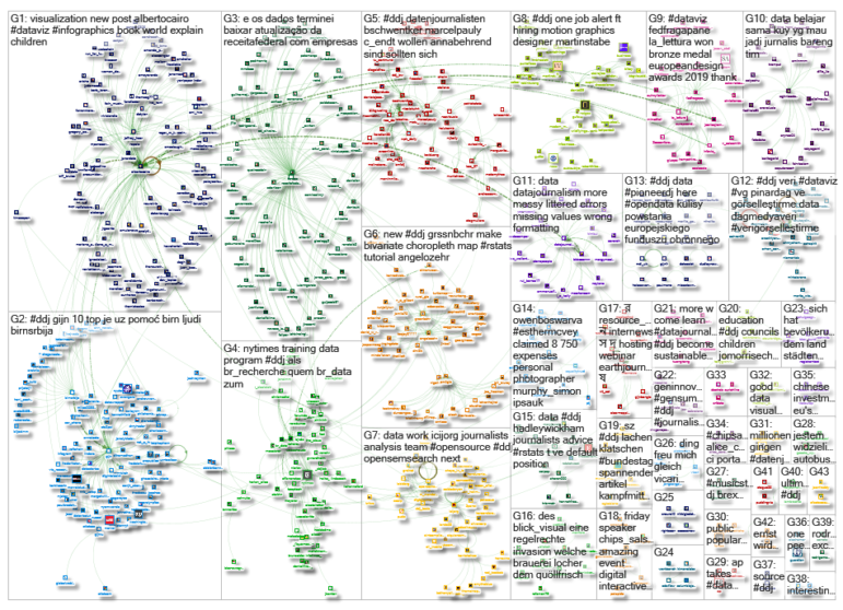
GIJN’s Data Journalism Top 10: Ring of Fire, Political Dynasties, Data Janitors, Hong Kong Protests


What’s the global data journalism community tweeting about this week? Our NodeXL #ddj mapping from June 10 to 16 finds a gorgeous series of data visualizations by National Geographic on the Pacific’s Ring of Fire, Bloomberg analyzing the influence of dynasties in Philippine politics, RStudio‘s Hadley Wickham talking about why you shouldn’t assign data cleaning to a “data janitor,” and BR Recherche looking at the complexity of privacy policies.
Ring of Fire
Here are some gorgeous data visualizations and analysis by National Geographic on the Pacific’s Ring of Fire — a 40,000 km volcanic belt stretching from New Zealand to the tip of South America with potential to disrupt hundreds of millions of lives in 40 countries.
Dynasties in the Philippines
The Philippines’ politics has long been dominated by dynasties: the Aquinos, Osmeñas and Marcoses. Bloomberg takes a closer look at the nation’s influential families and visualizes their power and positions over the years.
The Problem of Having a “Data Janitor”
Have you ever heard of a bear obstructing data collection? Read this interview with RStudio’s chief scientist Hadley Wichkam. He talks to ProPublica’s Hannah Fresques about how to find stories in commonplace data, the problem of having “data janitors,” the need for symbiosis between those who use R and those who use Python in the newsroom, and more.
Do You Read Privacy Policies?
Inspired by a BBC article, BR Recherche and BR Data used a text analysis tool developed by two scientists at Germany’s Universität Regensburg to analyze the privacy policies of several platforms, including Twitter, Facebook and Instagram. They discovered that the policies were far too complex for users to understand and required far too long a time to read. The New York Times also came to a similar conclusion here. (In German.)
Fun Infographics for Kids
Here’s a fun way for children to learn about data visualization. In “Yo y El Mundo” (Me and the World), authors Mireia Trius and Joana Casals present a colorful collection of infographics on a wide range of topics, from breakfasts in different countries to cities with the worst traffic. Although the book is in Spanish, data viz expert Alberto Cairo recommends it to all.
https://twitter.com/LaughlinPaul/status/1138760612140453888
Hong Kong Protests
The Financial Times uses Google Earth Studio to visualize the progression of the recent Hong Kong protests against a controversial extradition bill. The bill, which was suspended indefinitely on June 15, would have allowed the extradition of suspects from Hong Kong to face trial in mainland China.
Fundamentals of Data Visualization
The book “Fundamentals of Data Visualization” by integrative biology professor Claus O. Wilke will teach you the basics, including visualizing amounts, distributions, proportions, trends, geospatial data, and more. The book’s source code is hosted on GitHub. Data Journalism Turkey profiles the book here.
https://twitter.com/stephspiel/status/1139321827396849665
Female Representation in Art Museums
“When you ask the audience what art they want to see, we often hear the names of well-known male artists,” says Björn Quellenberg, Kunsthaus Zürich art museum’s spokesperson. Swissinfo.ch and Radio Télévision Suisse analyzed exhibitions held from 2008 to 2018 in 80 art museums and galleries in Switzerland and found that only a quarter of the solo exhibitions were works by women. (In German.)
Daycare Deficiency
Neue Osnabrücker Zeitung’s research suggests that the German government’s provision of childcare has sorely underestimated the country’s needs for daycare services catering to toddlers under three years old. Data on Github. (In German.)
Data Visualization Critique
“In many cases, it’s not necessarily what you say, but how you say it.” Economist Jonathan Schwabish shares his thoughts on how polite we need to be in critiquing others’ data visualizations.
Thanks, once again, to Marc Smith of Connected Action for gathering the links and graphing them. The Top Ten #ddj list is curated weekly.
 Eunice Au is GIJN’s program coordinator. Previously, she was a Malaysia correspondent for Singapore’s The Straits Times, and a journalist at the New Straits Times. She has also written for The Sun, Malaysian Today and Madam Chair.
For a look at Marc Smith’s mapping on #ddj on Twitter, check out this map.

This work is licensed under a Creative Commons Attribution-NoDerivatives 4.0 International License
Republish our articles for free, online or in print, under a Creative Commons license.
Republish this article
This work is licensed under a Creative Commons Attribution-NoDerivatives 4.0 International License
Read Next
Data Journalism
How a WhatsApp Community Is Bringing India’s Data Storytellers Together
Recently, more than 400 people gathered in the Indian city of Bengaluru for VizChitra 2026, a conference on data visualization and storytelling — but that is only a small part of the story.

Climate Data Journalism
Turning the Threat to a Distant Glacier into a Local Story Through Data Visualization
New York Times climate and environmental graphics reporter Mira Rojanasakul discusses how her team visualized the sea level rise threat from the melting Thwaites Glacier in Antarctica.

Data Journalism
Making Trillions Make Sense: How Reuters Visualized the AI Economy
How do you make a trillion dollars feel real to someone who has never seen that much money? Vineet Khare and Mayank Bhatt faced that very challenge for their data-driven investigation into AI investment.

Data Journalism
Data Cleaning Tools and Techniques for Non-Coders
Understanding, organizing, and validating data directly affects the accuracy of stories. New tools make cleaning accessible to journalists without coding.