
GIJN’s Data Journalism Top 10: AI-Powered Investigations, Why Companies Donate, Data From PDFs, UK Pay Gap
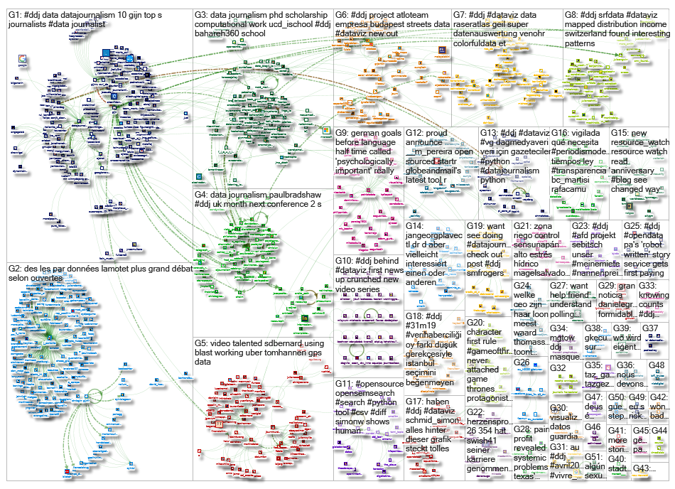
What’s the global data journalism community tweeting about this week? Our NodeXL #ddj mapping from April 8 to 14 finds a zine focused on machine learning-powered investigative journalism produced by @bxrobertz, a video explainer from @FT on if big corporations are really generous or just avoiding taxes, @knowtheory and @amandabee reviewing seven optical character recognition tools, and @workbenchdata with a tutorial on visualizing @Twitter data.
AI-Powered Investigative Journalism
Computational journalist Brandon Roberts produced an interesting zine on how machine learning can be applied to investigative journalism. In the first issue, he interviews the Minneapolis Star Tribune’s Chase Davis, profiles a new web scraping tool and dissects a machine learning-powered investigation into local property tax evasion.
https://twitter.com/benghancock/status/1116107043088113664
Philanthropy or Tax Avoidance?
At the World Economic Forum this year, economic historian Rutger Bregman questioned whether big corporations and their bosses were truly being generous in donating billions to causes, or just avoiding taxes. Financial Times’ journalists Federica Cocco and John Burn-Murdoch attempt to investigate Bregman’s question and explain their findings with sketched charts, Monopoly money and candy.
Extracting Data From PDFs
Trying to get data out from pesky PDFs but not sure which tool to use? Ted Han and Amanda Hickman, from Factful, went through seven optical character recognition tools so that you don’t have to. Here is their side-by-side comparison and review of the tools.
Visualize Twitter Data
Want to analyze and visualize Twitter data in four steps? Workbench prepared a tutorial on how to use the Twitter API to load tweets and associated data from an account and then visualize results of how often that account tweets a specific word. Data Journalism Turkey translated the tutorial into Turkish here.
Google’s Data Offerings
Google News Initiative is helping to boost the field of data journalism with more trainings, online resources and tools. What’s coming: free data training for local newsrooms in the United States and Canada, in partnership with Investigative Reporters and Editors, as well as Google tools training in collaboration with the Society of Professional Journalists. Also, data journalism MOOCs will be launched with the Knight Center for Journalism in the Americas this fall.
Python for Journalists Course
Datajournalism.com has released a four-course module on Python for data journalism. Listen to data journalism trainer Winny de Jong teach you how to set up Python on your computer, clean up messy datasets, analyze data and conduct web scraping. Best of all, the course is free!
Unequal Income Distribution
“The more beautiful the view, the higher the income inequality.” SRF Data took a hard look at wage differentials in Switzerland and created an interactive map showing the income distribution in each community. The most uneven income distribution was found in Anières, a municipality in the canton of Geneva. (In German.)
https://twitter.com/sandroluescher/status/1116354874684448769
The UK’s Gender Pay Gap
BBC journalists have dug into data reported by British firms on the difference between what they pay men and women. They found that 8,124 companies pay men more while just 1,424 pay women more.
Relationship Between Pharma and Doctors
In Switzerland, pharmaceutical companies inject millions into medical companies that conduct training for doctors. Le Temps dives into the issues surrounding the relationship between big pharma and the medical community, and finds a debate casting doubt on the independence and impartiality of doctors. Here’s how the team investigated this story. (In French.)
Goal Psychology
Does a goal scored just before half-time significantly affect the outcome of the game? Der Spiegel analyzed data from more than 45,000 matches from the four European leagues to find out.
Thanks, once again, to Marc Smith of Connected Action for gathering the links and graphing them. The Top Ten #ddj list is curated weekly.
 Eunice Au is GIJN’s program coordinator. Previously, she was a Malaysia correspondent for Singapore’s The Straits Times, and a journalist at the New Straits Times. She has also written for The Sun, Malaysian Today and Madam Chair.
For a look at Marc Smith’s mapping on #ddj on Twitter, check out this map.

Basic Data Journalism Tips for Editors

My Favorite Tools: Venezuela’s Lisseth Boon on Design and Data Visualization

Document of the Day: Visual Vocabulary

Tipsheet on Partnering with Civil Society Organizations and Non-Governmental Organizations

Turning the Threat to a Distant Glacier into a Local Story Through Data Visualization

Making Trillions Make Sense: How Reuters Visualized the AI Economy

Summer Reading List for Data Journalists: For Those Who Believe in the Power of Storytelling with Numbers

From Data to Storytelling: Concept and Design Tips from the Financial Times’ John Burn-Murdoch

This work is licensed under a Creative Commons Attribution-NoDerivatives 4.0 International License
Republish our articles for free, online or in print, under a Creative Commons license.
Republish this article
This work is licensed under a Creative Commons Attribution-NoDerivatives 4.0 International License
Read Next
Climate Data Journalism
Turning the Threat to a Distant Glacier into a Local Story Through Data Visualization
New York Times climate and environmental graphics reporter Mira Rojanasakul discusses how her team visualized the sea level rise threat from the melting Thwaites Glacier in Antarctica.
Data Journalism
Making Trillions Make Sense: How Reuters Visualized the AI Economy
How do you make a trillion dollars feel real to someone who has never seen that much money? Vineet Khare and Mayank Bhatt faced that very challenge for their data-driven investigation into AI investment.
Data Journalism
Summer Reading List for Data Journalists: For Those Who Believe in the Power of Storytelling with Numbers
Featuring books spanning four continents, these recommended reads provide a global perspective on data journalism.
Data Journalism
From Data to Storytelling: Concept and Design Tips from the Financial Times’ John Burn-Murdoch
The chief data reporter for the Financial Times discusses how he considers the use of text, color, and annotation to aid visual storytelling through charts and graphics.