10 Visualizations About Criminal Justice
Criminal justice is a perpetual focus of media coverage, but last year was especially ripe with stories in the United States. From the massive reform bill passed in Massachusetts to the debate over gun rights following the massacre of 17 at a Parkland, Florida, high school, journalists and data experts have been kept busy in their attempts to quantify and analyze the criminal justice machine in the US. Storybench cut through the noise and pulled out these 10 visualizations that best explain criminal justice in America today.
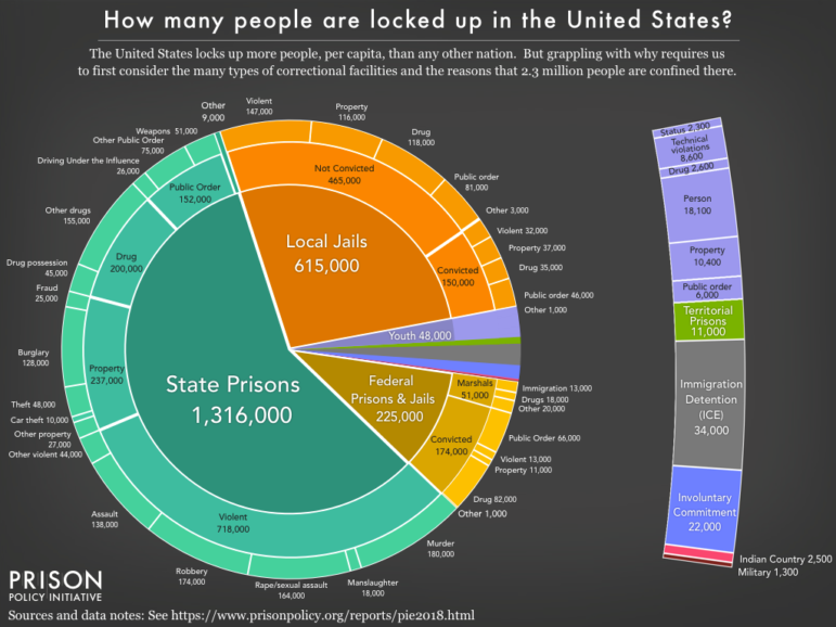
How Many People are Locked Up in the United States? (Prison Policy Initiative)
The Prison Policy Initiative published a report in March titled “Mass Incarceration: The Whole Pie,” and this mammoth chart appropriately heads it. Beyond just showing how staggeringly high the prison population is, the sub-sections within each slice show which offenses claim the most inmates.
Screenshot: Prison Policy Initiative
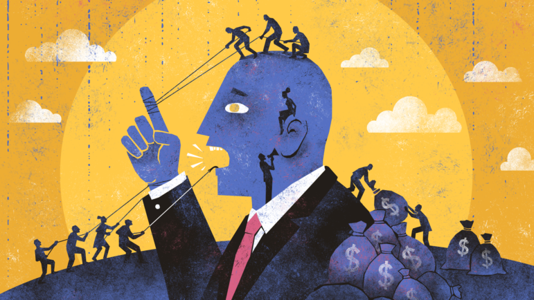
Following the Money of Mass Incarceration (Vox)
Mass incarceration isn’t just an unfortunate social phenomenon — it’s an economic giant. Billions of dollars are flooding the industry every year, and Vox uses this graphic, and data from the Prison Policy Initiative, to take you step-by-step through the money flow.
Screenshot: Vox
An Unequal Justice (Washington Post)
Being black in the US often means you’re at a disadvantage, as numerous studies have shown. This article and bar chart sum up some of the evidence, showing that justice eludes even black homicide victims. Arrests are made at a much higher rate for white homicide victims, despite the fact that black people are the demographic most affected by murder.

Screenshot: The Washington Post
Killings of Blacks by Whites Far More Likely to Be Ruled “Justifiable” (New York Times)
In a similar vein, this line graph from a New York Times article shows that whether or not a homicide is ruled “justifiable” can largely depend on the race of the killer and the victim. Anecdotal evidence, like the Trayvon Martin-George Zimmerman case, backs up the data.

Screenshot: The New York Times
Prisons and the Deluge (The Marshall Project)
Without freedom of movement, there’s not much that prisoners can do in advance of a hurricane except hope someone evacuates them. This piece overlays prison locations and flooded zones, serving as a reminder of how inmates are at the whim of nature and their corrections officers.

Screenshot: The Marshall Project
Capital Punishment’s Use and Popularity Are Decreasing (FiveThirtyEight)
This scatterplot and line graph combo will please opponents of the death penalty. After a spike of executions in 2000, capital punishment is on the decline, as is the public’s overall approval of it, according to this Jeff Sessions-inspired feature done by FiveThirtyEight.

Screenshot: FiveThirtyEight
Mass Incarceration Has Not Touched All Communities Equally (Sentencing Project)
A key facet of mass incarceration is sentencing disparities. This visualization (among others in the set) outlines just how unfair those disparities are, with the one in three rate for black men standing out in particular.

Screenshot: The Sentencing Project
Bail-Setting Practices Vary Widely by Judge in New York City (FiveThirtyEight)
Criminal justice activists have set their sights on bail reform as a crucial next step, and this story from FiveThirtyEight shows why. If you ever find yourself arrested in the Big Apple, just how much it will hurt your wallet depends on what judge you get.

Screenshot: FiveThirtyEight
Machine Bias (ProPublica)
Like in most facets of life these days, algorithms are beginning to have an enormous impact on the criminal justice system. While not the most aesthetically appealing, this simple bar graph from a longer ProPublica piece shows how machines determining “risk scores” for future criminality can display bias, just like their human coders.

Screenshot: ProPublica
Here’s One Excellent Reason to Cut Prison Populations (Huffington Post)
If there’s concern that cutting inmate populations could lead to further crime, this lengthy graphic might put it to rest. The majority of states have managed to decrease the number of people behind bars while making gains in overall public safety.
Screenshot: The Huffington Post
This post first appeared on Storybench and is reproduced here with permission.
 Alexander Frandsen is a researcher and staff writer at Storybench. He is also a journalism student at Northeastern University and a former magazine editor for the Northeastern University political review

Basic Data Journalism Tips for Editors

My Favorite Tools: Venezuela’s Lisseth Boon on Design and Data Visualization

Document of the Day: Visual Vocabulary
GIJN Guide to Investigating Foreign Lobbying

From Data to Storytelling: Concept and Design Tips from the Financial Times’ John Burn-Murdoch

Data Don’ts: Expert Tips to Avoid Misleading Audiences With Numbers

How The Pudding Used Data Visualizations to Recontextualize the Story of Climate Change

How Data Journalism Is Changing the Face of Africa

This work is licensed under a Creative Commons Attribution-NoDerivatives 4.0 International License
Republish our articles for free, online or in print, under a Creative Commons license.
Republish this article
This work is licensed under a Creative Commons Attribution-NoDerivatives 4.0 International License
Read Next
Data Journalism
From Data to Storytelling: Concept and Design Tips from the Financial Times’ John Burn-Murdoch
The chief data reporter for the Financial Times discusses how he considers the use of text, color, and annotation to aid visual storytelling through charts and graphics.
Data Journalism
Data Don’ts: Expert Tips to Avoid Misleading Audiences With Numbers
At a NICAR 2025 panel, data journalism experts discussed nuanced number errors that watchdog reporters often make that can confuse readers and disrupt story angles.
Climate Data Journalism
How The Pudding Used Data Visualizations to Recontextualize the Story of Climate Change
What does climate change feel like? How will your city’s climate shift, 50 years from now? Data scientist Derek Taylor explains his latest piece.
Africa Focus Data Journalism
How Data Journalism Is Changing the Face of Africa
Data journalism in Africa has made a powerful impact, from holding leaders accountable to refuting myths around domestic violence. But the field faces formidable challenges.