GIJN’s Data Journalism Top 10: Useful Chatbots, Less-Is-More Tables and Data Mapping Billions of Birds
What’s the global data journalism community tweeting about this week? Our NodeXL #ddj mapping from Sept 17 to 23 finds numerous data to map, from @NatGeo‘s migration of billions of birds to @morgenpost‘s Berlin schools and @A24COM‘s internet access in Argentina. There’s also @dhanalytics‘ tips on improving data tables and @mcrosasb on two useful chatbots.
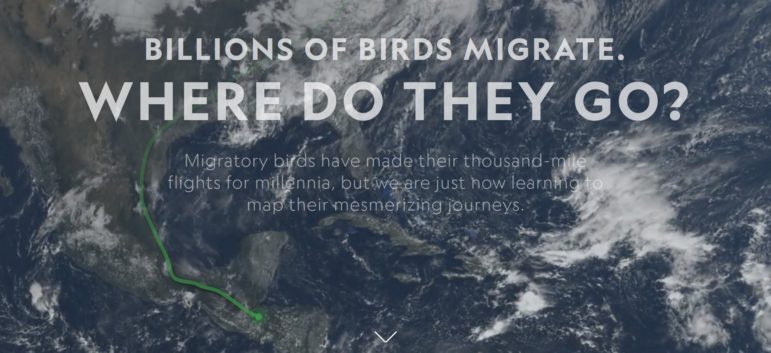
Mapping Billions of Birds
National Geographic’s senior graphics editor Brian Jacobs describes in detail the process behind creating an impressive data-driven feature on the journey of migratory birds. He writes about the challenges and solutions in dealing with the cartography, geographic processing, composition and effects, labelling, animations, data acquisition and more.
Make a Guess About Climate Change
SVT News created a “make a guess” interactive on climate change effects on the globe. See if you can guess the temperature increase, sea level rise and the size of the shrinking Arctic correctly. (In Swedish.)
https://twitter.com/MarieLiselott/status/1041080389584990208
Less Is More Tables
This GIF from 2014 is a good reminder that when it comes to data tables: Less is more effective, attractive and impactful. Follow the step-by-step tutorial to remove excess visual distractions and move text and figures to improve your table.
![]()
Useful Chatbots
Journalist Maria Crosas writes about two chatbots on Facebook Messenger: SummarizeBot, which extracts the most important information in articles, images with text or audio files; and FacterBot, which helps to detect false stories on the internet.
Mapping Schools in Berlin
Time to sign up your child for school in Berlin? Berliner Morgenpost built an interactive of all the schools in the city. Filter by district, school type, profile, language and special offerings. (In German.)
Mapping Internet Access in Argentina
Data journalist Ignacio Ferreiro mapped the internet access in Argentina and found the Patagonian provinces had the worst connections. (In Spanish.)
Google Trends on Brazilian Election
The Brazilian presidential election will take place on October 7th and millions of Brazilians are Googling information on the candidates running for the post. Discover which topics aroused the most interest through Google Trends’ lenses in this project by Carol Cavaleiro, Thais Viana and Tainá Simões. (In Portuguese.)
Scraping Geospatial Data
Bellingcat prepared a step-by-step tutorial on how to scrape geospatial data, including the tools needed to do it. Scraping such data might be useful for further analysis, geolocating footage or archiving purposes.
US Election DataBot Updated
ProPublica’s Election DataBot tool, launched in 2016, has been updated with more data and an improved interface. Find newsworthy information about the election quickly and in real time.
Tapestry Conference 2018
The sixth Tapestry Conference, an event to advance interactive online data storytelling, will be held at the University of Miami on November 29 and 30. It’s keynote speakers include the Guardian’s data editor Mona Chalabi, University of Michigan assistant professor of information Matthew Kay and Netflix’s senior data visualisation engineer Elijah Meeks.
Thanks, once again, to Marc Smith of Connected Action for gathering the links and graphing them. NOTE: Top Ten #ddj will take a short hiatus for two weeks as GIJN will be in Seoul, Korea for the 3rd Asian Investigative Journalism Conference. The Top Ten #ddj list will resume on October 18, 2018.
 Eunice Au is GIJN’s program coordinator. Previously, she was a Malaysia correspondent for Singapore’s The Straits Times, and a journalist at the New Straits Times. She has also written for The Sun, Malaysian Today and Madam Chair.
For a look at Marc Smith’s mapping on #ddj on Twitter, check out this map.

Guide to Mapping Analysis Using QGIS

Basic Data Journalism Tips for Editors

My Favorite Tools: Venezuela’s Lisseth Boon on Design and Data Visualization

Document of the Day: Visual Vocabulary

Turning the Threat to a Distant Glacier into a Local Story Through Data Visualization

Making Trillions Make Sense: How Reuters Visualized the AI Economy

Summer Reading List for Data Journalists: For Those Who Believe in the Power of Storytelling with Numbers

From Data to Storytelling: Concept and Design Tips from the Financial Times’ John Burn-Murdoch

This work is licensed under a Creative Commons Attribution-NoDerivatives 4.0 International License
Republish our articles for free, online or in print, under a Creative Commons license.
Republish this article
This work is licensed under a Creative Commons Attribution-NoDerivatives 4.0 International License
Read Next
Climate Data Journalism
Turning the Threat to a Distant Glacier into a Local Story Through Data Visualization
New York Times climate and environmental graphics reporter Mira Rojanasakul discusses how her team visualized the sea level rise threat from the melting Thwaites Glacier in Antarctica.
Data Journalism
Making Trillions Make Sense: How Reuters Visualized the AI Economy
How do you make a trillion dollars feel real to someone who has never seen that much money? Vineet Khare and Mayank Bhatt faced that very challenge for their data-driven investigation into AI investment.
Data Journalism
Summer Reading List for Data Journalists: For Those Who Believe in the Power of Storytelling with Numbers
Featuring books spanning four continents, these recommended reads provide a global perspective on data journalism.
Data Journalism
From Data to Storytelling: Concept and Design Tips from the Financial Times’ John Burn-Murdoch
The chief data reporter for the Financial Times discusses how he considers the use of text, color, and annotation to aid visual storytelling through charts and graphics.