GIJN’s Data Journalism Top 10: Nike’s Vaporflys, Trump’s Trade War, FastCharts, Datapasta


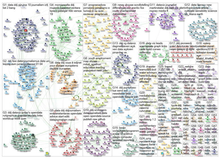
What’s the global data journalism community tweeting about this week? Our NodeXL #ddj mapping from July 16 to 22 finds @UpshotNYT confirming Nike’s claim that their Vaporflys really do give runners an advantage, @MilesMcBain making some data journalists very happy with Datapasta, @WSJGraphics visualizing Trump’s escalating trade war, and @FinancialTimes looking at Britain’s surprising digital divide while touting its new chart-making tool.
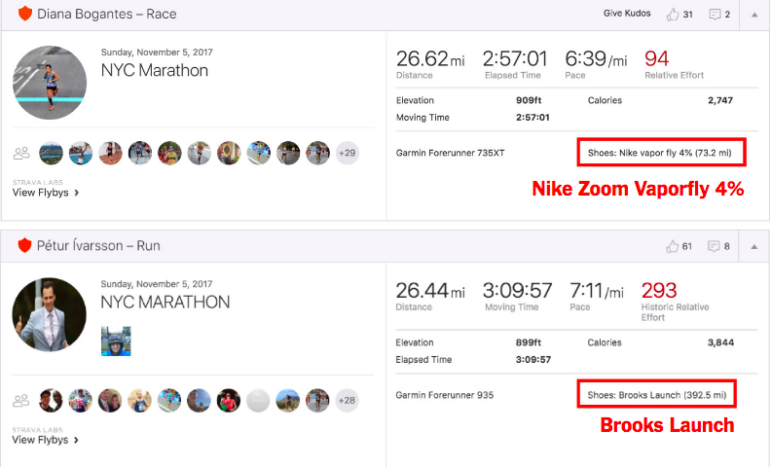
Faster Running Shoes
If a running shoe made you 25, 10 or even 2 percent faster, would it be fair to wear it in a race? Nike says its Vaporfly shoes are about 4 percent better than some of its best racing shoes. The New York Times tested Nike’s claim by analyzing public race reports and shoe records from Strava, a fitness app, and found that runners wearing Vaporflys have a real advantage over competitors not wearing them.
NYT confirms Nike’s performance claims on their new Vaporfly running shoe. Along the way, it hints at a future where any brand and its implicit promises may actually be tested… https://t.co/EPDcXqPSKr pic.twitter.com/DkK3vtX1tF
— Andrew Hargadon (@andrewhargadon) July 22, 2018
Trump’s Trade War
The Trump administration’s use of tariffs on imported goods started slowly but has broadened in recent weeks. The Wall Street Journal (@WSJGraphics) looks at the growing impact of the escalating trade war.
See Trump’s trade war unfold https://t.co/BLPa3c4FZ3 with dramatic reveal via @iarynam @willmauldin @elliot_bentley pic.twitter.com/GpGdkHhASt
— shane shifflett (@shaneshifflett) July 20, 2018
FastCharts
The Financial Times has a tool to create simple charts in its newsroom — simpler than using Excel or Google Sheets, they say. Amanda Gordon and Ashoor Namrood explain the process of how FastCharts was created.
Another newsroom bespoke chart tool, another success story! ?? https://t.co/kryQHfRCYh
— Jon McClure (@JonRMcClure) July 17, 2018
Rural: Faster Internet?
Worldwide, digital rights advocates fret about a digital divide — the gap in internet speeds between rural and urban areas, with urban areas having faster access. However, in Great Britain, it is the reverse. An analysis by the Financial Times shows that consumers in some of the most rural areas enjoy broadband speeds considerably faster than those in the middle of London or Manchester.
Our broadband map is in print today, made by our @UCLQStep intern @hfrobertson11 and @theboysmithy. And it’s interactive, with a QR code leading to the personalisation available online: https://t.co/wNqMX7BhOw pic.twitter.com/y57gkAhTsR
— Martin Stabe (@martinstabe) July 19, 2018
Datapasta
Datapasta reduces resistance associated with copying and pasting data to and from R. It was created by Miles McBain, a code hacker, number cruncher and #rstats user after he found himself using intermediate programs like Sublime to turn text into suitable formats.
TFW you learn about a package that does the *thing* that you couldn’t articulate in a Google search. ✨?✨
More gifs/info here: https://t.co/A2adsYFg26 @MilesMcBain pic.twitter.com/WBIrUeJSq5
— Irene Steves (@i_steves) July 20, 2018
Resources: Design, Data and Code
Lena Groeger, a designer and developer at ProPublica, collated a big list of resources for design, data and coding that is suitable for beginners.
Here is the full set of @Datawrapper tutorials we covered in Data Viz 2 today! https://t.co/yAwoTH64DR
And here is my big list of resources: https://t.co/YpAG4QobUt
Get in touch with any questions. Thanks #nahj2018!
— Lena Groeger (@lenagroeger) July 21, 2018
Women Data Journalists
At Data Beers Barcelona, Story Data Barcelona presented their project on women in #ddj and released a spreadsheet and map of women data journalists. At the same event, a brand new website that lists data journalists from Spain and Latin America was launched as an initiative of Master in Innovation in Journalism, Miguel Hernández University.
Lo prometido es deuda
Abrimos bbdd #womenDDJ en #DataBeersBCN para que entre todas visibilicemos a las #periodistasdedatos ♀️
Gracias por contribuir! ? Sois grandes!
▶️ bbdd editable https://t.co/RZ7oMc00X8
▶️ Mapa https://t.co/VpXKH7gYRw#periodismodatos #ddj pic.twitter.com/jcrGXcTF6R— eli vivas (@eli_vivas) July 19, 2018
Staying on Home Soil
An analysis by OBC Transeuropa found that a third of Europeans have never traveled abroad. This is more often the case in Southeast Europe, but also in Italy, Spain and Poland, where more than 50 percent of the population have never crossed national borders in their lifetime.
De nombreux Européens sont déjà en vacances, mais un tiers d’entre eux n’a jamais quitté son pays. Une analyse data de @BalcaniCaucaso: https://t.co/qOqN23derf #voyages #ddj pic.twitter.com/n1sYbLvurw
— European Data Journalism Network (@EdjNet) July 17, 2018
German Rental Market is Broken
Germany’s real estate prices and rents have risen at an insane pace in many cities in recent years and have made housing a crucial social issue of our time. Süddeutsche Zeitung crowdsourced real life stories and ended up with 57,000 responses that painted a depressing picture of Germany’s rental market, especially for single parents. (In German.)
A great piece of data journalism from @SZ about the German rental market using a mix of survey analysis and individual stories of individuals and families struggling with the current high rents.
[Article is in German]https://t.co/AiC59kzG8L— Christoph Molnar (@ChristophMolnar) July 17, 2018
Second Home Cities
Cities along the coast of Brittany, France, enjoy an influx of tourists in the summer but in the winter they become ghost villages. Le Télégramme found that these cities, which have a high percentage of second homes, correlate to the median age of residents there. Cities with a larger number of second homes tend to have an older median age among residents. (In French.)
#dataviz Dans toutes ces communes, un logement sur deux est une maison secondaire ! Le détail : https://t.co/fkducGI9nM #ddj #bretagne pic.twitter.com/C5aPexNQXL
— dataspot (@dataspotTLG) July 20, 2018
Thanks, once again, to Marc Smith of Connected Action for gathering the links and graphing them.
 Eunice Au is GIJN’s program coordinator. Previously, she was a Malaysia correspondent for Singapore’s The Straits Times, and a journalist at the New Straits Times. She has also written for The Sun, Malaysian Today and Madam Chair.
For a look at Marc Smith’s mapping on #ddj on Twitter, check out this map.

This work is licensed under a Creative Commons Attribution-NoDerivatives 4.0 International License
Republish our articles for free, online or in print, under a Creative Commons license.
Republish this article
This work is licensed under a Creative Commons Attribution-NoDerivatives 4.0 International License
Read Next

Data Journalism Methodology
How to Tell the Stories of People Behind Data Points
At the NICAR26 data journalism summit, a panel of veteran data reporters shared tips on how to amplify and contextualize data-driven public interest stories with ordinary people at the short end of policy.

Data Journalism How They Did It
Using WhatsApp to Crowdsource Data on Ride Hailing Companies’ Labor Lockouts
We used WhatsApp to crowdsource information from Uber and Lyft drivers in NYC about company lockouts during a local, minimum wage dispute.

Data Journalism Methodology News & Analysis
Tips for Investigating Hate Crimes and Violence When Government Data Sources Fail
Journalist Rachel Chitra used news reports to build a database on hate crimes and violence in India. Here she gives tips for reporters facing a data gap, and offers lessons learned from her research about how journalists can reliably step in to gather, clean, and publish data when the government fails to keep track of important information.
Data Journalism
Why Dynamic Data Visualization Is Key to Covering Climate Change
As calls for change grow louder in light of the latest IPCC (Intergovernmental Panel on Climate Change) report and in the run up to COP26 conference in Glasgow this November, it’s time to focus on how data visualization can help people grasp the challenges that lie ahead.