This Week’s Top 10 in Data Journalism
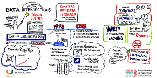
Sketch of Data Intersections Symposium at University of Miami by artist Caryn Ginsberg.
What’s the global data journalism community tweeting about this week? Our NodeXL #ddj mapping from March 19 to 25 finds a sobering study on income inequality between black and white males visualized by @nytimes, a cool time-lapse graphic of snow fall in the United States by @PostGraphics and peak baby-making seasons by country by @VismeApp and @ddjournalism.
Race Influencing Income Inequality?
Black boys who are raised in wealthy families in well-to-do neighbourhoods earn less in adulthood than white boys with similar backgrounds, according to a new study by researchers of The Equality Opportunity Project. The New York Times visualized the data to show this sobering disparity.
This @nytimes piece is a gut punch. It includes a data visualization that shows the invisible hand of systemic racism at work. An important read
Sons of Rich Black Families Fare No Better Than Sons of Working-Class Whites https://t.co/MEJ31pA2pX pic.twitter.com/lIpa3laVRk
— Baratunde (@baratunde) March 19, 2018
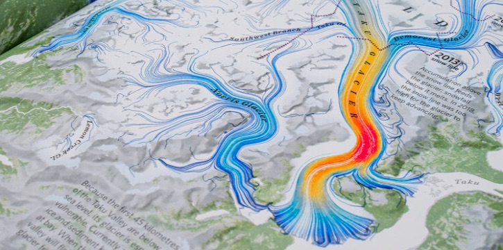
Let the Snow Fall
This Washington Post graphics team created a cool day-by-day timelapse of all the snow that fell in the United States from October 2017 to this March. They show how this winter was one for the record books.
Literally, a very cool #map. Snowfall tracking from @wapo. Snow accumulation data from the National Operational Hydrologic Remote Sensing Center. https://t.co/LsHBb00avs pic.twitter.com/x2aMpC1hV8
— Gill Green (@greengeographer) March 26, 2018
Peak Baby-Making Seasons
Based on the United Nations’ data on live births, Visme noted a correlation between three different variables: the top birth months, seasons of the year and the latitude of the country (distance from the equator). Visme also used the data to visualize the peak mating seasons for different countries.
Human Mating Seasons: The surprising link between your birthday and place of birth— in one heat map – https://t.co/heRfxmsfMm pic.twitter.com/QSi6IJYkSi
— Antonio Vieira Santos ? (@akwyz) March 26, 2018
International Chart Day
Californian congressman Mark Takano recently announced that he is partnering with Tumblr and the Society for News Design to celebrate the first-ever International Chart Day on April 26. In Congress, Takano has been an advocate for the use of compelling infographics online and on the floor of the House of Representatives during debate.
International Chart Day announced: April 26 https://t.co/dCA4I6ao2R (and there’ll be a #dataviz #infographics #ddj conference in DC to celebrate it!) pic.twitter.com/Yp09i73kTv
— Alberto Cairo (@albertocairo) March 23, 2018
Scraping without Coding
Freelance investigative and data journalist Samantha Sunne, also author of the Tools for Reporters weekly newsletter, shared her tips for scraping without coding, useful scraper tools and also tools she would not recommend, during NICAR18.
Google Sheets: Scraping without coding #ddj #vg #scraping https://t.co/96iOra05IJ
— Pınar DağⓋ (@pinardag) March 23, 2018
Free Digital Journalism MOOC for Africa
Code for Africa, with support from Google News Lab and the World Bank’s Global Media Development Programme, launched a Massive Open Online Course (MOOC) specifically designed for African journalists. The MOOC, which is free of charge, includes 47 lessons created by some of the world’s leading digital journalism experts.
.@ICFJ recent survey on the State of Technology in Global Newsrooms confirms only half of new hires in newsrooms have experience with digital news tools. Africa’s first digital journalism platform aims to improve this with up-to-date online training. https://t.co/vWgQ8cShRW #ddj pic.twitter.com/OI2e6E9vqF
— Code for Kenya (@Code4Kenya) March 20, 2018
Data Intersections Symposium
The University of Miami hosted its first Data Intersections symposium this March, which enabled conversations between professionals and scholars from domains that have been deeply transformed by the increasing availability of data and the digital tools used to manipulate it, such as data science, statistics, data journalism, the physical and biological sciences, and the digital humanities.
If you want to get a sense of what our first Data Intersections was about, here’s a summary: https://t.co/9FLwU2pKLP #dataviz #infographics #ddj. Coming again in 2019! pic.twitter.com/sbJO8DooxL
— Alberto Cairo (@albertocairo) March 20, 2018
Unequal Representation
The agenda of black women — who comprise 27% of Brazil’s population — is still not represented widely in the chambers of power in Brazilian society. Gênero e Número highlights that of the elected Brazilian councilors in 2016, black representatives only constituted 0.6 percent.
#Política2018 Do universo de 57,8 mil vereadores eleitos em 2016, somente 328 são mulheres pretas, ou 0,6% do total. Nas capitais, foram somente seis vereadoras pretas do total de 809 eleitos daquele ano. Confira a reportagem completa em: https://t.co/17JDl70Qo2 #ddj pic.twitter.com/KHCiJ1InH5
— Gênero e Número (@generonumero) March 23, 2018
Data Journalism Tips
Northeastern School of Journalism graduate Bridget Ann Peery summarizes some key takeaways on data journalism from the News and Journalism Track at SXSW.
“Find out what’s countable and find an angle” + “Journalists are information synthesizers, seek the simplest way to share information” ?? Check out the takeaways on data journalism from the “news nerds” panel at #SXSW @storybench #ddj #cityjtips #JRNL301 https://t.co/gj17w6KR2L
— Thomas Kilroy (@tpkilroy) March 23, 2018
Newsroom Skills Survey Data
Explore the International Center For Journalists’ global survey data on newsroom technology. Filter the data by region, newsroom, position and more, and use the data to inform new strategies and research.
How are newsrooms in your region of the world embracing technology, and where are they falling behind? Explore the data from our global survey of 2,700+ newsroom managers & journalists, and tell us what you find by tweeting on the #ICFJtechsurvey hashtag. https://t.co/75A8otjzGa pic.twitter.com/lLqHZnJHLV
— ICFJ (@ICFJ) March 21, 2018
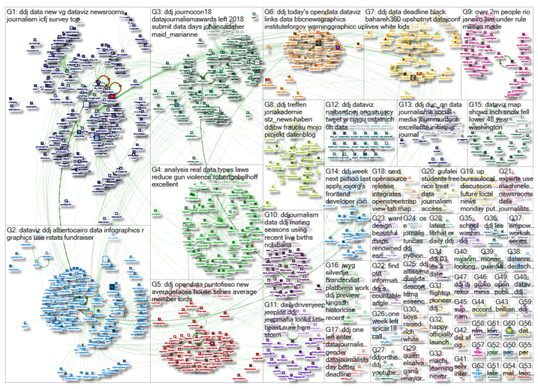
Thanks, once again, to Marc Smith of Connected Action for gathering the links and graphing them.
For a look at Marc Smith’s mapping on #ddj on Twitter, check out this map.

Document of the Day: Visual Vocabulary
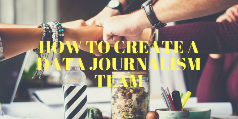
How To Create a Data Journalism Team

Tipsheet on Partnering with Civil Society Organizations and Non-Governmental Organizations

AI Accountability Reporting Guide

Data Journalism Top 10: Climate Game, Tax Inequality, Weather Proverbs, Musical Politics, Who’s in Your Wallet
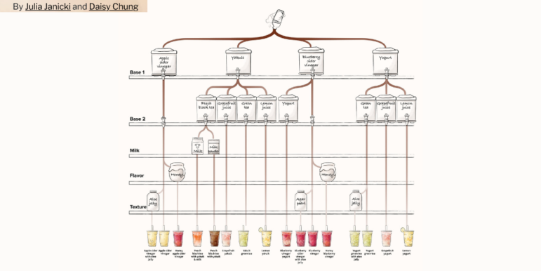
Data Journalism Top 10: Misrepresenting Women, Bubble Tea, and India’s Nightingale
Why Dynamic Data Visualization Is Key to Covering Climate Change
Data Journalism Top 10: Climate Disasters, Olympic Running, Russian Healthcare, and Bulgarian Coal Plants

This work is licensed under a Creative Commons Attribution-NoDerivatives 4.0 International License
Republish our articles for free, online or in print, under a Creative Commons license.
Republish this article
This work is licensed under a Creative Commons Attribution-NoDerivatives 4.0 International License
Read Next
Data Journalism
Data Journalism Top 10: Climate Game, Tax Inequality, Weather Proverbs, Musical Politics, Who’s in Your Wallet
Our weekly curation of the most popular data journalism stories on Twitter highlights a climate change policy game, an analysis of banknote representation, an examination of how America’s tax system favors the ultra-wealthy, and the sonification of French polling data.
Data Journalism
Data Journalism Top 10: Misrepresenting Women, Bubble Tea, and India’s Nightingale
Our weekly NodeXL curation of the most popular data journalism stories on Twitter includes a look at how women in the headlines can be used to perpetuate existing stereotypes, an examination of how large pockets of unvaccinated individuals are driving the pandemic in the US, and a fun make-your-own bubble tea interactive adventure.
Data Journalism
Why Dynamic Data Visualization Is Key to Covering Climate Change
As calls for change grow louder in light of the latest IPCC (Intergovernmental Panel on Climate Change) report and in the run up to COP26 conference in Glasgow this November, it’s time to focus on how data visualization can help people grasp the challenges that lie ahead.
Data Journalism
Data Journalism Top 10: Climate Disasters, Olympic Running, Russian Healthcare, and Bulgarian Coal Plants
Our weekly project that maps the most popular data journalism stories on Twitter found several environmental projects this week, including a climate disaster in Germany, air pollution in South Asia, and deforestation in Brazil. We also feature more data-driven coverage of the Tokyo Olympics, an investigation into Bulgarian coal plants, and a guide to creating appealing data visualizations based on simple charts.