This Week’s Top Ten in Data Journalism


What’s the global data journalism community tweeting about this week? Our NodeXL #ddj mapping from October 16 to 22 has @Sage_News analyzing data journalism practices over the past four years, data expert @albertocairo weighing in on uncertainty in interpreting graphics, @tristanf listing 12 new digital story formats for news and @R_Graph_Gallery‘s inspiring Python Graph Gallery.
No Data Journalism Revolution (Yet)
An analysis of international data journalism projects nominated for awards over four years revealed that data journalism hasn’t changed as much as you’d think. Researchers Wiebke Loosen, Julius Reimer and Fenja de Silva-Schmidt noted in a paper that they found data journalism still mostly covers politics, it’s still labor-intensive and requires big teams, it’s still mostly done by newspapers and it still primarily uses “pre-processed public data.”
By far the most common ways to get data for data journalism: 1) “publicly available”, 2) “not indicated”. Not good. https://t.co/7KkPHLsLLn
— Juuso Koponen (@infomuotoilu) October 23, 2017
Graphics Uncertainty
Learning to read graphics is akin to learning how to read written language. The first time anyone faced a basic time-series line graph —the graphic that contemporary middle school students see and draw on a regular basis — she was probably puzzled. Data expert Alberto Cairo discusses how people misread common charts, graphs, and maps and what we can do about it.
Great article on “Uncertainty, #graphicacy and the power of #statistics”
Written by @albertocairo https://t.co/VHgZdnMeAq #DataScience #data pic.twitter.com/qGJSAfCPNZ— IMSD Switzerland (@IMSD_Analytics) October 23, 2017
New Story Forms
Tristan Ferne, executive producer at BBC Research & Development analyzed story formats used for news that aren’t legacies from print or broadcast, including longform scrollytelling, listicles and timelines.
Beyond 800 words: new digital story formats for news https://t.co/gSVvhrNtQV pic.twitter.com/ir2y2tRaJi
— Joiakim Tuil (@enjoyer_5) October 17, 2017
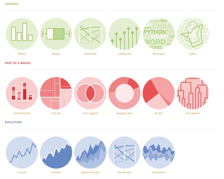
Inspiring: Python Graph Gallery
The gallery displays hundreds of charts, with the reproducible Python code. It aims to showcase the awesome data visualization possibilities of Python.
The #Python Graph Gallery: Useful for discovering and learning how to code #dataviz in Python.https://t.co/1HWEYiZxCA pic.twitter.com/yZ1wPNvKlz
— Randy Olson (@randal_olson) October 16, 2017
Anticipating More Catalonias
Catalonia’s secession effort from Spain may encourage other regions in Europe. Tages-Anzeiger gives an overview of areas with secession aspirations and an analysis on the intensity of the conflict.
Wo in Europa Risse entstehen könnten. Gute Übersicht https://t.co/b1OUlt1DlP pic.twitter.com/EbKa1kqLSe
— Martin Motzkau (@MartinMotzkau) October 19, 2017
Brazil’s Female Music Bands
Rock Feminino mapped female metal, alternative, pop rock and punk rock bands in Brazil, from Braincrusher to Indiscipline.
#ddj #datajournalism So proud of being part of: https://t.co/Qqbj1ykXZN
— Vivian Guilherme (@vivianguilherme) October 17, 2017
Global Open Data Portals
Truth is, some open data portals can be hard to come by. To make it easier, OpenDataSoft put together this resource of 2600+ open data portals worldwide.
Did you know that Open Data Inception now gathers more than 2,600 #OpenData portals? ? https://t.co/fxAu3byDgT pic.twitter.com/zT3POFQLy5
— OpenDataSoft (@opendatasoft) October 19, 2017
Popular Names in Venezuela
The interactive shows the number of people assigned a given name by year of birth, from 1896 to 1996. What’s interesting to note is that the names given behave like fashions that come and go, influenced by things such as television stars and famous films.
!function(e,t,s,i){var n=”InfogramEmbeds”,o=e.getElementsByTagName(“script”),d=o[0],r=/^http:/.test(e.location)?”http:”:”https:”;if(/^\/{2}/.test(i)&&(i=r+i),window[n]&&window[n].initialized)window[n].process&&window[n].process();else if(!e.getElementById(s)){var a=e.createElement(“script”);a.async=1,a.id=s,a.src=i,d.parentNode.insertBefore(a,d)}}(document,0,”infogram-async”,”https://e.infogram.com/js/dist/embed-loader-min.js”);
Unlocking the Potential Data in the Media
BBC Research & Development announced a five-year research partnership with eight UK universities to unlock the potential of data in the media.
We’re part of @BBCRD‘s Data Science Research Partnership. It will be led by @CarolineEJay of @UoMSciEng & @dsi_uom https://t.co/0eAErpfYd4 pic.twitter.com/DYyx64poRY
— Manchester Uni News (@UoMNews) October 19, 2017
Saving Data Projects
From interactive visualizations to easy-to-use databases, storytelling with data has revolutionized modern reporting. But these projects are disappearing from the internet because newsrooms have no process for archiving these stories. To help out, take the survey; the results will be used to create new tools for preserving data journalism.
Save the Data: Future-proofing data journalism https://t.co/1jRcxF1nmn #ddj #dj #dataviz #vg https://t.co/zcm4CqfPNt pic.twitter.com/kZ8zEwy8zX
— Pınar DağⓋ (@pinardag) October 16, 2017
Thanks, once again, to Marc Smith of Connected Action for gathering the links and graphing them.
For a look at Marc Smith’s mapping on #ddj on Twitter, check out this map.


This work is licensed under a Creative Commons Attribution-NoDerivatives 4.0 International License
Republish our articles for free, online or in print, under a Creative Commons license.
Republish this article
This work is licensed under a Creative Commons Attribution-NoDerivatives 4.0 International License
Read Next

Data Journalism News & Analysis
From Space to Story in Data Journalism
Over the past 10 years satellite imagery has become an important component of data journalism. In the next 10, it will likely evolve further, from a tool used primarily for illustrating stories to an integral part of research and investigative reporting.

Data Journalism
10 Outstanding Data Projects Win the 2024 Sigma Awards
There were 52 data journalism entries from 22 countries in shortlist for the 2024 Sigma Awards. Here are the top 10 winning projects.

Data Journalism Data Journalism Top 10
Trump’s Disappearing Donors, Tracking the Mars Rover, and the Ongoing Wars in Gaza and Ukraine
Our column of the best in data journalism also features stories on AI’s ability to forecast the weather, analyzing the Argentine president’s Tweetstorms, and apathetic EU voters.

Data Journalism
Updating the Inverted Pyramid of Data Journalism
Data journalist and instructor Paul Bradshaw has updated the Inverted Pyramid of Data Journalism — and brought together resources for every stage.