Data Journalism’s Top Ten
What’s the global data journalism community tweeting about this week? Our NodeXL #ddj mapping from Sept 11 to 17 has @puntofisso using machine learning to map the average face of British politicians, @AftertheFloodco creating a font that turns numbers into sparklines, and @datassist listing seven deadly sins in statistical analysis.
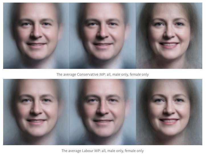
Average British Politicians
Technologist Giuseppe Sollazzo used machine learning to figure out what an average UK member of parliament looks like. The result: white, male and blue eyed. Think: a slightly feminine version of Nick Clegg.
if you average out the faces of all MPs from both parties you get near-identical disturbing smooth-cheeked automata https://t.co/y3od4Hv88n pic.twitter.com/SSZO6uaiDu
— James Vincent (@jjvincent) September 14, 2017
Font Turns Numbers into Graphics
London design studio After the Flood has created a font to make sparklines — tiny graphics that fit into a line of text to provide context of how a number has changed over time. The AtF Spark font can turn digits into bar graphs, line graphs and dot graphs.
font makes sparklines from numbers in text.
this – sorry pun – sparks a lot of ideas 🙂#datavizhttps://t.co/xuV4nbPytG pic.twitter.com/Ovd4F9ZR34— miska knapek (@miskaknapek) September 12, 2017
Seven Deadly Sins of Statistical Analysis
Data expert Heather Krause lists the seven common mistakes that occur in statistical analysis, including seeing causality in the wrong direction and ignoring potential external factors.
7 Deadly Statistical Analysis Sins You Need To Avoid @datassist: https://t.co/WD9IRoZU47 #dataviz #ddj #infographics pic.twitter.com/8yXXWHKmWN
— Alberto Cairo (@albertocairo) September 12, 2017
Prejudice: Urban Versus Rural
Zeit Online has a cool interactive feature on popular prejudices about urban city dwellers and rural villagers. They tackle beliefs such as: village residents meet friends more often when compared to city folks, the bigger the city the less likely one goes to church and that city dwellers have more likely spent time abroad.
nice datajournalistic narrativ on urban/countryside development in Germany https://t.co/YwXTL2NAe1 pic.twitter.com/FEMeMiyz3A
— miska knapek (@miskaknapek) September 13, 2017
Next Wave of Data Journalism (1)
Paul Bradshaw states that in just a decade, data journalism has settled down into familiar practices and genres, from the interactive map and giant infographics to the quick turnaround “Who comes bottom in the latest dataset” write-up. He argues that there is a need to move forward and that there are plenty of places to go.
The next wave of data journalism – open data, transparency, automation, algorithms, AI and bots. by @paulbradshaw https://t.co/ej48rhvU4O
— Mohammed Haddad (@haddadme) September 10, 2017
Next Wave of Data Journalism (2)
Paul Bradshaw looks at the role that computational thinking is likely to play in the next wave of data journalism — and the need to problematize that.
Computational thinking and the next wave of #DataJournalism https://t.co/Vr5jzuSBZ8 by @paulbradshaw pic.twitter.com/phkd76icAt
— BW Intl Media (@BWIntlMedia) September 18, 2017
The Fate of Tegel Airport
In 1996, the German government agreed to concentrate air transport in the capital region in a “single-airport concept” in Schönefeld and to take the inner-city airports Tempelhof and Tegel off the grid. Tempelhof was closed in 2008. Berliner Morgenpost analyzes whether Tegel supporters have a case for it to remain open.
Ja oder Nein beim #TXL-Volksentscheid? Der Tegel-O-Mat der @morgenpost hilft. https://t.co/4DsruNawuT #ddj
— C.Erdmann / Berlin (@carsten_erdmann) September 11, 2017
Designing Better Dataviz
Data expert Alberto Cairo reminds data journalists to produce graphics that are actually informative and useful for the general public — and not for the data visualization community.
New post: A conversation about designing better #dataviz —and spotting misleading ones https://t.co/7NqoWfN592 #ddj #infographics pic.twitter.com/EQoi0TELiS
— Alberto Cairo (@albertocairo) September 12, 2017
Data Needs Context
Alberto Cairo shows how presenting a single data point is meaningless without context. Chart updated with a suggestion by Andrew Losowsky.
4) I’ll to plug this again; it’s related: Numbers mean nothing on their own https://t.co/mYsqKeJZtN updated with a suggestion by @losowsky pic.twitter.com/gfDRMGVHJG
— Alberto Cairo (@albertocairo) September 16, 2017
German Election Postmortem
This should be fun. Data visualization teams from several German newsrooms will be gathering on October 4 to present their German election dataviz projects and answer questions. Expect Berliner Morgenpost and Tagesspiegel among others.
Wahlnachbesprechung aus Datenjournalimussicht am 4. Oktober. https://t.co/0BZvSRvdaL
— didumdida (@didumdida) September 18, 2017
Thanks, once again, to Marc Smith of Connected Action for gathering the links and graphing them.
For a look at Marc Smith’s mapping on #ddj on Twitter, check out this map.


Basic Data Journalism Tips for Editors

My Favorite Tools: Venezuela’s Lisseth Boon on Design and Data Visualization

Document of the Day: Visual Vocabulary

GIJN Guide to Investigating Foreign Lobbying

From Data to Storytelling: Concept and Design Tips from the Financial Times’ John Burn-Murdoch

Data Don’ts: Expert Tips to Avoid Misleading Audiences With Numbers

How The Pudding Used Data Visualizations to Recontextualize the Story of Climate Change

How Data Journalism Is Changing the Face of Africa

This work is licensed under a Creative Commons Attribution-NoDerivatives 4.0 International License
Republish our articles for free, online or in print, under a Creative Commons license.
Republish this article
This work is licensed under a Creative Commons Attribution-NoDerivatives 4.0 International License
Read Next
Data Journalism
From Data to Storytelling: Concept and Design Tips from the Financial Times’ John Burn-Murdoch
The chief data reporter for the Financial Times discusses how he considers the use of text, color, and annotation to aid visual storytelling through charts and graphics.
Data Journalism
Data Don’ts: Expert Tips to Avoid Misleading Audiences With Numbers
At a NICAR 2025 panel, data journalism experts discussed nuanced number errors that watchdog reporters often make that can confuse readers and disrupt story angles.
Climate Data Journalism
How The Pudding Used Data Visualizations to Recontextualize the Story of Climate Change
What does climate change feel like? How will your city’s climate shift, 50 years from now? Data scientist Derek Taylor explains his latest piece.
Africa Focus Data Journalism
How Data Journalism Is Changing the Face of Africa
Data journalism in Africa has made a powerful impact, from holding leaders accountable to refuting myths around domestic violence. But the field faces formidable challenges.