
Step-By-Step Guide for Journalists on the Basics of Google Sheets

Tipsheet for Using Ocean Data in Your Investigations

No Coding Required: A Step-by-Step Guide to Scraping Websites With Data Miner

GIJC23 – The Future of Data Journalism: New Analytical Tools, Data Visualization, and AI
 One of the most important takeaways from the NICAR conference — in my opinion — is the understanding that data stories can be simultaneously confusing and exciting. While I was there, I led a presentation on the importance of data biographies, and I’d like to share some of what I talked about with you.
There are many experts out there with years or decades of experience producing fascinating data stories and there are just as many (okay, probably many more) people still learning how to use data and experimenting with data journalism. When I’m introducing students to the world of data analysis and visualization, I’m often asked what the most important step in working with data is, and my answer is always the same: developing data biographies.
Too often, inexperienced data users make the mistake of taking their data at face value — assuming the story they see at first glance is the true (and only) story the data has to tell. I like to encourage people to treat data the way they would a human source. You’d never write a story without researching the person who supplied your information — why treat data any differently?
Getting to Know Your Data
For every piece of data you’re going to include in your story, you need to create a data biography — the background, or origin of your data. Just as you’d do a background check on a human source before publishing what they told you, you need to understand your data:
- Where did it come from?
- Who collected it?
- How was it collected?
- Most importantly, why was it collected?
This task is not always as straightforward as it may look at first blush. But getting to know your data can reveal crucial gaps, bias, misinformation, or overlooked details in your story. Think about it this way: if a doctor told you that you needed more sugar in your diet, you might assume there was some medical reason for his suggestion. If a candy apple salesman told you the same thing, you’d probably perceive the information very differently. Likewise, data isn’t just about the numbers in front of you, but the story behind how those numbers got there in the first place.
Real World Example: Violence Against Women Stats
A while ago, our team was working on a data story about violence against women. We spent a bit of time searching for data sources and determined that the United Nations was a good starting point. We downloaded the UN’s data on both violence against women and intimate partner violence and started our analysis.
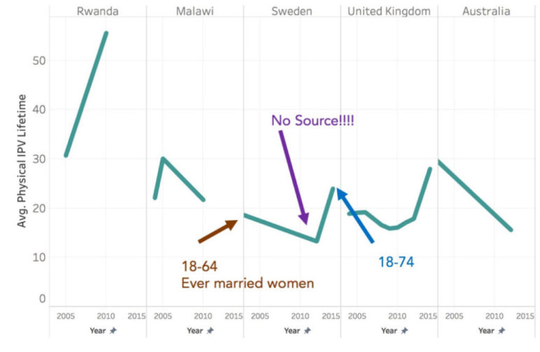
Examining the variable for intimate partner violence over a woman’s lifetime, we did a couple of quick plots to get an idea of what trends within various countries looked like:
 Trends in some countries were surprising and indicated unusual changes in the rates of violence against women. We wondered what was happening.
 Our logical first step after our quick glance at the data was to create data biographies for each of these points. We needed to know the background of the information we were looking at so that we could better understand the patterns we were seeing.
Data Biography: Where?
In this case, the first thing we noticed in our data was where the information was coming from. Some of the data reflected all women, some reflected only women of a certain age, and some only included women of a specific marital status. All this data was lumped together in the same variable — the same name, the same label, and no hint as to the differences in the data sources.
 Data Biography: Who?

Next, we looked at who collected that data. Examining the UN’s documentation to complete our data biography revealed that a wide range of people and organizations had been involved in collecting the data contained in this variable.
Data Biography: How and Why?
Some of the parties collecting the data we were using had gathered it for national statistics purposes; some were advocates making a case; some were testing out new methodology. All of our data, collected using different methods and for different reasons, was presented in the same table, with the same variable name and the same labels. Had we not taken the time to get to know our data with a data biography, we would never have realized how different all these data points were.
 Once we had completed our data biography, it became clear that some of the trends we had seen that looked like significant changes in violence rates were actually variations in the data collection.


Using our data biography, we determined that data collection in Rwanda was reasonably consistent across the years. Because we were confident the trends we saw in that data were actually happening, we could move forward in investigating what caused such a dramatic spike in violence against women there.
Interestingly, in the years shown above, Rwanda elected a majority female parliament and passed the country’s first-ever laws aimed at preventing violence against women. So what did that mean?
Was there a huge backlash against the government changes that drove up violent acts?
Or were more incidents of violence being reported now that women felt they had recourse?
Even with a good data biography, you’ll still have to take care in interpreting your data — we’ll talk more about that in our next post on bulletproofing your data.
Data Isn’t Always Objective
Those of you who participated in the free online data journalism course I led with Alberto Cairo recently may remember this clip explaining how to create a data biography:
Remember, by taking the time to create a data biography, you can tell your story with full confidence that your sources are accurate and trustworthy. Want a shortcut to creating quality data biographies? Download a free copy of our data biography template.
 This post originally appeared on the website of Datassist and is cross-posted here with the author’s permission.
Heather Krause is a data scientist. She founded Datassist, an international team of data professionals, which provides data consulting to journalists, non-profits and policy makers worldwide.
Step-By-Step Guide for Journalists on the Basics of Google Sheets
Tipsheet for Using Ocean Data in Your Investigations
No Coding Required: A Step-by-Step Guide to Scraping Websites With Data Miner
GIJC23 – The Future of Data Journalism: New Analytical Tools, Data Visualization, and AI

This work is licensed under a Creative Commons Attribution-NoDerivatives 4.0 International License
Republish our articles for free, online or in print, under a Creative Commons license.
Republish this article
This work is licensed under a Creative Commons Attribution-NoDerivatives 4.0 International License
Read Next

Data Journalism
One Name at a Time: How Die Zeit Built a Searchable Database of Nazi Party Members
An online tool set up by the German newspaper Die Zeit, in cooperation with archives in Germany and in the United States, allows people to search several million Nazi Party membership cards.
Data Journalism
How the Hindu Is Embedding AI Into Its Data Journalism
LLMs are quietly reshaping data journalism workflows at The Hindu, helping reporters process vast document sets, write scripts and build interactive tools.

Data Journalism
Developing a Data State Of Mind: Key Tips for Editors
Data is woven into how journalists cover everything from local government spending to global climate change patterns, but for editors without a specialist background, it can be daunting.

Data Journalism
2026 Sigma Awards for Data Journalism Open for Entries – Deadline Extended
The Sigma Awards celebrate the best data journalism from around the world. Submissions are now open for data projects published in 2025.