When Virtual Reality Meets Data Journalism
Isn’t the best journalism always immersive? Whether it’s Walter Kronkite’s journalistic take on history “You are There” from the 1950s or Declan Walsh’s mobile phone reporting from Syria in June, the best journalism makes you feel like you are part of the story. You care what happens.

Immersive Journalism: “What I Saw in Syria,” Declan Walsh’s moving portrayal in the New York Times.
Virtual Reality is a powerful tool in making journalism more immersive to its readers and increasingly it’s becoming an essential part of the journalist’s toolkit. There are great examples of reporters using VR, such as the work of VR pioneer Nonny de la Peña, The Guardian’s 6×9 exploration of solitary confinement, or the Berliner Morgenpost’s exploration of life as a refugee.
Data journalism has been slower to the party, not least because it presents unique challenges. But journalists and developers have begun to experiment. The Wall Street Journal’s Roger Kenny and Ana Asnes Becker’s Is the Nasdaq in another bubble? is a rollercoaster ride along the country’s economic history, using VR to tell the story. It’s a terrific piece of work and was shortlisted for the 2016 data journalism awards.
Besides Kenny and Becker’s work, to my knowledge no other major news outlet has yet produced a VR dataviz (let me know if I’ve missed one that you know of).
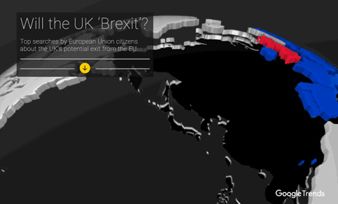
So when we made an interactive guide to the UK’s EU referendum, it seemed like an important opportunity to try out producing our own 360-degree data visualization. The United Kingdom voting on whether to stay in the European Union or to “Brexit” is a huge story across Europe, and we wanted a visualization which would simply illustrate the top questions being asked in each country on search.
We worked with Wes Grubbs and the team at Pitch Interactive to build the original interactive and coder Michael Chang to turn that into an immersive VR experience. It was an experiment: what would happen if we turned a straightforward data visualization into a VR experience? Is that even possible — and would anyone be able to understand it?
And this is the result. It’s also accessible via the ‘cardboard’ option at the bottom of the screen. By moving your head and looking around the visual, you can explore the top question being asked in each country.

I have a bit of experience of working with designers to create an immersive data experience. But this is different, instead of a large infinity cube we had the more infinite space of the world inside a smartphone screen.
Data journalism and advances in accessible technology go hand in hand: the reason that any data journalist can make a map now is that there are a load of easy to use map making tools available, for instance. VR isn’t in that world yet, with the onus on developers to push the technology to get it to do what they want. There are a few places to help you through this so far, including this comprehensive guide from the Google VR team to creating visuals for Cardboard here. It includes pretty much every detail you need to make sure the visuals work well in a 360-degree environment. There’s also this piece by Kenny, which offers a guide for developers wanting to create 360-degree dataviz.
What We Learned
VR brings its own challenges. Here is what we noticed in particular:
- There’s no room for lots of text, so you’re trying to do something simpler in a more complicated environment. The visual actually includes less data than the original. In fact, the more text you have, the more likely it is that you will make your viewers sick. And not making people feel sick is a key obsession of developers working with VR: you’re putting users in an alternate reality and if that reality doesn’t behave in predictable ways, then it can make people want to vomit, literally. It’s the equivalent of motion sickness.
- The viewer no longer needs to “click” or “tap” to demonstrate intent. But it also raised the question: how long should the viewer have to look at something to “activate” it? Also, our early prototype was giving us headaches (literally) until we realized that our virtual “eyes” were too far apart in the virtual world — as though the left eye were 10’ away from the right eye.
- It’s all about location. Movement in the virtual world can be disorienting, so we found it more effective to spread the information around the viewer. The Pitch team sketched Inception-like ways of bending maps, exploring laying out information in space as one would on a print page. Secondary “sidebar” information could be the area behind you, for example.
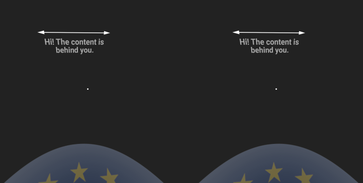
- Looking down is much more comfortable than looking up. So, look down in this and you see the European flag, to help ground the viewer (and provide a nice visual trick).
- Instructions can be helpful. Pitch’s Adam Florin describes the technology as “still a bit of a moving target, especially on mobile”. An incoming call produces a pretty disorienting experience, for example. This is such a new area, we felt it needed instructions. A screen tells you what to do and there are pointers to help you look in the right direction.
In visualization terms, this is a pretty “quick and dirty” project. Ideally you’d have months to put this together. But the Brexit vote is this Thursday, so we wanted to see if it was possible. Is this going to be how all data is visualized in a year’s time? Probably not. But 360-degrees reporting is increasingly a big consideration in all content produced by anyone.
VR is at an exciting stage where it could help take journalism in an entirely new direction. For the News Lab data team, it was something we wanted to try to help provide journalists with another tool in the data toolkit. Helping readers and users feel like, in Cronkite’s words, “You Are There” is what journalism is all about.
This story originally appeared on Simon Roger’s website and is reprinted under a Creative Commons license. You can hear more about using VR in data journalism in this interview with Partially Derivative.
 Simon Rogers is the data editor at Google’s News Lab. He is the author of “Facts are Sacred,” from Faber & Faber, and a new range of infographics for children books from Candlewick. He previously worked for The Guardian where he launched and edited the Guardian datablog.

Reporter’s Guide to Investigating Cryptocurrency

Tipsheet on Partnering with Civil Society Organizations and Non-Governmental Organizations

AI Accountability Reporting Guide

Guide to Mapping Analysis Using QGIS
Your 17 Favorite Tools for Journalism from 2017
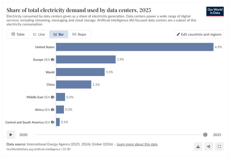
Global Data Center Energy Use, US Strike on Iran School, Russia’s Security Service Leaks, Portugal’s Ancient Trees

How to Make Investigations Matter More: A Q&A with the Authors of ‘The Guide to Impact Journalism’
The Power of ‘Positive Deviant’ Data Investigations: How Good Outliers Can Expose Systemic Misconduct or Policy Failure

This work is licensed under a Creative Commons Attribution-NoDerivatives 4.0 International License
Republish our articles for free, online or in print, under a Creative Commons license.
Republish this article
This work is licensed under a Creative Commons Attribution-NoDerivatives 4.0 International License
Read Next
Reporting Tools & Tips
Your 17 Favorite Tools for Journalism from 2017
Ren LaForme, the tool guy over at Poynter who runs their Try This! — Tools for Journalism newsletter, put together a list of his readers’ favorites from 2017. A quick, fun and helpful must read highlighting journalism tools from the Pipl app to FOIA Slack and a dirt cheap phone tripod.
Data Journalism Top 10
Global Data Center Energy Use, US Strike on Iran School, Russia’s Security Service Leaks, Portugal’s Ancient Trees
This latest Top 10 in Data Journalism column also highlights rising drug-related deaths in Berlin, heatwave fatalities in Europe, and Hong Kong’s rapidly aging population.
Distribution & Promotion
How to Make Investigations Matter More: A Q&A with the Authors of ‘The Guide to Impact Journalism’
In investigative journalism, many newsrooms have begun implementing an “impact strategy.” How can they do better and what is the goal?
Reporting Tools & Tips
The Power of ‘Positive Deviant’ Data Investigations: How Good Outliers Can Expose Systemic Misconduct or Policy Failure
One often overlooked approach for accountability reporting involves side-by-side comparisons between successful and failing institutions with near-identical resources.