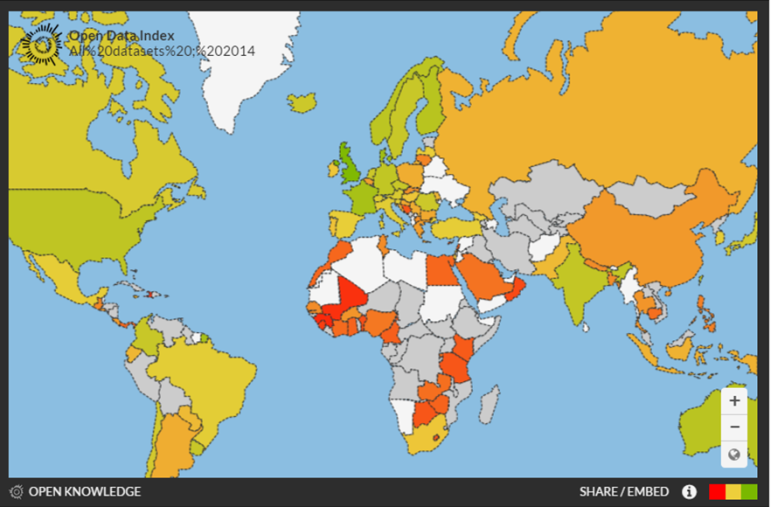
Global Open Data Index: Only 11% of Key Datasets Are Open
Open Knowledge, the UK-based nonprofit that focuses on unlocking data around the world, has released the latest version of its Global Open Data Index. The index attempts to make sense of the explosion in open government data portals, which have grown from just a handful three years ago to nearly 400 worldwide.
Open Knowledge surveyed ten key data sets that impact transparency, accountability, and key services to citizens:
- Transport timetables
- Government budget
- Government spending
- Election results
- Company register
- National map
- National statistics
- Legislation
- Postcodes/zipcodes
- Emissions of pollutants
The index began in 2013 with a review of open government data in 70 countries. That has now expanded to 97 countries, with special attention to countries of the Global South.
The data are downloadable and available country-by-country. You can map a single country or the entire globe (as above).
So how is the world doing on open data? Well, there’s good news and bad. The good: the number of entries and data sets is growing, and we’ve got a handy tool to measure that. The bad: only 11% of the datasets surveyed are deemed open by the index. In the fight for open data, there’s a long road ahead.

A snapshot of the world’s available data: the Global Open Data Index now ranks 97 countries.

A Call for Debate: Taking Open Data and Government to the Next Level

The Research Desk: Tips and Tools

GIJN Guide to Investigating Foreign Lobbying

Guide to Investigating Caste

Data Journalism Top 10: Measuring Mask Use, Parental Interruptions, Childbirth Woes, India’s Low Death Rate

Data Journalism Top 10: Bill Gates Conspiracies, COVID-19 Excess Mortality, Home Deaths Spike, Test Kits

Data Journalism Top 10: Viral Dataviz, DIY Masks, Breaking the Wave, China and US Response to COVID

GIJN’s Data Journalism Top 10: Women and the Oscars, February’s Sad Songs, Hollywood’s Franchises, Moscow’s Elite Owners

This work is licensed under a Creative Commons Attribution-NoDerivatives 4.0 International License
Republish our articles for free, online or in print, under a Creative Commons license.
Republish this article
This work is licensed under a Creative Commons Attribution-NoDerivatives 4.0 International License
Read Next
Data Journalism
Data Journalism Top 10: Measuring Mask Use, Parental Interruptions, Childbirth Woes, India’s Low Death Rate
How widespread is mask use in your country? Our NodeXL #ddj mapping from July 13 to 19 finds The New York Times mapping the odds of people encountering other mask wearers in the United States, two university professors quantifying the number of interruptions a parent suffers on average every hour while working from home, the Committee to Protect Journalists talking to data journalists about the struggles of reporting on COVID-19, and openDemocracy documenting cases of mistreatment of women in labor around the world since the pandemic started.
Data Journalism
Data Journalism Top 10: Bill Gates Conspiracies, COVID-19 Excess Mortality, Home Deaths Spike, Test Kits
Misinformation has grown ubiquitous during the COVID-19 pandemic, so much so that World Health Organization Director-General Tedros Adhanom Ghebreyesus proclaimed: “We’re not just fighting an epidemic; we’re fighting an infodemic.” Microsoft co-founder Bill Gates has emerged as a favorite target of disinformation actors, according to The New York Times, that we discovered through our NodeXL #ddj mapping from April 13 to 19. We also found The Economist and ProPublica examining the true impact of the pandemic by looking into “excess mortalities” such as home deaths, the Associated Press releasing and updating a coronavirus public dataset for the United States.
Data Journalism
Data Journalism Top 10: Viral Dataviz, DIY Masks, Breaking the Wave, China and US Response to COVID
From “flattening the curve” to “social distancing,” and now “breaking the wave,” the global data journalism community is using new terminology in its attempts to explain the intricacies of COVID-19 to the masses. Our NodeXL #ddj mapping from April 6 to 12 finds Reuters Graphics explaining their “breaking the wave” chart, The Washington Post helping readers figure out the best material to use to make their own masks, the Financial Times comparing the response of China and the United States in handling the pandemic, and Press Gazette highlighting the huge appetite for data-driven visual journalism about COVID-19.
Data Journalism
GIJN’s Data Journalism Top 10: Women and the Oscars, February’s Sad Songs, Hollywood’s Franchises, Moscow’s Elite Owners
What’s the global data journalism community tweeting about this week? Our NodeXL #ddj mapping from February 3 to 9 finds UOL highlighting the lack of gender equality among Oscar winners and G1 looking into problems of ageism in the Best Actress category. This edition also has The Economist analyzing Spotify data to find the most depressing month for listeners, Proekt Media investigating property owners in a prestigious residential area in Russia, and The Financial Times spotlighting the lack of innovation in the movie industry.