Data Journalism’s Top Ten


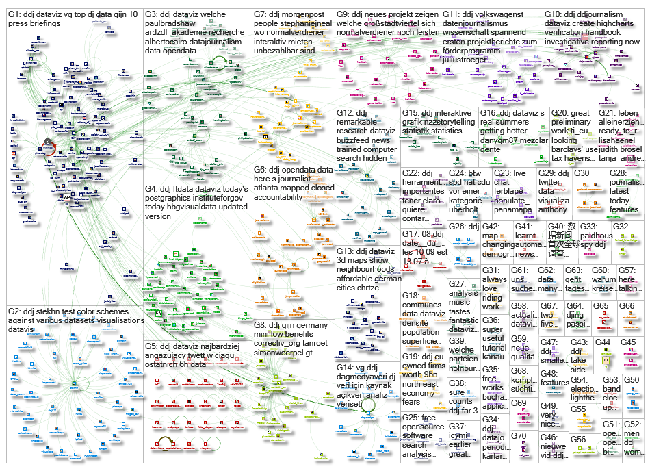
 What’s the global data journalism community tweeting about this week? Our NodeXL #ddj mapping from August 7 to 13 has @UpshotNYT plotting Game of Thrones characters in two dimensions, @paulbradshaw offering 10 principles for data journalism and data journalists at a @dagstuhl workshop with narrative patterns for data-driven storytelling.
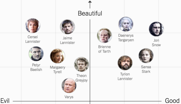
The Good, Evil, Ugly and Beautiful of Game of Thrones
Upshot NYT wants your help to plot the characters in Game of Thrones in two dimensions. Assess their overall goodness and their external beauty.
A great digital product from @UpshotNYT that has wider use beyond #GoT … e.g., feature prioritization for teams https://t.co/dN98ioPV2j
— peter bray (@petebray) August 14, 2017
Ten Principles for Data Journalism
Paul Bradshaw attempts to use Bill Kovach’s and Tom Rosenstiel’s journalism principles as the basis for a set of 10 principles for (modern) data journalism.
10 principles for #datajournalism in its second decadehttps://t.co/9gpUheLDEl #dj #ddj #vg #dataviz pic.twitter.com/STEtsp6C5A
— Pınar DağⓋ (@pinardag) August 8, 2017
Delve into data.world
A platform for people to discover and share cool data, connect with interesting people and collaborate on projects involving datasets.
Really awesome new feature from https://t.co/GQxllIWHGe! https://t.co/Haq0jy3Pns
— Shad Reynolds (@shadr) August 11, 2017
Narrative Patterns for Data-Driven Storytelling
This collection of cards came out of a 2016 workshop on data-driven storytelling in Dagstuhl, Germany. A group of data journalists investigated how data-driven stories work and came up with these cards, each representing a specific narrative technique, pattern or “trick” you can apply to effect flow, empathy and argumentation in a data story.
Narrative patterns for data-driven storytelling: https://t.co/Sfz0U8MK8p #dataviz #ddj pic.twitter.com/MDdCVl5ekM
— Steffen Kühne (@stekhn) August 7, 2017
Mapping Spy Planes
The US airspace is buzzing with surveillance aircraft for law enforcement and the military. BuzzFeed News trained a computer to find them.
Incredible: Journalists used machine learning to unmask secret surveillance flights inside the US. https://t.co/reXC2Jq3P7
— Edward Snowden (@Snowden) August 8, 2017
Test Your Dataviz Color Palette
Here’s a graphical user interface (GUI) for viewing, manipulating and choosing hue chroma luminance (HCL) color palettes.
Test your color schemes against various datasets and visualisations: https://t.co/klOsVmqAf2 #ddj #datavis #rstats pic.twitter.com/sgLQTfczvv
— Steffen Kühne (@stekhn) August 8, 2017
Ethnographer: Design Job of the Future
What is a data ethnographer and why is it poised to become so important? Fast Company has some thoughts on this.
Data ethnography is the #design job of the future according to @FastCoDesign Here’s what you should know https://t.co/LKsDZR0mbA
— tvasilchik (@tvasilchik) August 7, 2017
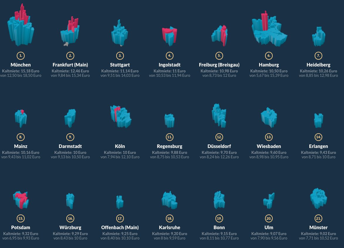
Dataviz: Germany’s Rising Rents
Interactive visualization of rental prices in German cities, which are on the rise. Many quarters are now unaffordable for average income earners.
As an average earner you can’t afford to live in some of these neighborhoods. https://t.co/L4jK4NN8Vn #ddj pic.twitter.com/RTRfbcNP6g
— Julius Tröger (@juliustroeger) August 7, 2017
Data Journalism Portfolio of Trinity Mirror
Trinity Mirror says data journalism is not a fad nor or a ghetto but rather mainstream journalism that must be widely accessible and lead the “most read” news lists.
The Trinity Mirror Data Unit – what we do and how we do it https://t.co/ul38qgEOcZ pic.twitter.com/smePypzldB
— David Ottewell (@davidottewell) March 9, 2017
German Weather Open Data
The German Meteorological Department is making its weather data public.
Der DWD stellt jetzt einen Teil der Wetterdaten als #opendata zur Verfügung: https://t.co/licH3PmlWC #DDJ #Recherche
— ARDZDFmedienakademie (@ARDZDF_Akademie) August 13, 2017
Thanks, once again, to Marc Smith of Connected Action for gathering the links and graphing them.
For a look at Marc Smith’s mapping on #ddj on Twitter, check out this map.

This work is licensed under a Creative Commons Attribution-NoDerivatives 4.0 International License
Republish our articles for free, online or in print, under a Creative Commons license.
Republish this article
This work is licensed under a Creative Commons Attribution-NoDerivatives 4.0 International License
Read Next
Data Journalism
GIJN’s Data Journalism Top 10: Racing Snails, Presidential Gifts and Berlin’s Building Blocks
What’s the global data journalism community tweeting about this week? Our NodeXL #ddj mapping from May 21 to 27 finds @nigelblue’s wildly humorous infographic book about crazy competitions across the globe, @Data_Match breaks down the list of gifts given to the president of the United States by foreign leaders and @FinancialTimes looks into the pressures Antarctica faces.

Data Journalism News & Analysis
From Space to Story in Data Journalism
Over the past 10 years satellite imagery has become an important component of data journalism. In the next 10, it will likely evolve further, from a tool used primarily for illustrating stories to an integral part of research and investigative reporting.

Data Journalism
10 Outstanding Data Projects Win the 2024 Sigma Awards
There were 52 data journalism entries from 22 countries in shortlist for the 2024 Sigma Awards. Here are the top 10 winning projects.
Data Journalism Methodology
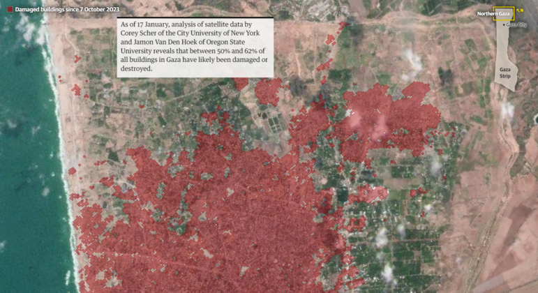
Mapping Conflict: Using Satellite Radar Data to Track the War Damage in Gaza
Gaza’s urban landscape has changed profoundly since the start of Israel’s military campaign. Researchers Jamon Van Den Hoek and Corey Scher have been mapping the impact.