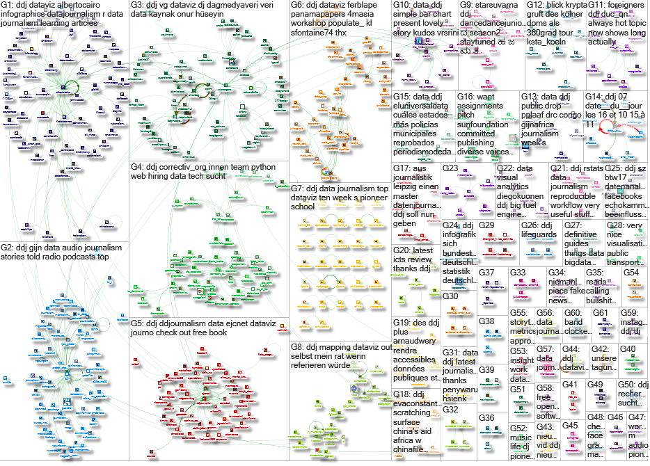
Top Ten #DDJ: This Week’s Top Data Journalism


What’s the global #ddj community tweeting about? Our NodeXL mapping from July 10 to 16 has Dwarshuis on the Airbnb takeover of Amsterdam, @blprnt on taking a systems approach to data and @SPIEGELONLINE and @Correctiv_org on Big Pharma’s payments to doctors.
Watch Airbnb Take Over Amsterdam
Dwarshuis illustrates the Airbnb phenomenon in Amsterdam since the company launched, with a dot showing the first time an apartment was rented out in the city, along with the name of the owner.
Scary visualisation of the .@airbnb‘ation of #Amsterdam https://t.co/i5f13IuOrd pic.twitter.com/u3XbuCVv1b
— Padraig O’Mara (@beyourownreason) July 16, 2017
You Say Data, I Say System
@blprnt says taking a systems approach to data thinking allows you not only to solve problems more efficiently, but to more deeply understand (and critique) the data machinery that ubiquitously affects our day-to-day lives.
“You Say Data, I Say System” by @blprnt https://t.co/zGBfYugfP2
— Melissa Zeligman (@mellyzelly) July 18, 2017
On Big Pharma’s Payroll
In 2016, the pharmaceutical industry paid €562 million to physicians and clinics, with only a quarter of all doctors reporting these revenues openly, reported @SPIEGELONLINE and @Correctiv_org.
2016 hat die Pharmaindustrie 562Mio€ an Mediziner & Kliniken gezahlt. Nur jeder vierte Arzt legt die Zahlungen offen https://t.co/l5bTnolCTJ pic.twitter.com/Sf6gB2rXaM
— SPIEGEL ONLINE (@SPIEGELONLINE) July 14, 2017
Cologne: Inside the Archbishop’s Crypt
Germany’s Kölner Stadt-Anzeiger offers a 360 view inside Archbishop Joachim Cardinal Meisner’s last resting place in the Cologne Cathedral.
Kardinal #Meisner wird in der Gruft im Dom beigesetzt: Unser 360-Grad-Video zeigt, wo genau. #Köln #KölnerDom https://t.co/JkLDROhgWH
— ksta.de/koeln (@ksta_koeln) July 13, 2017
In Mapping, Size Matters
Bigger areas on maps can overshadow the smallest ones, leading us to make false assumptions about the underlying data. @MusMekh shows how to better represent your data.
A trick from @MusMekh to help your #maps accurately represent your #data: https://t.co/9ZjjdeIl3F #ddj @ejcnet pic.twitter.com/qNdcViiGu7
— DataDrivenJournalism (@ddjournalism) July 10, 2017
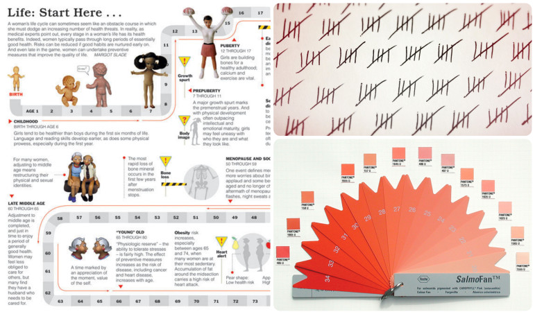
Data Viz: The Book
Data Visualization for All is an open-access textbook which provides a friendly introduction to data visualization, with step-by-step tutorials, video screencasts and real-world examples. Featured tools include Google Sheets, Tableau Public, Carto, Highcharts, Leaflet and GitHub.
Check out this free book and online course for a friendly introduction to #dataviz: https://t.co/BhPYc0x9Nt #ddj @ejcnet pic.twitter.com/8jZvJpOag4
— DataDrivenJournalism (@ddjournalism) July 16, 2017
Data Journalism Grows, But Essential Training Doesn’t
Data journalism is attracting younger reporters who have undergraduate degrees but little training in data-oriented fields like statistics and coding, the Global Data Journalism survey found.
International #datajournalism study finds the field is growing, but training in statistics and coding is not: https://t.co/zcHSmg3XGF pic.twitter.com/MXTXJhYvXh
— Society of Pro Journ (@spj_tweets) July 17, 2017
By the Numbers: Immigrants in Switzerland
Using data provided by the Federal Statistical Office to the National Centre of Competence in Research for migration and mobility studies, @swissinfo_en retraced 15 years of migratory movements of foreigners who arrived in Switzerland in 1998.
Nice article based on our Migration-Mobility Indicatorshttps://t.co/lt0bs1aYaI
— nccr – on the move (@nccr_onthemove) July 17, 2017
Visualizing Geographic Data in R
This post by @NickDoesData focuses on using the R visualization package ggplot2, which is found in the tidyverse package.
Check out my latest blog: Visualizing Geographic Data in R https://t.co/LzsD9dE4Vs
— Nick Heitzman (@NickDoesData) July 12, 2017
More R: Packages for Interactive Plots and Visualizations
@AntGuilllot shows the best packages for network and graph data, sequential data, hierarchical data and textual data.
ICYMI, feat. lots o’ @timelyportfolio: “A pick of best R ?s for interactive viz” by @AntGuilllot https://t.co/6sgT7u5ofx #rstats #dataviz pic.twitter.com/22XCgmugRF
— Mara Averick (@dataandme) July 15, 2017
Doing Data Journalism for Audio
@paulbradshaw offers up examples from his MA in data journalism at Birmingham City University to give you inspiration for telling data stories using audio.
Data journalism on radio, audio and podcastshttps://t.co/JUKZeowcNl
— IRPI (@irpinvestigates) July 16, 2017
Thanks, once again, to Marc Smith of Connected Action for gathering the links and graphing them.
For a look at Marc Smith’s mapping on #ddj on Twitter, check out this map.

This work is licensed under a Creative Commons Attribution-NoDerivatives 4.0 International License
Republish our articles for free, online or in print, under a Creative Commons license.
Republish this article
This work is licensed under a Creative Commons Attribution-NoDerivatives 4.0 International License
Read Next

Data Journalism News & Analysis
From Space to Story in Data Journalism
Over the past 10 years satellite imagery has become an important component of data journalism. In the next 10, it will likely evolve further, from a tool used primarily for illustrating stories to an integral part of research and investigative reporting.

Data Journalism
10 Outstanding Data Projects Win the 2024 Sigma Awards
There were 52 data journalism entries from 22 countries in shortlist for the 2024 Sigma Awards. Here are the top 10 winning projects.

Data Journalism Data Journalism Top 10
Trump’s Disappearing Donors, Tracking the Mars Rover, and the Ongoing Wars in Gaza and Ukraine
Our column of the best in data journalism also features stories on AI’s ability to forecast the weather, analyzing the Argentine president’s Tweetstorms, and apathetic EU voters.

Data Journalism
Updating the Inverted Pyramid of Data Journalism
Data journalist and instructor Paul Bradshaw has updated the Inverted Pyramid of Data Journalism — and brought together resources for every stage.