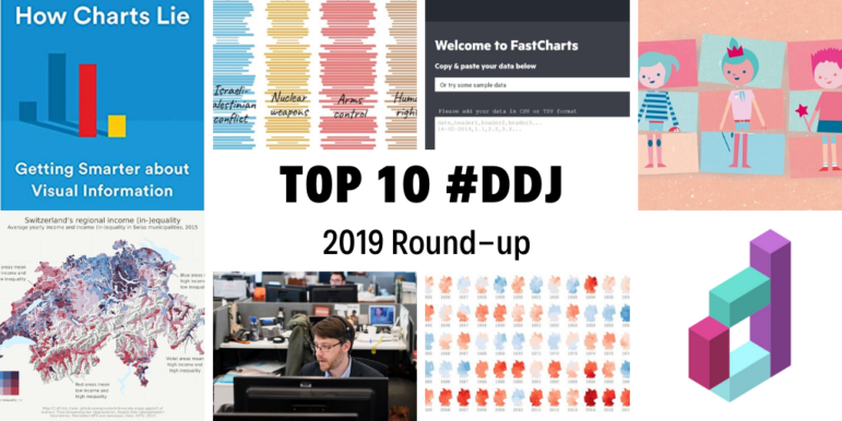
Accessibility Settings

color options

monochrome muted color dark

reading tools

isolation ruler

Topic

Data Journalism

649 posts

Resource Tipsheet

Visualizing Data

Once you’ve done your analysis, you may want to create graphs, charts, or maps to display your results. Here are some resources to help you display your data in visually appealing, reader-friendly formats. Flowing Data offers a plethora of tutorials that will help you visualize your data. You’ll learn how to make cartograms, upset plots, […]

Resource

Using R

R is a popular programming language most commonly used for data cleaning, statistics, and data visualization. Both the R program and R-Studio are open source. Below are some books and online resources to get you started. Many of the online vendors listed under “Training Courses” offer free or low-cost classes in R. Datajournalism.com offers this […]

Resource

Mapping

If you have a dataset involving geographic locations, these tools and tipsheets can help you analyze your data using maps. The most commonly used mapping programs in newsrooms are ArcGIS from Esri (which has free options for journalists) and the open-source program QGIS. Some also are useful for visualizing, but we’ve added a separate list […]

Resource Tipsheet

Analyzing Data – Python

Python is one of the most popular programming languages for data journalists, and it is useful for scraping websites as well as cleaning and analyzing data. Here are some resources for learning to code in Python.  A Byte of Python is an online book dedicated to the basics of Python. It is targeted at those […]

Resource Tipsheet

Analyzing Data – SQL

SQL is a commonly used language for working with databases. It is particularly useful for working with larger datasets that can bog down Excel and for joining separate datasets for analysis. Several open-source versions are used in newsrooms, including Postgresql and DB Browser for SQLite.  Here are some tips on how to get started. This […]

Resource Tipsheet

Analyzing Data – Spreadsheets

Spreadsheets often are the first data tool journalists learn to use. They come in handy for cleaning and analyzing data in structured formats such as .csv files. Microsoft Excel and Google Sheets are the most commonly used spreadsheets. Below are some resources to help you navigate Excel and improve your spreadsheet skills. Data Journalism Training: […]

Resource Tipsheet

Tools for Scraping, Cleaning, and Prepping Data

Got dirty data or pesky PDFs? These programs can help you get your data into a format you can use. OpenRefine is a free tool for exploring, cleaning, and matching data. It is particularly useful for dealing with messy data. It is available in English, Chinese, Spanish, French, Russian, Portuguese (Brazil), German, Japanese, Italian, Hungarian, […]

Resource Tipsheet

Prepping Data – Tips

Once you have your data, check out these free online tipsheets and tutorials for advice on how to inspect and clean it before you start analyzing. This story is a great example of what to do when there are gaps in terms of the data available from official bodies (2021). Data Biographies: How to Get […]

Resource Tipsheet

Getting Data – Using Open Records Laws

Government bodies often have mechanisms that allow journalists and members of the public to request data and documents. Below are some resources to help you understand the public records laws where you live and draft successful records requests. The National Freedom of Information Coalition is a US nonprofit organization that has a guide to international […]

Resource Tipsheet

Data Journalism Conferences

These conferences can provide opportunities to network, learn new techniques, and discuss story ideas with fellow data journalists. The Centre for Investigative Journalism Summer Conference includes sessions on data journalism from leading practitioners. Data Harvest is held in conjunction with the European Investigative Journalism Conference. The next one is scheduled for 19-22 May 2022 in […]

Resource

Getting Started – Tip Sheets

If you’re new to data journalism, these free online materials can help you get your bearings. Read this 2022 big list of data journalism tools and resources by GIJN’s Alastair Otter. What data journalists should know about building custom AI models, by Jeremy Merrill and the Columbia Journalism Review. Collaborative Data Journalism Guide This 2019 […]

Resource Tipsheet

Getting Started – Books

Data journalism is a perpetually evolving topic. GIJN’s resource pages are updated regularly with new material. Data + Journalism – A Story-Driven Approach to Learning Data Reporting by Mike Reilley and Samantha Sunne (to be published in 2023). At the GIJC19 conference in Hamburg, attendees heard the presentation: Latest Data Journalism Trends From AI to […]

Resource

Scraping Data 

Scraping refers to using a tool or writing a program that automatically pulls data from a website. Below are some resources for learning to scrape data from websites, no matter what your comfort level with coding. This chapter from The Data Journalism Handbook 1 includes tips for scraping and some code examples. Journocode (2019) offers a […]

Data Journalism

GIJN’s Data Journalism Top 10: 3D Animation, Brexit Borders, Bad Research, NY Subway

What’s the global data journalism community tweeting about this week? Our NodeXL #ddj mapping from September 2 to 8 finds Folha de São Paulo’s beautiful 3D animation of the Brazil National Museum’s restoration efforts, Guardian’s real-time visualization of Irish border crossings, NZZ’s look at China’s bad research impacting scientists worldwide, and The New York Times calculating the variability of New York City’s subway commute times.

Data Journalism

GIJN’s Data Journalism Top 10: Zero Privacy, Hurricane Maps, Water Stress, Russian Judges

What’s the global data journalism community tweeting about this week? Our NodeXL #ddj mapping from August 26 to Sept 1 finds The New York Times examining the massive amount of digital trackers that follow an individual’s web activity, The Washington Post looking at the stress on global water resources, Data Visualization Society announcing the first #VizRisk challenge winners, and Datajournalism.com sharing tips on how journalists can learn to code.

Data Journalism

GIJN’s Data Journalism Top 10: Burning Amazon, Mass Shootings, Hungarian Kings

What’s the global data journalism community tweeting about this week? Our NodeXL #ddj mapping from August 19 to 25 finds Bloomberg mapping the alarming degradation of the Amazon rainforest, Alyssa Fowers discussing variations in visualizing mass shootings and their corresponding impact on readers, Data Carpentry sharing tips for organizing data in spreadsheets, and Atlatszo visualizing the succession of Hungarian kings.

Data Journalism

GIJN’s Data Journalism Top 10: Data Complexity, Forking Paths, Post-Brexit

What’s the global data journalism community tweeting about this week? Our NodeXL #ddj mapping from August 12 to 18 finds information designer Giorgia Lupi discussing how to embrace data complexity, The New York Times Opinion building a forking path visualization to predict an individual’s political leanings, the Guardian visualizing Brexit’s potential impact on the UK’s food imports, and El Universal Mexico looking at the incidences of crime claiming young victims.

Data Journalism

GIJN’s Data Journalism Top 10: Tarantino’s Swearing, TheyDrawIt Tool, Climate Crisis

What’s the global data journalism community tweeting about this week? Our NodeXL #ddj mapping from August 5 to 11 finds Spiegel Online analyzing the typical features in Quentin Tarantino’s films, MU Collective releasing an interactive “TheyDrawIt” tool to engage and educate readers, and the conversation on the climate crisis heating up — with 101 East Al Jazeera looking into Cambodia’s deforestation, Neue Zürcher Zeitung analyzing Switzerland’s forest fires, and the Financial Times digging into the impact of jet streams on the climate.

Data Journalism

GIJN’s Data Journalism Top 10: Visualizing Climate Change, Numbers from Phrases, Democratic Donors, Moscow Money

What’s the global data journalism community tweeting about this week? Our NodeXL #ddj mapping from July 29 to August 4 finds a number of articles related to the climate crisis, including the BBC’s piece on tree planting and its interactive tool on temperatures across the world, as well as Alberto Cairo’s blog post on misleading charts created by climate deniers. We also found useful tips and tools: a data GIF maker by Google News Initiative, Datajournalism.com’s strategies for teaching data journalism, and Paul Bradshaw’s tutorial on how to extract numeric data from phrases.

Data Journalism

GIJN’s Data Journalism Top 10: Hong Kong Protests, Migration Waves, Democratizing Dataviz

What’s the global data journalism community tweeting about this week? Our NodeXL #ddj mapping from July 22 to 28 finds The New York Times analyzing the catalyst behind Hong Kong’s recent protests, National Geographic visualizing human migration in the past 50 years, Ellery Studio’s fun and informative renewable energy coloring book, and The Economist’s findings that Hillary Clinton could have won the 2016 US election if all Americans had turned up to vote.

Data Journalism

GIJN’s Data Journalism Top 10: Amazon.com, the Menstrual Cycle, Canadian Sex Crimes, Nonsensical Diagrams

What’s the global data journalism community tweeting about this week? Our NodeXL #ddj mapping from July 8 to 14 finds BBC News analyzing Afghan election results as well as graphing the milestones of the 25-year-old Amazon empire, Federica Fragapane visualizing the female menstruation cycle for Scientific American, and Bloomberg taking a closer look at China’s domination of the South China Sea. We also have a fun piece by Alberto Cairo on nonsensical diagrams.

Data Journalism

GIJN’s Data Journalism Top 10: The NYT’s Data Curriculum, Space Junk, Parents vs. Non-Parents

What’s the global data journalism community tweeting about this week? Our NodeXL #ddj mapping from June 17 to 23 finds Federica Fragapane visualizing space debris and their distance from earth, The New York Times open-sourcing its in-house data curriculum, Nathan Yau visualizing what time is lost for people once they have children, and Guns & America quantifying gunshot incidents within 300 meters of Washington, DC schools.

Data Journalism

GIJN’s Data Journalism Top 10: Ring of Fire, Political Dynasties, Data Janitors, Hong Kong Protests

What’s the global data journalism community tweeting about this week? Our NodeXL #ddj mapping from June 10 to 16 finds a gorgeous series of data visualizations by National Geographic on the Ring of Fire, Bloomberg analyzing the influence of dynasties in the Philippines’ politics, RStudio’s Hadley Wickham talking about why you shouldn’t assign data cleaning to a “data janitor,” and BR Recherche looking at the complexity of privacy policies.

Data Journalism Reporting Tools & Tips

Six Lessons From Reporting “Heartbroken”

Every investigative journalist encounters moments of doubt. Neil Bedi, an investigative reporter at the Tampa Bay Times, shares the set of rules his team followed to survive the toughest reporting challenges while reporting their Pulitzer-nominated series “Heartbroken.”

Data Journalism

GIJN’s Data Journalism Top 10: Avengers on the Move, Nonprofit Tax Filings, Visualizing Uncertainty

What’s the global data journalism community tweeting about this week? Our NodeXL #ddj mapping from June 3 to 9 finds @sto3psl mapping places the Avengers visited in Europe, @fedfragapane visualizing which elements in the periodic table are in danger of running out, @srfdata highlighting the top worries of the Swiss and @propublica doing researchers and journalists a huge public service by making 3 million US nonprofit records text-searchable.

Data Journalism

GIJN’s Data Journalism Top 10: European Election, Data via Audio, Tax Fraud & Parserator

What’s the global data journalism community tweeting about this week? Our NodeXL #ddj mapping from May 27 to June 2 finds immense buzz around the recent European Parliament elections, with @SZ explaining the EU political landscape, @morgenpost looking at the results in Berlin, and @journocode collecting data journalism pieces related to the election. There’s also @datajournalism’s tips on presenting data through audio and @BIRNSrbija’s data investigation into major corporate tax fraud in Serbia.