Accessibility Settings

color options

monochrome muted color dark

reading tools

isolation ruler

Tag

visual journalism

5 posts

Data Journalism

Data Journalism Top 10: Climate Migrants, COVID Testing Disparities, Outbreak Epicenters, Brazil’s Military

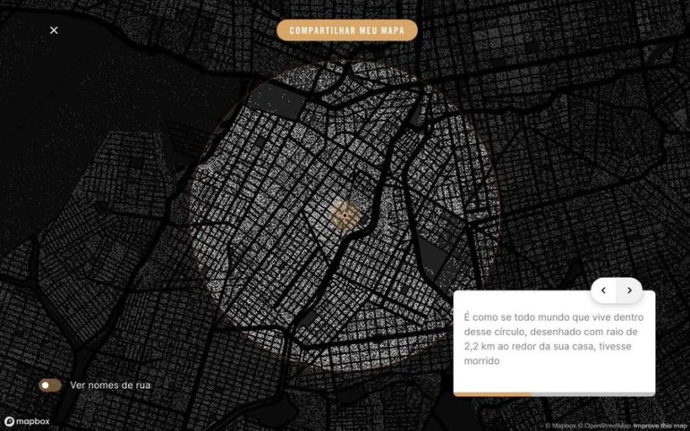
In the midst of the pandemic, some newsrooms haven’t forgotten about the issue of climate change. Our NodeXL #ddj mapping from July 20 to 26 found ProPublica partnering with The New York Times Magazine to examine climate migration and where climate refugees are moving to. On the COVID-19 front, FiveThirtyEight revealed the disparities in the availability of testing sites between Black and Hispanic neighborhoods and white areas, broadcaster RBB highlighted that the risk of coronavirus was more keenly felt by low-income earners, and the Google News Initiative and Agência Lupa communicated the impact of the coronavirus by visually putting readers at the epicenter of an outbreak.

Reporting Tools & Tips

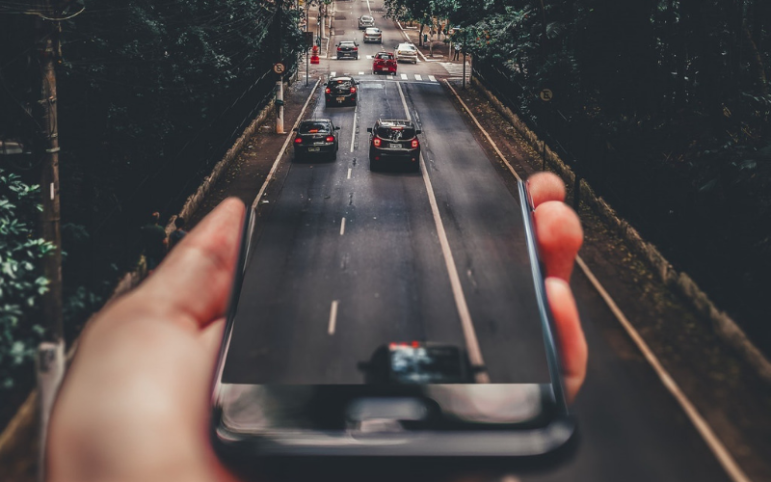
9 Types of Visual Storytelling on Mobile

In September 2017, the lead producer for the BBC Internet Research & Future Services, Tristan Ferne, identified 12 different story formats used in digital news. With new formats constantly emerging, Emma-Leena Ovaskainen, a visual journalist for Finland’s biggest daily newspaper Helsingin Sanomat, has modified the list and made her own additions.