How They Did It News & Analysis
How They Did It: Collaborating Across a Continent on Latin America’s Untold Migrant Stories
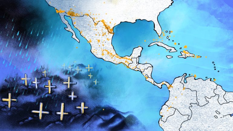
In the project Migrantes de otro mundo — Migrants from Another World — a team of more than 40 journalists in more than a dozen countries decided to collaborate to tell the untold story of the migrants from Asia and Africa who travel through Latin America each year. As the creators of the project put it: “By its wandering nature, migration is a story that can only be properly told through collaboration.”