Accessibility Settings

color options

monochrome muted color dark

reading tools

isolation ruler

Tag

Germany

25 posts
Pandora Papers image 2

Data Journalism

Data Journalism Top 10: Pandora Papers, Data Podcasts, and COVID-19 in Scottish Care Homes

Tracking the most popular data journalism stories on Twitter from September 27 to October 3, we found a series of articles based on discoveries from the Pandora Papers offshore leak. In this edition, we also feature reporting on the damage caused by the eruption of the volcano on La Palma, data journalism podcasts, and a roundup of the German election results.

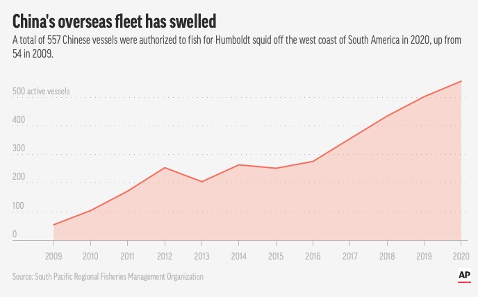
China's Secret Fishing Fleet

Data Journalism

Data Journalism Top 10: China’s Vast Fishing Fleet, Europe’s Internet Speed, Afghan Resources, and US Murders Rate

Tracking the most popular data journalism stories on Twitter from September 20 to September 26, using NodeXL mapping and our own human curation, we found investigations into burning oil in the Greek islands and heat-related deaths in German cities. In this edition, we also feature an exclusive story about China’s vast, secretive fishing fleet, a look at the US arms race, and an analysis of suspicious anomalies in the recent Russian election results.

Data Journalism

Data Journalism Top 10: Merkel’s Legacy, Russia’s Politics, Korea’s Missiles, Melting Ice Archives

Tracking the most popular data journalism stories on Twitter from September 13 to September 19, using NodeXL mapping and our own human curation, we found projects by Reuters and the German newspaper Morgenpost analyzing Merkel’s legacy in numbers. In this edition, we also feature a story looking into North and South Korea’s missile programs, a piece on school segregation in the United States, and more worrying climate change revelations.

Data Journalism

Data Journalism Top 10: The Taliban’s March, Border Walls Quadruple, Kenyan Corruption, White Men Like the Office

Two decades after US-led troops invaded Afghanistan to topple the Taliban regime, the organization has retaken control of the country. Our NodeXL mapping from August 9 to 15, found an animated map by the Financial Times showing how the Taliban captured various districts across the country before surging into the capital Kabul earlier this week. In this edition, we also feature an investigation into America’s diabetes crisis by Reuters, a look into Lionel Messi’s legacy at Barcelona by The Economist, and a piece on the history of data journalism by the Guardian.

Data Journalism

Data Journalism Top 10: Climate Disasters, Olympic Running, Russian Healthcare, and Bulgarian Coal Plants

Our weekly project that maps the most popular data journalism stories on Twitter found several environmental projects this week, including a climate disaster in Germany, air pollution in South Asia, and deforestation in Brazil. We also feature more data-driven coverage of the Tokyo Olympics, an investigation into Bulgarian coal plants, and a guide to creating appealing data visualizations based on simple charts.

Data Journalism

Data Journalism Top 10: Tokyo Olympics, Sand Mining, Elder Care, Russia’s Forests, TikTok’s Algorithm

Our NodeXL mapping from July 19 to 25, which tracks the most popular data journalism stories on Twitter each week, found imaginative data-driven coverage of the Olympics by The Washington Post, The New York Times, and other major outlets. In this edition, we also feature a piece by Reuters Graphics on how a Chinese lake has been decimated by sand mining, a cross-border investigation into the billion Euro business of elder care, and a deep dive into TikTok’s secretive algorithm by The Wall Street Journal.

Forbidden Stories' Pegasus Project exposé

Data Journalism

Data Journalism Top 10: Pegasus, Silencing Reporters, Europe Flooding, Diversity Mapping, K-pop

Our NodeXL mapping from July 12 to 18, which tracks the most popular data journalism stories on Twitter each week, found a series of articles resulting from the collaborative project that analyzed an unprecedented leak of more than 50,000 phone numbers selected for surveillance. In this edition, we also feature an insight into Facebook’s data wars by The New York Times, an interactive piece by Al Jazeera on how the holy city of Mecca has expanded, and a colorful project by the Washington Post on the rise of K-pop.

Data Journalism

Data Journalism Top 10: Apartheid Architecture, Night Trains, Conflict Reporting, LGBTQ & Refugee Vaccines

Would you board a night train instead of a plane in order to help protect the environment? European policymakers hope more and more citizens will do so. Our NodeXL #ddj mapping from May 3 to 9, found an article by Bloomberg analyzing a plan to drastically cut greenhouse gas emissions by rolling out more cross-border rail lines. In this edition, we also feature a multimedia project looking at an architectural phenomenon linked to apartheid in South Africa, a Washington Post story about the true toll of the coronavirus pandemic in Mexico City, and a guide on using data in conflict reporting.

Data Journalism

Data Journalism Top 10: A New President, Trump’s Twitter Insults, Germany’s Elections, Flying Green

As Joe Biden was sworn in as the 46th president of the United States, much of the international media coverage was focused on an inauguration like no other. Our NodeXL #ddj mapping from January 18 to 24 found a Washington Post analysis of the president’s first address to the nation and a Bloomberg project visualizing the enhanced measures put in place to deal with concerns about security and the coronavirus.

Data Journalism

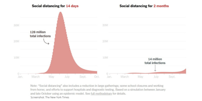
Data Journalism Top 10: Social Distancing Interactive, Epidemic Modeling, Germany’s Low Death Rate, and Zuckerburg TikTok Video

The coronavirus pandemic has resulted in the production of various interactives, charts, and simulations by data journalists and citizens around the world. This week’s NodeXL #ddj mapping from March 23 to 29 finds The New York Times explaining the dangers of ending social distancing measures by Easter, Germany’s Der Spiegel and Der Tagesspiegel measuring traffic levels and COVID-19 cases respectively, the Tampa Bay Times monitoring the situation in Florida, Kevin Simler making an interactive simulation to explain how general epidemics unfold, and Mona Chalabi creating a viral TikTok video on Mark Zuckerberg’s donation to advance coronavirus research.