Data Journalism Reporting Tools & Tips
Document of the Day: DataViz Cheatsheet
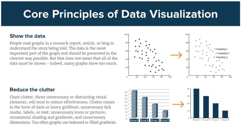
Economist Jonathan Schwabish created a handy data visualization cheatsheet with straightforward key principles to adhere to when creating data visualizations. Remember: avoid 3D, make labels easy to read and try small multiples.