EARLY BIRD TICKETS - Online Investigative Journalism Week (IJ WEEK)
July 31, 2026 • 23:59
-
day
days
-
hour
hours
-
min
mins
-
sec
secs

Accessibility Settings

color options

monochrome muted color dark

reading tools

isolation ruler

Tag

climate crisis

14 posts

Data Journalism

GIJN’s Data Journalism Top 10: Plastic Mountains, #SharpieGate, Stopwatch Analysis, Collaborative Software

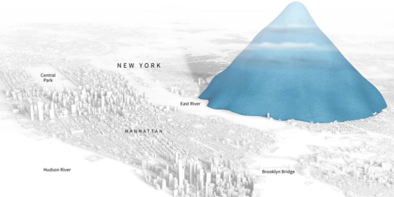
What’s the global data journalism community tweeting about this week? Our NodeXL #ddj mapping from September 9 to 15 finds ProPublica open-sourcing its collaborative reporting software; CityLab interviewing Mark Monmonier, author of “How to Lie With Maps,” on Donald Trump’s deceptive hurricane map; Al Jazeera surveying South Sudan’s citizens on displacement; and Reuters visualizing just how bad the Earth’s problem is in terms of single-use plastics.


Data Journalism

GIJN’s Data Journalism Top 10: Burning Amazon, Mass Shootings, Hungarian Kings

What’s the global data journalism community tweeting about this week? Our NodeXL #ddj mapping from August 19 to 25 finds Bloomberg mapping the alarming degradation of the Amazon rainforest, Alyssa Fowers discussing variations in visualizing mass shootings and their corresponding impact on readers, Data Carpentry sharing tips for organizing data in spreadsheets, and Atlatszo visualizing the succession of Hungarian kings.

Data Journalism

GIJN’s Data Journalism Top 10: Tarantino’s Swearing, TheyDrawIt Tool, Climate Crisis

What’s the global data journalism community tweeting about this week? Our NodeXL #ddj mapping from August 5 to 11 finds Spiegel Online analyzing the typical features in Quentin Tarantino’s films, MU Collective releasing an interactive “TheyDrawIt” tool to engage and educate readers, and the conversation on the climate crisis heating up — with 101 East Al Jazeera looking into Cambodia’s deforestation, Neue Zürcher Zeitung analyzing Switzerland’s forest fires, and the Financial Times digging into the impact of jet streams on the climate.

Data Journalism

GIJN’s Data Journalism Top 10: Visualizing Climate Change, Numbers from Phrases, Democratic Donors, Moscow Money

What’s the global data journalism community tweeting about this week? Our NodeXL #ddj mapping from July 29 to August 4 finds a number of articles related to the climate crisis, including the BBC’s piece on tree planting and its interactive tool on temperatures across the world, as well as Alberto Cairo’s blog post on misleading charts created by climate deniers. We also found useful tips and tools: a data GIF maker by Google News Initiative, Datajournalism.com’s strategies for teaching data journalism, and Paul Bradshaw’s tutorial on how to extract numeric data from phrases.