Accessibility Settings

color options

monochrome muted color dark

reading tools

isolation ruler

Tag

artificial intelligence

29 posts
Surveillance camera warning

News & Analysis Safety & Security

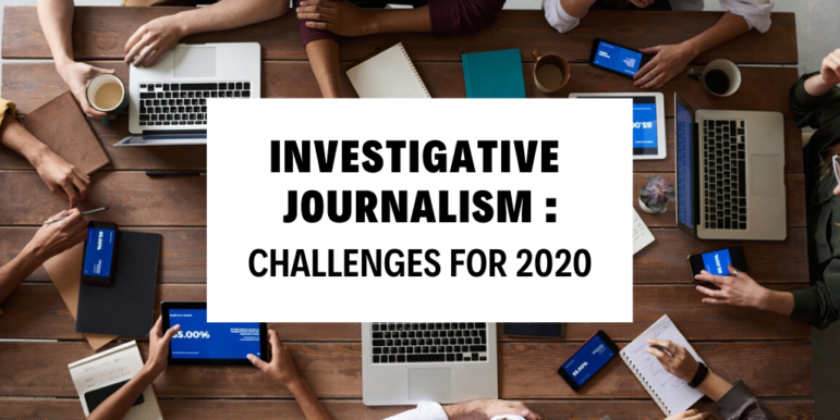
Top 5 Surveillance Investigations of 2021

Investigative journalists went all out last year in covering surveillance issues. From a deep-dive into the dark side of pandemic tech in Singapore’s techno-utopia to an in-depth look at how schools are spending thousands on unreliable “aggression detectors” in the name of student safety, global reporters have been holding Big Tech accountable for its role in fueling authoritarianism worldwide. 

News & Analysis

Deepfake Geography: How AI Can Now Falsify Satellite Images

With more sophisticated AI technologies emerging, researchers warn that “deepfake geography” could become a growing problem. As a result, a team of researchers that set out to identify new ways of detecting fake satellite photos warn of the dangers of falsified geospatial data and call for a system of geographic fact-checking.

Data Journalism

Data Journalism Top 10: Thanksgiving Dangers, Vaccine Tracker, Crosswords Diversity, Golf Swings, Facebook Fact-checks

Around the world, people are toning down their celebrations in a bid to mitigate spread of the coronavirus. The latest casualty: Thanksgiving. Our NodeXL #ddj mapping from November 16 to 22 found FiveThirtyEight’s timely piece explaining the risk of COVID-19 transmission from even small Thanksgiving dinner gatherings. Also popular: The New York Times tracking the status of all vaccine trials in progress, and The Pudding analysis of race and gender in crossword puzzles from five major US news publications.

Data Journalism

Data Journalism Top 10: Beirut Blast, Predicting Crime, US Election Simulators, and COVID in Ukraine

What was the magnitude of the Beirut port blast and how did it compare to other infamous explosions in history? Our NodeXL #ddj mapping from August 31 to September 6 finds Reuters illustrating just how powerful last month’s blast was in relation to the Chernobyl disaster and other explosions. The Tampa Bay Times highlighted how a county sheriff’s office is using an algorithm to supposedly predict and intercept the criminals of the future, while The New York Times used satellite maps to show how physical and political geographies interact across the United States. ESPN has been looking into the potential of people in college football crowds to become COVID-19 super-spreaders, and Slate analyzed the overuse of the word “murmur” in the popular Twilight novel series.

Data Journalism

Data Journalism Top 10: Unequal Pandemic Impact, COVID Contracts, Tainted Water, Data Ethics

Which communities are most economically affected by the coronavirus pandemic? Our NodeXL #ddj mapping from May 25 to 31 finds the Toronto Star looking at the effects of Canada’s lockdown on different communities in the country, ProPublica sharing a tool that lets you explore United States federal government contracts related to the coronavirus, the Financial Times analyzing excess mortality in 19 countries, and the Knight Center for the Journalism in the Americas offering a free online course on ethics in data journalism.

News & Analysis

What Investigative Journalism Will Look Like in 2020

GIJN asked investigative journalists around the world to look ahead at what’s in store for 2020. Here are the trends, key forces, and challenges they expect will affect investigative and data journalism in the coming year, as well as the new skills and approaches we should be thinking about.

Data Journalism

GIJN’s Data Journalism Top 10: Open Source, Artificial Intelligence, Interactive Oceans, Bar Chart Races, EU Polling

What’s the global data journalism community tweeting about this week? Our NodeXL #ddj mapping from November 25 to December 1 finds The New York Times profiling Bellingcat and its use of OSINT techniques; the International Consortium of Investigative Journalists and Stanford University collaborating to employ artificial intelligence to solve a journalistic problem; and the Science Communication Lab creating a beautiful interactive scientific poster to explore the world’s oceans.

Data Journalism

GIJN’s Data Journalism Top 10: Thanksgiving Travel, Visualization Art, Bad Charts, Dataharvest

What’s the global data journalism community tweeting about this week? Our NodeXL #ddj mapping from November 18 to 24 finds Google Trends mapping the busiest places and times for Thanksgiving, Al Jazeera profiling the work of data journalist Mona Chalabi and her hand-drawn visualizations, the Tow Center for Digital Journalism examining the use of machine learning and artificial intelligence in journalism, and the Investigative Reporting Workshop collating useful public datasets in one place.

Data Journalism

GIJN’s Data Journalism Top 10: Trump’s Tweets, London’s Polluted Tube, Rising Seas, Data Voids

What’s the global data journalism community tweeting about this week? Our NodeXL #ddj mapping from November 4 to 11 finds The New York Times analyzing more than 11,000 of Trump’s tweets, The Financial Times measuring air quality in London’s Underground, Der Tagesspiegel creating an interactive of the Berlin Wall, and Nieman Lab discussing data voids exploited by media manipulators.