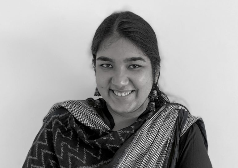

Pei Ying Loh, the co-founder of Kontinentalist. Illustration courtesy of Manon Verchot/ In Old News
Diversity through Data: A Conversation with Kontinentalist’s Pei Ying Loh
Pei Ying Loh is the co-founder of Kontinentalist, a publication that uses data to tell nuanced stories that highlight the diversity of Asia.
Since its start, Kontinentalist has found creative ways to tell stories on topics ranging from how the rubber industry in Singapore and Malaysia was shaped by colonialism, to Asia’s favorite alcoholic beverages. The team also offer workshops on the essentials of data storytelling, based on the tools they’ve used for their own stories.
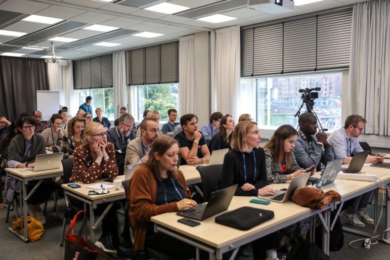
In Old News spoke to Pei Ying Loh at the 2023 International Journalism Festival in Perugia, Italy.
Q: What was the idea behind the Kontinentalist?
A: We are a data-driven editorial publication and studio based in Singapore, and we’re focused on covering Asian issues, trying to bridge the gap between the research sector and the public. When we first started, we wanted to build a platform, hopefully using some sort of a map, to be able to distribute information free of charge to people in Southeast Asia to understand how geopolitical trends were affecting their daily lives.
The project we were really focused on was China’s Belt and Road Initiative, which had only been really written or looked at from a very one-sided perspective from Western media. We wanted to sort of balance it, but not from a Chinese perspective. So I began to pull together the information to discuss this initiative, but it’s really, really boring and very dry.
And that’s when I chanced upon multimedia storytelling and data storytelling as an approach to present information in a much more visually engaging manner, but also in a more focused way. And then my team and I [started with] scrollytelling and Mapbox, and we became a bit addicted to the practice. Since then we’ve really been focusing on transferring that skillset to all sorts of issues: climate change, cultural trends, cultural phenomena, social justice, so on and so forth.
We really want to focus on Asia, combating, I guess, Eurocentrism in the news, and to celebrate the diversity and beauty of Asian cultures in a meaningful way.
Q: You do a mix of stand-alone stories and series. How do you decide what should be a series and what should be stand-alone?
A: That’s a really good question. We generally have four large umbrella themes that we try to park our stories under. The first one is what we call Asia Debunked, where we feel that there is a prevailing narrative, a myth, that is not very helpful or a very harmful narrative in both the way it portrays Asians or Asian culture. In the discussion of the issue, we try to use data journalism as a way to demystify and to myth-bust, essentially.
We also have what we call Future Asia, where we talk about what’s in the future. And that’s where tech, climate change, infrastructural development, all of that goes.
We also talk about Asian diversity and look at cultural phenomena, pop culture trends, queer films, sci fi, and use those as points of celebration of the uniqueness of diversity and complexity that Asia can bring to the forefront.
And then we have a very weird umbrella called Singapore Specials because we’re based in Singapore, and it’s really where anything and everything related to the country goes. Because of the sensitivity of the political climate in Singapore, it does make us reporting on a couple of things a bit challenging, legally speaking, but also in terms of the data resources available, they are quite scarce because open data is not very well practiced. So we end up doing a lot of historical investigations.
Most times we don’t intentionally go into something saying, “I’m going to do a series on this topic.” But what often happens as we as we start doing research, we realize there’s a lot of material, and it’s too much to pack into one story. And that’s when we decide to split things up into chapters and try and make it meaningful for the audience.
So that’s how — and my background is in history, I was a history major — so that’s how we ended up doing that particular story on rubber. I did chapter one as a part of trying to add to the conversation around Singapore celebrating — I don’t know why we use the word celebrate — but commemorating 200 years since we were colonized.
And I wanted to talk about something that was economic and rarely looked upon, and the rubber trade was one of them. But while I was preparing part one, I realized the narrative was very limited. It was a lot about “this White person did this thing” and “this Chinese person did this thing.” They were both rich and privileged people.
And there was very little investigation into the subaltern part of history, the people who really did the majority of the heavy lifting of the industry and how they were treated, what their economic conditions were like. And that led me to then through part two, which is just to really look at archival material, their wages… and all this is available, it’s all in colonial archives.
So I pulled up information around wages, living conditions, and other journal articles that have done similar investigations, to really understand there is a huge system of inequality and discrimination and that has strong links to present day society and how our society is configured in Singapore.

Screenshot from a project on the legacies of rubber and colonial exploitation in Singapore and Malaysia. Illustrations for the project were by Griselda Gabriele. Image: Screenshot, Kontinentalist
Q: How do you decide that a story is a fit for the Kontinentalist? Does it have to fit under one umbrella or are there other factors that you consider?
A: We generally try to fit into those four umbrellas. And we’ve also communicated that to our audience quite clearly. When we approach something, we talk about why it’s important for us, especially in our newsletters. We discuss why these identities or negotiating or discussing these issues is important to us as a company and what our mission is.
But in terms of what we really dedicate our time to, we want pieces that have a long shelf life. So a lot of our stories take a long time to develop, at least three to six months, very often, and like 10 different people working on a single story at a time.
It doesn’t feel right to put so much effort into something that will get maybe a lot of clicks on a single day, but tomorrow would be lost in the news cycle. So I think for us, we care more about the quality of the experience and whether or not we are contributing meaningfully to a conversation. And that’s a piece of reference that people come to repeatedly over time.
That is really our measurement of success. We will look at if our articles have been cited in other journal articles that people have referenced to create other things. And that’s how we know we’ve made it. We’ve done a good thing and that’s what we really aim for. And we try to — whoever pitches us — we try to steer them towards that direction and we assess whether or not there is that timeless quality or what we call evergreen quality before we decide to go further.
Q: How do you make decisions around your visualizations? And where do you draw inspiration from?
A: I think admittedly when I first started, I wasn’t very careful about this and I was kind of a newbie to the field. So I used Flourish and a lot of the cool tools. And there was also a lot of, I guess, desire to want to mimic what’s been done in the US and even in Europe in better and more well-established data journalism outfits. At places like The Pudding or South China Morning Post and Reuters. But I think now that we’ve really honed in on the meaning of what we do, our team of designers have also been very purposeful in creating an entire internal guideline and document on how to design our visualizations and how to design our outputs.
I think the focus is really about uplifting Asian communities and not repeating tropes. Be very careful about that. So for example, if you just Google, I mean, no offense to The Economist, for example, but if you just Google Economist and China, you’ll get all the covers that are the same. It’s always pandas, dragons, red flag, communism, some degree of like, you know, like socialist realism, propaganda-style imagery.
I mean, China has a lot of problems, but that is perpetuating an image that is a disservice to a lot of people who live in that country in a culture that might be very easily misunderstood across the world… I think for us, we want to be able to portray these issues in a language, so in an art form, that is unique to those cultures that it comes from or in a way that respects them with dignity.
So for example, in the story that we did on Chinese names, so we looked at a database of Han Chinese names instead of just doing a simple bar chart to talk about how several names have greater popularity, we used a Chinese chessboard as an opportunity to visualize things, so we use the grid system of a Chinese chessboard to represent how some characters are more represented and how some characters are less represented, and essentially trying to use local art forms to represent and visualize data.
Q: You also share a lot of resources and behind-the-scenes of your work. If someone is interested in learning from the work you do, what is the best way for them to do that?
A: So we’ve grappled with this quite a bit. Even within the team we feel like we’ve done what we can, but we still feel like the learning curve is very steep when we compare ourselves to The New York Times or The Washington Post.
What I’ve now learned is that the fancy stuff does probably not even half the job. The fancy stuff — the scrollytelling, the animations — they’re all nifty tricks that will draw the reader in and make something visually engaging for what is really at the core of everything which is a good story and a good investigative question.
It’s not just like you are oddly curious about one very niche thing, but you know, it’s a shared curiosity and bouncing off of that to look into data and see how you can answer your question with data.
It’s a fairly frivolous example, but in Singapore our prime minister has earned a nickname for wearing pink all the time and people have this impression that he loves to wear pink and [have given him] a slightly homophobic nickname, Pinky. And we wanted to talk about that from a data perspective. So we color-picked all his T-shirts from YouTube and made a data visualization and analyzed if he indeed wore pink all the time. And you know, it is a well-worn color, but it’s often just confirmation bias.

By looking at the data, the team found that white is the prime minister’s favored shirt color, contrary to public perception. Image: Screenshot, Kontinentalist
You never know what questions can be answered with data. But it’s most important to start with a question that people actually have and want to know the answer to first. And that’s what we usually recommend as step one and not be too hung up about creating fancy visualizations and things like that.
We also have a workshop, Data Storytelling 101, designed to be as friendly as possible to people who have never touched data ever before, never seen an Excel sheet before this workshop. So we go through the basics of how you can compose a data story in just a couple of slides.
We’ve had people who are journalists but also in corporate communications, civil servants, even data scientists, data analysts. It’s a 10-hour course over two days, and a step that we recommend if you are looking for a no code fuss-free entry into data storytelling.
Q: Is there anything else that you want to share?
A: We are always very open to collaboration, so that’s one. We actually reduced the amount of stories that we produce because it is very taxing on the team, so we try to do 10 to 12 big stories a year on our website and we try to make each one a meaningful collaboration with either a nonprofit or an individual who is able to bring something unique to the table, either through a perspective or unique data set that we don’t have access to.
We’re also trying to build a tool and we’ve got some money from Google News Initiative to run this for a little while. We’re building a data storytelling platform / content management service / community type thing similar to Medium, where you’re able to pull together a data story with relative ease.
And lastly, we’re trying to build a community of data storytellers and journalists within the Southeast Asian media. So if that’s also something that you’re interested in, please do get in touch with me on social media channels… I am a weirdo who checks our social media every day, all the time.
This story was originally published by In Old News. You can see the original here, or listen to it here. This version — republished by GIJN with permission — has been edited for style and length.
 In Old News aims to support a diverse journalism ecosystem through stories and trainings. The organization has trained thousands of journalists in over 65 newsrooms to use their phones for multimedia journalism with the aim of supporting a diverse journalism ecosystem through stories and trainings. It also publishes stories “of journalism from journalists.”


