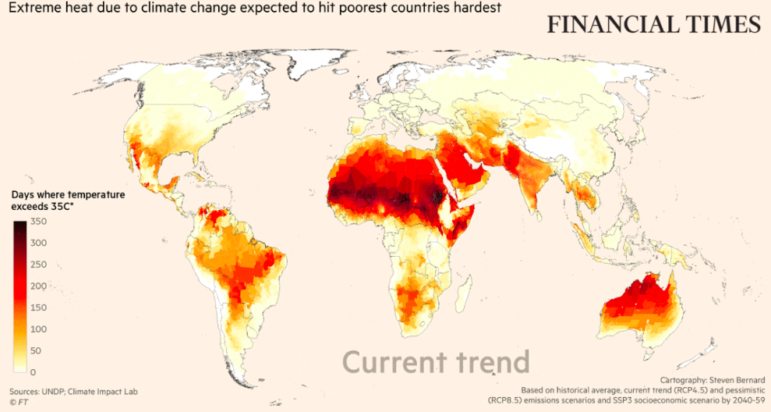
The Financial Times mapped how current trends in climate change exacerbate global inequity. Image: Screenshot, Financial Times
Data Journalism Top 10: Hollywood Blockbuster Diversity, Climate Inequities, Election Deniers, Toxic Twitter
Read this article in


The Financial Times mapped how current trends in climate change worsen global inequity. Image: Screenshot, Financial Times
Gender balance and diversity are longstanding issues in the Hollywood movie business. According to an analysis by Axios, Marvel Studios, which has contributed to the problem for years, has improved in its recent slate of productions. Our weekly NodeXL and human curation of the most popular data journalism stories on Twitter also looks at the proliferation of shooting clubs in Brazil, US midterm election trackers, representation at COP27, and toxic tweets.
Diversity in the Marvel Cinematic Universe
“She-Hulk,” “Ms Marvel,” “Hawkeye,” “Eternals,” “Black Widow”: These latest entertainment features from Marvel Studios are led by women or persons of color. But the Marvel Cinematic Universe, which launched in 2008, hasn’t always been this diverse. In its first decade, Marvel’s blockbuster films all featured white male leads. The release of “Black Panther” in 2018 marked a turning point for the production studio, which then started to increasingly showcase persons of color or females as titular characters. Axios analyzed 36 film and television projects over 14 years to find out how representation and gender parity in Marvel movies has changed over time.
Shooting Clubs in Brazil
Gun laws in Brazil were eased during outgoing Brazilian President Jair Bolsonaro’s time in office, which triggered a boom in firearm ownership and an explosion of new shooting clubs across the country. In this two-part investigation, The Intercept Brasil spent months researching and mapping the number of gun clubs in the Amazon region, as well as investigating their impact on Indigenous peoples and their land.
Tracking US Midterm Election Results
While most news organizations were tracking the general results of the US midterm elections, The Washington Post was keeping tabs on the wins and losses by candidates who have questioned Joe Biden’s presidential election win in 2020. As of yesterday, 176 out of the 291 Republican candidates who are also “election deniers” have won their electoral races. The Post is also monitoring victories in nine key states that have the potential to directly affect access to abortion laws. Bonus: Developer and designer Will Chase posted a collection of cartograms in a tweet thread, offering us a quick look at the different ways various news organizations are visualizing the midterm election results.
Campaign Logo Quiz
With hundreds of US Congress seats up for election in the US midterms, the country has been awash with campaign materials featuring candidates’ individual electoral insignias. Do the logos of these candidates follow a pattern according to their political party affiliation? Bloomberg created a quiz for readers to see if they can spot a Democrat or a Republican based on their icons. Also, see The Center for American Politics and Design’s database of campaign logos collected since 2018.
Global Presence at COP27
The 2022 United Nations Climate Change Conference (COP27), expected to be the second-best attended event in its history, ends today. Using data from UN’s provisional list of participants, Carbon Brief analyzed the representation of delegates by country, gender, and group at the big climate event and compared it with past conferences.
How Climate Change Drives Inequity
According to new research from the Climate Impact Lab and the United Nations Development Programme, climate change disproportionately affects poorer countries. The Financial Times visualized the data on how climate change could increase mortality rates, how demand for electricity will increase to cope with global warming, and how extreme heat will impact the labor market.
Toxic Twitter
It may come as no surprise that Twitter suffers from a problem of online abuse and harassment, and that women usually bear the brunt of it. Using a tool developed by Jigsaw, the BBC analyzed three million tweets aimed at the members of the UK Parliament over six weeks in March and April this year. It found that more than 130,000 of those tweets, or one in 20, were extreme or abusive.
https://twitter.com/petesherlock79/status/1590253174845153280
Female Incarceration Rates in Costa Rica
The number of women in prison in Costa Rica has been increasing for years — doubling in the last two decades, according to a data analysis by independent journalism platform La Data Cuenta. Journalists looked at other statistics in the country, such as unemployment and income, with a gendered perspective, in an attempt to find out factors that may have contributed to the increase. They also dug into the reasons for incarceration and the types of sentences meted out by judges.
Lack of Transparency in Spain
Members of Spain’s legislative branch, the Congress of Deputies, is required by law to disclose their meetings with lobbyists and private interest groups. But according to an analysis of public records by Spanish digital newspaper El Confidencial, more than half of the legislators fail to do so. The newsroom created a searchable database for readers to find out the names, companies, or organizations that have met with members of Congress.
European History Visualized
How well do you know European history? This animated video set to classical music shows a chronological timeline of Europe’s significant events from 1444’s Crusade of Varna to 2022’s Russian invasion of Ukraine. Territories are depicted using balls, with their size roughly corresponding to the country’s relative size, economic power, military might, population, and influence on the continent. Statistician Nathan Yau wrote about the video in his blog.
Thanks again to Marc Smith and Harald Meier of Connected Action for gathering the links and graphing them. The Top Ten #ddj list is curated weekly.
 Eunice Au is GIJN’s global team manager. Previously, she was a Malaysia correspondent for Singapore’s The Straits Times, and a journalist at Malaysia’s New Straits Times. She has also written for The Sun, Malaysian Today, and Madam Chair.
For a look at NodeXL’s mapping on #ddj and data journalism on Twitter, check out this map.

This work is licensed under a Creative Commons Attribution-NoDerivatives 4.0 International License
Republish our articles for free, online or in print, under a Creative Commons license.
Republish this article
This work is licensed under a Creative Commons Attribution-NoDerivatives 4.0 International License
Read Next

Data Journalism News & Analysis
Lessons Learned: 10 Common Mistakes in Data Journalism
GIJN asked speakers and attendees in the NICAR conference hallways for the data journalism gaps they see, and for under-covered topic areas and under-used skills that newsrooms can address.

Data Journalism News & Analysis
From Space to Story in Data Journalism
Over the past 10 years satellite imagery has become an important component of data journalism. In the next 10, it will likely evolve further, from a tool used primarily for illustrating stories to an integral part of research and investigative reporting.

Data Journalism
10 Outstanding Data Projects Win the 2024 Sigma Awards
There were 52 data journalism entries from 22 countries in shortlist for the 2024 Sigma Awards. Here are the top 10 winning projects.

Tipsheet Data Journalism Reporting Tools & Tips
Tipsheet for Using Ocean Data in Your Investigations
Investigations into what happens on, under, and around the ocean can often be answered thanks to the vast amount of data available online.