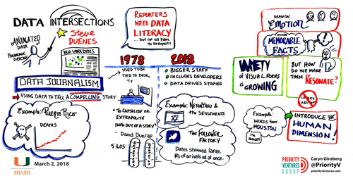
Data Journalism
GIJN’s Data Journalism Top 10: Racing Snails, Presidential Gifts and Berlin’s Building Blocks
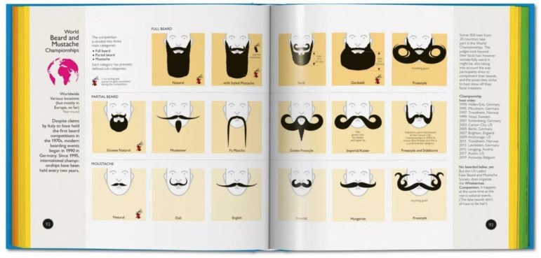
What’s the global data journalism community tweeting about this week? Our NodeXL #ddj mapping from May 21 to 27 finds @nigelblue’s wildly humorous infographic book about crazy competitions across the globe, @Data_Match breaks down the list of gifts given to the president of the United States by foreign leaders and @FinancialTimes looks into the pressures Antarctica faces.