Data Journalism
GIJN’s Data Journalism Top 10: The NYT’s Data Curriculum, Space Junk, Parents vs. Non-Parents
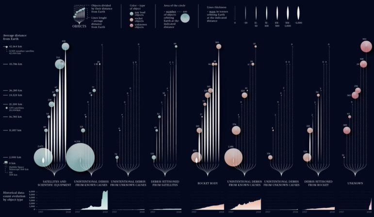
What’s the global data journalism community tweeting about this week? Our NodeXL #ddj mapping from June 17 to 23 finds Federica Fragapane visualizing space debris and their distance from earth, The New York Times open-sourcing its in-house data curriculum, Nathan Yau visualizing what time is lost for people once they have children, and Guns & America quantifying gunshot incidents within 300 meters of Washington, DC schools.