Accessibility Settings

color options

monochrome muted color dark

reading tools

isolation ruler

Series

Top 10 in Data Journalism

430 posts

Data Journalism

Data Journalism Top 10: A Stunning COVID Data Blunder, Beautiful News, Arctic Fires, Eviction Abuses, Isolating Students

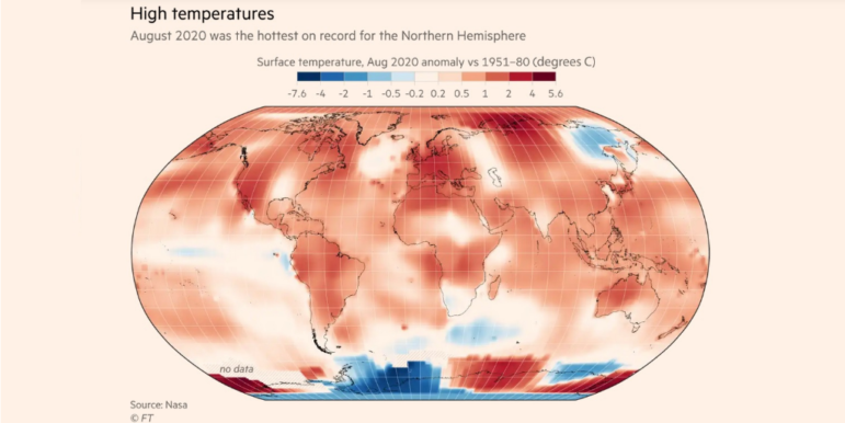
The advancement of technology and availability of complex data tools has been a real boon to society, but utilizing the wrong tools for the job can have dire consequences. Our NodeXL #ddj mapping from October 5 to 11 finds British media organizations the BBC and the Guardian reporting on a blunder by the English national health authority: it used the wrong Excel file format to store data, resulting in the loss of thousands of COVID-19 test data results. Meanwhile, German television news program ZDF heute highlighted how the Arctic has reached record high temperatures this year, DCist and Spotlight DC examined problems in the process of evictions, and we find Information is Beautiful offering a daily feed of uplifting news among the gloom of 2020’s news cycle.

Data Journalism

Data Journalism Top 10: Black Voter Suppression, K-Pop, Data Privacy Rights, and Global Coronavirus Deaths

Personal data is big business, and not only for private firms. Our NodeXL #ddj mapping from September 21 to 27 finds a number of troubling investigations: Channel 4 News revealed that Donald Trump’s 2016 presidential campaign used personal data from Facebook and Cambridge Analytica to deter Black voters from casting their ballot; Consumer Reports found that companies were making it difficult for people to opt out of having their data sold despite a landmark California law that protects individual data rights; and Noteworthy and The Business Post highlighted a concerning lack of clear regulation surrounding access to, and use of, genetic and patient data by private firms.

Data Journalism

Data Journalism Top 10: Death and Wealth, Internet Privacy Tool, COVID Under Control, Dataviz Colors

“Death is the great equalizer,” or so the saying goes. But our NodeXL #ddj mapping from September 21 to 27 finds an investigation by The Boston Globe Spotlight team that proves otherwise: race and income influences how and when people die. In this Top 10 #ddj edition, we also found The Markup launching its new privacy tool, the Financial Times examining how Finland, and the cities of Madrid and New York City handled the pandemic, as well as a great guide by Datawrapper’s Lisa Charlotte Rost to choosing better colors for your charts.

Data Journalism

Data Journalism Top 10: Mapping the Pandemic, Shrinking Japan, Data Recipes, Extreme Temps, Google Election Searches, FinCEN Files

How fast is the coronavirus spreading in countries around the world? Our NodeXL #ddj mapping from September 14 to 20 finds data visualization designer Jan Willem Tulp simulating the speed of COVID-19 infections and German television news program ZDF heute mapping how the pandemic traversed the globe. Meanwhile, Thibi Recipes explores tutoring data journalism as if you’re following a cooking recipe, the Financial Times reports on climate extremes, and ICIJ and Buzzfeed bare suspect financial data.

Data Journalism

Data Journalism Top 10: Border Disputes, Mediterranean Gas, Data Reporting Grants, Newsroom Cuts

Territorial disputes — over land, borders, or resources — are a long-standing source of tension around the world. Our NodeXL #ddj mapping from September 7 to 13 finds Al Jazeera explaining the India-China dispute over a shared Himalayan border in seven maps, and the Financial Times attempting to put into context the tensions between Turkey and its neighbors competing over natural gas discoveries. We also find Stanford University and Big Local News offering data reporting grants on the pandemic, and other groups offering free data journalism workshops and webinars.

Data Journalism

Data Journalism Top 10: Beirut Blast, Predicting Crime, US Election Simulators, and COVID in Ukraine

What was the magnitude of the Beirut port blast and how did it compare to other infamous explosions in history? Our NodeXL #ddj mapping from August 31 to September 6 finds Reuters illustrating just how powerful last month’s blast was in relation to the Chernobyl disaster and other explosions. The Tampa Bay Times highlighted how a county sheriff’s office is using an algorithm to supposedly predict and intercept the criminals of the future, while The New York Times used satellite maps to show how physical and political geographies interact across the United States. ESPN has been looking into the potential of people in college football crowds to become COVID-19 super-spreaders, and Slate analyzed the overuse of the word “murmur” in the popular Twilight novel series.

Data Journalism

Data Journalism Top 10: Tracking Police Accountability; Racism and Housing; China’s Hidden Prison Camps

The police shooting of Jacob Blake, a 29-year-old African American man, in the United States has reignited national unrest just months after the death of George Floyd. Our NodeXL #ddj mapping from August 24 to 30 finds ProPublica documenting police violence against Black Lives Matter protesters and tracking police accountability. The New York Times shows how the process of redlining, or denying mortgage finance to predominantly Black neighborhoods from the 1930s onwards, has resulted in heat disparities among cities, and BuzzFeed News uncovers scores of new internment camps in Xinjiang, China, by analyzing satellite data.

Data Journalism

Data Journalism Top 10: North Korea Ghost Ships, Trolls Attack WHO, Al Pacino’s Wardrobe, COVID Air Travel

Satellite imagery has become increasingly useful in establishing evidence of human rights abuses and in shining a light on dubious activities being conducted in secretive parts of the world. Our NodeXL #ddj mapping from August 17 to 23 finds NBC News utilizing satellite data to solve a long-standing mystery about North Korean “ghost boats” washing up on Japanese shores, The New York Times analyzing footfall data to determine how the coronavirus pandemic has influenced consumer spending, and Bellingcat revealing a coordinated network of attacks on Twitter against the director general of the World Health Organization (WHO).

Data Journalism

Data Journalism Top 10: Election Forecasts, The Sweatpants Era, Hong Kong Protests, DJ in Eastern Europe & Caucasus

One of the biggest issues that comes with visualizing election forecasts is how to incorporate uncertainty in a way that is understandable to readers. Our NodeXL #ddj mapping from August 10 to 16 finds FiveThirtyEight explaining their election forecast design process and considerations. Elsewhere, The New York Times Magazine has been digging into the collapse of the fashion industry, and the Hong Kong Free Press is teaming up with the Journalism and Media Studies Centre of The University of Hong Kong to expand its protest research archive.

Data Journalism

Data Journalism Top 10: Herd Immunity Calculator, Post-COVID Offices, Back-to-School Jitters

How many people need to get infected or die of the coronavirus before we reach a herd immunity threshold? Our NodeXL #ddj mapping from August 3 to 9 finds that The Washington Post created a herd immunity calculator to estimate this. Also in the Data Journalism Top 10 this week: BBC’s Visual and Data Journalism team illustrates the future of work environments post-COVID-19, The New York Times shares projections of the potential number of children who may carry the virus back to school in the fall according to county, and Oregon Public Broadcasting discovers a surprising reason for the low incidence of coronavirus transmission in bars and restaurants in the US state of Oregon.