Register for #GIJC25
November 20, 2025 • 09:00
-
day
days
-
hour
hours
-
min
mins
-
sec
secs

Accessibility Settings

color options

monochrome muted color dark

reading tools

isolation ruler

Posts

707 posts

Reporting Tools & Tips

5 Tools for Professional Looking Infographics for the Non-Designer

For newsrooms that want to produce professional looking infographics but don’t have the technical skills or budget to hire a professional, Kat Duncan came up with five user-friendly tools to help you create neat looking infographics without worrying about too much coding.


Resource

Document of the Day: Reuters Institute Digital News Report 2018

The Reuters Institute surveyed 74,000 people in 37 countries to find out how consumers around the world are using digital news. The findings are included in its 2018 Digital News Report, revealing insights about digital news consumption that could help inform newsrooms on their digital news strategies. The report focuses on the issues of misinformation, new business models, rise of messaging apps and new audio growth.

Data Journalism

GIJN’s Data Journalism Top 10: Sad Tunes Algorithm, Fragapane’s Beautiful Dataviz, African Pay Gap, Euro-Xenophobia

What’s the global data journalism community tweeting about this week? Our NodeXL #ddj mapping from Sept 10 to 16 finds @miriamquick analyzing @Spotify data to rank the top five saddest songs, @Code4Africa creates a tool to measure gender pay gap in African countries, @fedfragapane shares beautiful illustrations on Instagram, #edjnet finds Italy, Turkey and Greece topping the list of Europe’s xenophobic countries, and @TaylorMirf highlights the low rates of immunizations in Washington state.

Reporting Tools & Tips

How to Start Your Own Media Newsletter

Your newsletter mailing list is made up of real people who have allowed you into some of the most prime real estate in the world: their inbox, and this privilege should not be abused. Splice Newsroom offers their tips to offer your subscribers quality content.

Data Journalism Reporting Tools & Tips

Document of the Day: DataViz Cheatsheet

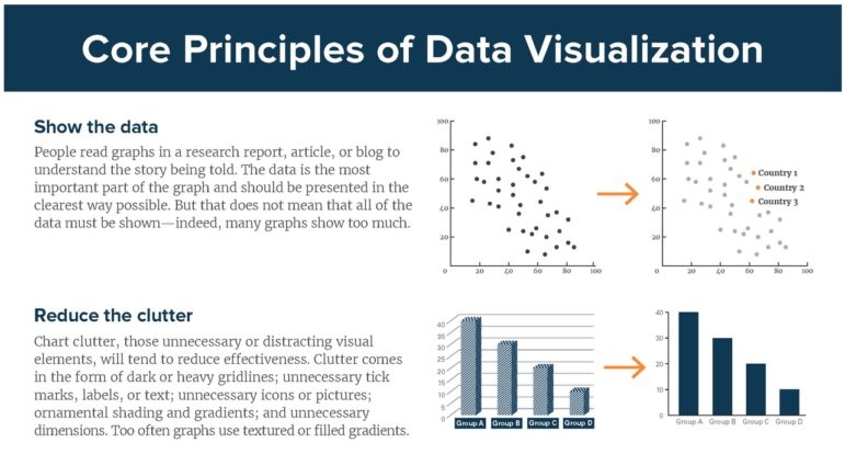
Economist Jonathan Schwabish created a handy data visualization cheatsheet with straightforward key principles to adhere to when creating data visualizations. Remember: avoid 3D, make labels easy to read and try small multiples.

Data Journalism

GIJN’s Data Journalism Top 10: German Heat, Austrian Arms, Quebec School Fees and Salvadoran Kidney Disease

What’s the global data journalism community tweeting about this week? Our NodeXL #ddj mapping from Sept 3 to 9 finds @FiveThirtyEight attacked by the green-eyed monster with their equivalent of Bloomberg’s “Jealousy List,” @daswasfehlt breaks down Austria’s export of arms, @GoogleAI announces the beta launch of Google Datasets Search, and @SZ documents how climate change is wreaking havoc on temperatures in Germany but boosting ice-cream sales.

News & Analysis

Collaborations Help Strengthen Journalism in Venezuela

The winners of the Eighth National Investigative Journalism Awards, organised by Venezuela’s Instituto Prensa y Sociedad, highlight the relevance and importance of collaborative journalism. By building transregional teams, Venezuelan reporters were able to investigate issues that the Venezuelan state tries to hide.