Register for #GIJC25
November 20, 2025 • 09:00
-
day
days
-
hour
hours
-
min
mins
-
sec
secs

Accessibility Settings

color options

monochrome muted color dark

reading tools

isolation ruler

Posts

707 posts

Data Journalism

GIJN’s Data Journalism Top 10: Visualizing Climate Change, Numbers from Phrases, Democratic Donors, Moscow Money

What’s the global data journalism community tweeting about this week? Our NodeXL #ddj mapping from July 29 to August 4 finds a number of articles related to the climate crisis, including the BBC’s piece on tree planting and its interactive tool on temperatures across the world, as well as Alberto Cairo’s blog post on misleading charts created by climate deniers. We also found useful tips and tools: a data GIF maker by Google News Initiative, Datajournalism.com’s strategies for teaching data journalism, and Paul Bradshaw’s tutorial on how to extract numeric data from phrases.

Data Journalism

GIJN’s Data Journalism Top 10: Hong Kong Protests, Migration Waves, Democratizing Dataviz

What’s the global data journalism community tweeting about this week? Our NodeXL #ddj mapping from July 22 to 28 finds The New York Times analyzing the catalyst behind Hong Kong’s recent protests, National Geographic visualizing human migration in the past 50 years, Ellery Studio’s fun and informative renewable energy coloring book, and The Economist’s findings that Hillary Clinton could have won the 2016 US election if all Americans had turned up to vote.

News & Analysis

GIJN’s Data Journalism Top 10: Aging Wimbledon, Must-Read DataViz, Bad Charts, German Opera

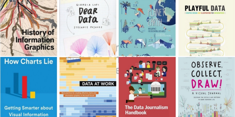
What’s the global data journalism community tweeting about this week? Our NodeXL #ddj mapping from July 15 to 21 finds Information Is Beautiful’s sharing its gallery of must-read data visualization books, Datajournalism.com highlighting pitfalls in creating charts, the FT analyzing the age of Wimbledon players, and WDR scrutinizing Germany’s opera repertoire.

Data Journalism

GIJN’s Data Journalism Top 10: Amazon.com, the Menstrual Cycle, Canadian Sex Crimes, Nonsensical Diagrams

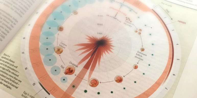
What’s the global data journalism community tweeting about this week? Our NodeXL #ddj mapping from July 8 to 14 finds BBC News analyzing Afghan election results as well as graphing the milestones of the 25-year-old Amazon empire, Federica Fragapane visualizing the female menstruation cycle for Scientific American, and Bloomberg taking a closer look at China’s domination of the South China Sea. We also have a fun piece by Alberto Cairo on nonsensical diagrams.

Data Journalism

GIJN’s Data Journalism Top 10: The NYT’s Data Curriculum, Space Junk, Parents vs. Non-Parents

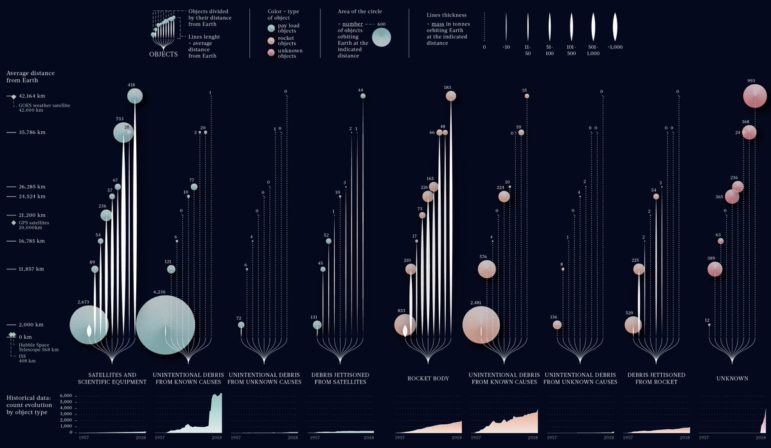
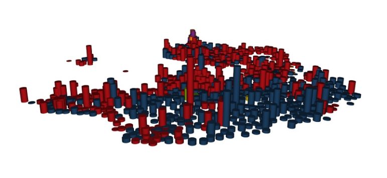
What’s the global data journalism community tweeting about this week? Our NodeXL #ddj mapping from June 17 to 23 finds Federica Fragapane visualizing space debris and their distance from earth, The New York Times open-sourcing its in-house data curriculum, Nathan Yau visualizing what time is lost for people once they have children, and Guns & America quantifying gunshot incidents within 300 meters of Washington, DC schools.

Data Journalism

GIJN’s Data Journalism Top 10: Ring of Fire, Political Dynasties, Data Janitors, Hong Kong Protests

What’s the global data journalism community tweeting about this week? Our NodeXL #ddj mapping from June 10 to 16 finds a gorgeous series of data visualizations by National Geographic on the Ring of Fire, Bloomberg analyzing the influence of dynasties in the Philippines’ politics, RStudio’s Hadley Wickham talking about why you shouldn’t assign data cleaning to a “data janitor,” and BR Recherche looking at the complexity of privacy policies.

GIJN Welcomes Seven New Member Organizations in Seven Countries

The Global Investigative Journalism Network is delighted to welcome seven new member organizations based in seven countries. We are particularly pleased to welcome our first members in Bolivia and Lesotho. The new groups bring GIJN’s global membership to 182 groups in 77 countries.

Data Journalism

GIJN’s Data Journalism Top 10: Avengers on the Move, Nonprofit Tax Filings, Visualizing Uncertainty

What’s the global data journalism community tweeting about this week? Our NodeXL #ddj mapping from June 3 to 9 finds @sto3psl mapping places the Avengers visited in Europe, @fedfragapane visualizing which elements in the periodic table are in danger of running out, @srfdata highlighting the top worries of the Swiss and @propublica doing researchers and journalists a huge public service by making 3 million US nonprofit records text-searchable.

Data Journalism

GIJN’s Data Journalism Top 10: European Election, Data via Audio, Tax Fraud & Parserator

What’s the global data journalism community tweeting about this week? Our NodeXL #ddj mapping from May 27 to June 2 finds immense buzz around the recent European Parliament elections, with @SZ explaining the EU political landscape, @morgenpost looking at the results in Berlin, and @journocode collecting data journalism pieces related to the election. There’s also @datajournalism’s tips on presenting data through audio and @BIRNSrbija’s data investigation into major corporate tax fraud in Serbia.