Data Journalism
GIJN’s Data Journalism Top 10: UN Votes, Disaster Reporting, Big Data Stories in Small Newsrooms
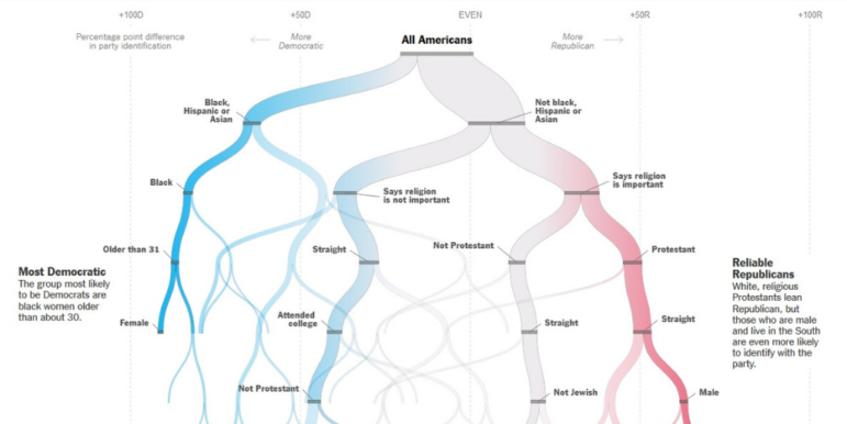
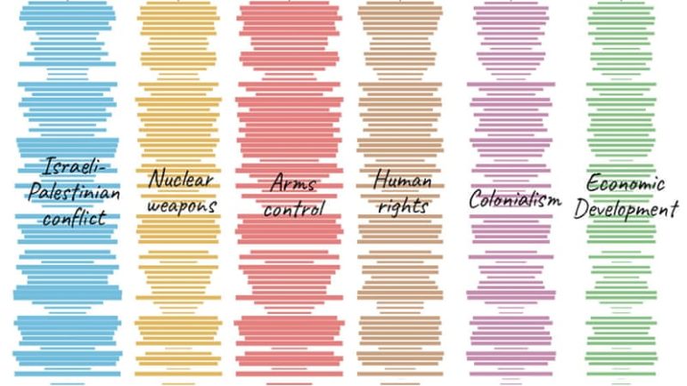
What’s the global data journalism community tweeting about this week? Our NodeXL #ddj mapping from September 30 to Oct 6 finds Al Jazeera Labs analyzing the key issues debated and voted at the United Nations General Assembly since 1946, Datajournalism.com gathering expert advice on doing data journalism during natural disasters, Knight Center offering a free data visualization course in three languages, and El Confidencial visualizing the internal migration patterns in Spain’s provinces.