Register for #GIJC25
November 20, 2025 • 09:00
-
day
days
-
hour
hours
-
min
mins
-
sec
secs

Accessibility Settings

color options

monochrome muted color dark

reading tools

isolation ruler

Posts

707 posts

Data Journalism

Data Journalism Top 10: COVID-19’s Spread, Death Rates, and Curve Flattening; The Shape of Dreams; Transphobia Tracking

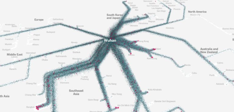
The attention of the global data journalism community remains very much tuned in to the developing COVID-19 pandemic, which is reflected in our NodeXL #ddj mapping from March 16 to 22. The New York Times mapped the movements of millions of people to trace how the virus spread out from China, The Financial Times tracked how coronavirus case trajectories compare among countries, while Robert Kosara explains the brilliance of a “Flatten the Curve” cartoon.

Data Journalism

Data Journalism Top 10: Social Distancing, Coronavirus Clusters, Flattening the Curve, Trump Cherry-Picks Data

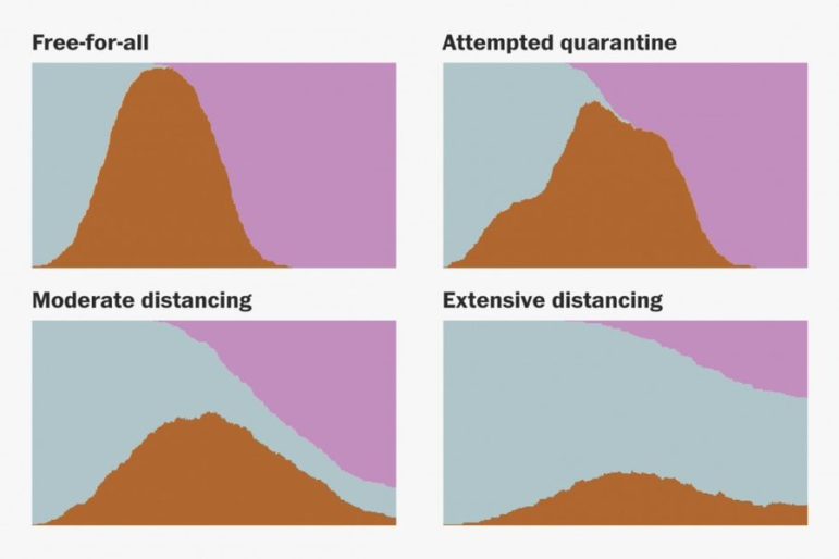
The novel coronavirus is very much dominating the Twitter chatter among the global data journalism community this week. Our NodeXL #ddj mapping from March 9 to 15 finds The Washington Post simulating different social distancing scenarios and their effects on slowing the spread of COVID-19, South China Morning Post highlighting research into a cluster case, Süddeutsche Zeitung charting the exponential growth in countries with high infection rates, and The New York Times spotlighting the jobs which put workers at the greatest risk of contracting the virus.

News & Analysis

The 20 Leading Digital Predators of Press Freedom Around the World

Reporters Sans Frontieres published, for the first time, a list of press freedom’s 20 worst digital predators in 2020. Whether state offshoots, private-sector companies, or informal entities, they reflect a reality of power at the end of the 21st century’s second decade, in which investigative reporters and other journalists who cause displeasure risk being the targets of predatory activity by often hidden actors.

Data Journalism

Data Journalism Top 10: COVID-19 Data Viz, Brazil President’s Tweets, Beach Erosion, India’s Influencers, London by Bike, Syllabi

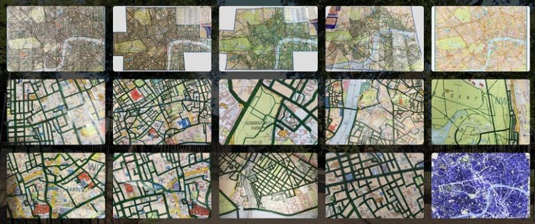
What’s the global data journalism community tweeting about this week? Our NodeXL #ddj mapping from March 2 to 8 finds a list of COVID-19 related data visualizations selected by health activist Joel Selanikio, Folha De S. Paulo analyzing Brazilian President Jair Bolsonaro’s tweets, VoxEurop highlighting the potential disappearance of the world’s beaches due to climate change, and Davis Vilums mapping every central London street over four years by cycling.

Data Journalism

Data Journalism Top 10: Royal Instagram Mystery, US Election, The Markup Launches, 100 Years of Mideast Deals

What’s the global data journalism community tweeting about this week? Our NodeXL #ddj mapping from February 24 to March 1 finds The New York Times digging into some curious data from two Instagram accounts of the British royal family, Al Jazeera analyzing Trump’s plan to resolve the Israeli-Palestinian conflict, The Markup launching with an investigation into auto insurance algorithms, and Pew Research Center sharing some American election data snapshots.

Case Studies

Understanding the Authoritarian’s Playbook: Tips for Journalists

In “Democracy Undone: The Authoritarian’s Playbook,” The GroundTruth Project chronicles seven leaders whose instincts and inclinations herald a brand of populist nationalism that, if history is a guide, can lead to authoritarian government. From Brazil to Italy and the US, these global leaders seem to share common “plays,” including weaponizing fear, undermining institutions and targeting outsiders. GroundTruth fellows offer tips for journalists covering this rising authoritarianism.

Data Journalism

GIJN’s Data Journalism Top 10: Weird Maps, ‘Out of Control’ Airbnb, Augmented Reality Graphics, Russian Doctors, Brazilian Data

What’s the global data journalism community tweeting about this week? Our NodeXL #ddj mapping from February 17 to 23 finds geographer Tim Wallace collecting some amusingly unusual maps, The Guardian analyzing the effect of Airbnb’s prevalence on home ownership in Great Britain, the Data Visualization Society evaluating the successes and shortcomings of its first year, and former Ogilvy & Mather chief creative officer Tham Khai Meng sharing how a Japanese newspaper utilized augmented reality to animate graphics.

Data Journalism

GIJN’s Data Journalism Top 10: Sigma Awards, Campaign Trail Food, Data Cleaning Nightmares, Massive Leaks

What’s the global data journalism community tweeting about this week? Our NodeXL #ddj mapping from February 10 to 16 finds The Guardian US analyzing food expenditure on the Democrats’ campaign trail, The Washington Post’s Steven Rich sharing the pains of cleaning spelling permutations in data, The International Consortium of Investigative Journalists explaining the process of handling the massive #LuandaLeaks records, and the Sigma Awards announcing its shortlist.