Data Journalism
Data Journalism Top 10: Olympic Bias, Electric Vehicles, Redlining’s Legacy, and Pandemic Violence
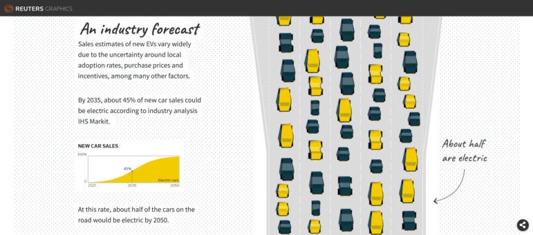
Our weekly curation of the most popular data journalism stories on Twitter looks at the US transition from gas-powered to electric vehicles, the legacy of racially discriminatory housing practices, and an analysis of judging bias in Olympic ski jumping.