Image: Screenshot, NBC News
Visualizing a Trillion Dollars, India’s Warming Cities, Russian Mercenaries at Sea, and World Cup Player Physiques


An international investigation into Russia’s shadow fleet has revealed how mercenaries on ships transporting Russian oil are monitoring crews. Danish investigative unit Danwatch tracked how 83 Russians with military and intelligence backgrounds have sailed through Danish waters. Our roundup of the top 10 in data journalism, looking at stories from June 4 to 17, also includes a Straits Times interactive analyzing the physical traits of footballers at the 2026 World Cup, a BBC India piece exploring why temperatures feel so different within the same Indian city, and Texty’s study of how Ukrainians are portrayed on film.
Russia’s Shadow Fleet Mercenaries
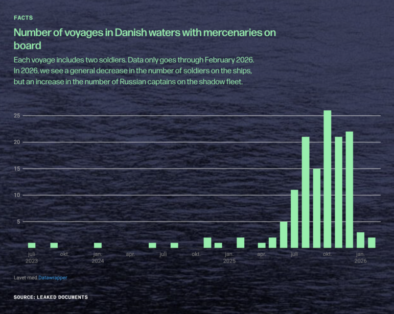
Image: Screenshot, Danwatch
In the territorial waters of Western nations, a covert security operation is underway aboard Russia’s shadow fleet — the tankers carrying sanctioned Russian oil. Working with a consortium of European media outlets headed by Follow the Money and Dossier Center, Danish investigative outlet Danwatch reported that Moscow is embedding armed minders on ships to keep tanker crews compliant and resistant to NATO inspections. Reporters reviewed more than 2,000 crew lists and drew on hidden camera interviews to identify dozens of mercenaries operating onboard. They then cross-referenced leaked passport numbers, pay stubs, and travel records with social media and Telegram activity to confirm that at least 83 Russians with military and intelligence backgrounds — including several with ties to the Wagner mercenary group — sailed undetected through Danish waters. Danwatch found that between May 2025 and February 2026, these men made nearly 140 voyages on 65 ships, 58 of which carried oil sold by Russian state company Rosneft.
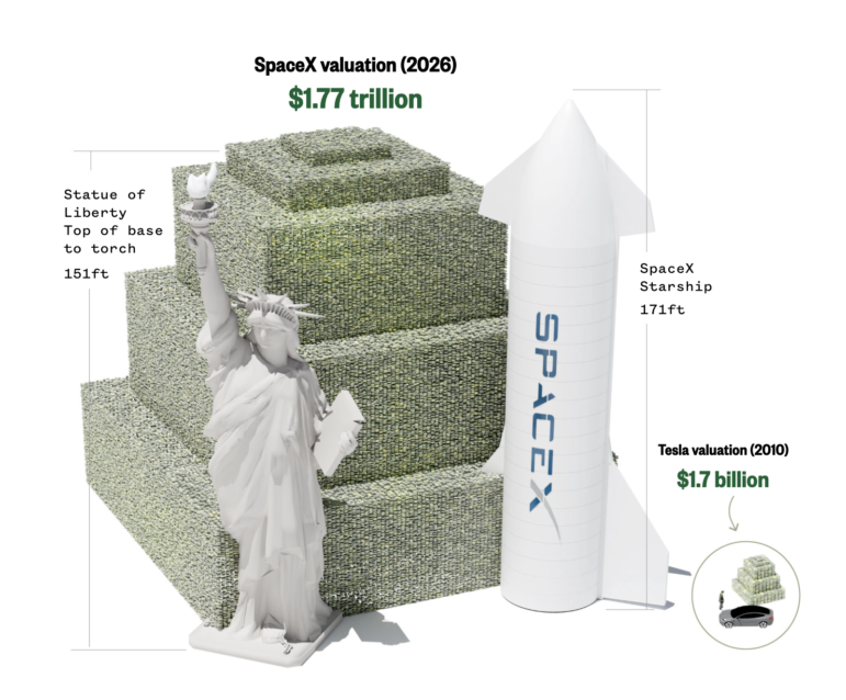
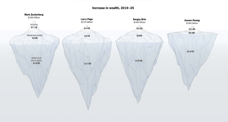
How Much is a Trillion Dollars?
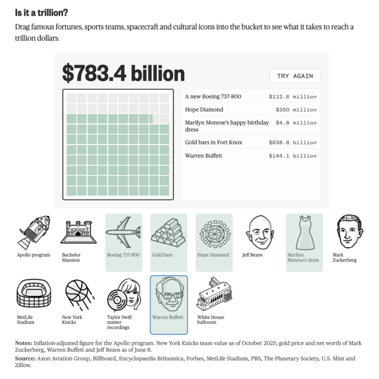
Image: Screenshot, NBC News
SpaceX debuted on the US stock market this month with a valuation north of US$2 trillion, instantly turning CEO Elon Musk into the world’s first trillionaire. The stock market listing sent newsrooms scrambling to explain a number most people can’t make sense of. To convey the scale, mathematician John Allen Paulos offered a time-scale comparison: a million seconds ago was two weeks past, a billion seconds takes us back to 1994, while a trillion seconds predates recorded history, reaching back to roughly 29,000 BCE. NBC News built an interactive bubble chart ranking the SpaceX IPO against the next nine largest in history, alongside a calculator letting readers try to spend a trillion dollars on items like Boeing 737s or the Met Life Stadium in New York. According to the story, it would take a typical US household nearly 12 million years to accumulate that much wealth.
What Does a World Cup Football Player’s Physique Look Like?
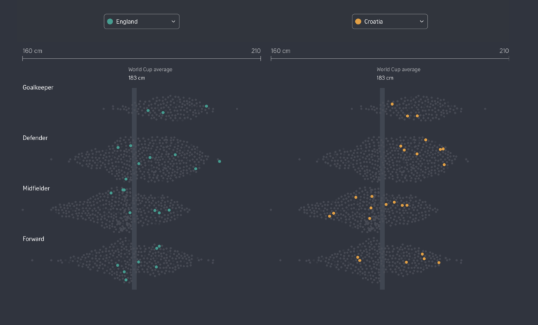
Image: Screenshot, The Straits Times
The 2026 FIFA World Cup has kicked off with an expanded tournament of 48 teams and 1,200 players taking to pitches across Canada, Mexico, and the United States. The Straits Times set out to map the physical traits that make athletes suited to their positions on the pitch — and how different national teams compare. Drawing on data from ESPN and other football transfer sites as well as country population data, reporters compared the heights of forwards, midfielders, defenders, and goalkeepers, allowing readers to toggle between squads and compare them against the tournament average height. The analysis also measured how players stack up against their own nations’ populations, finding that Dutch players are roughly as tall as the average Dutchman, while Ecuador’s squad is significantly taller than the general public back home. The story opens and closes with an interactive tool that takes a reader’s height, weight, and age and matches them to comparable World Cup players, assembling a personalized starting eleven built around their physical profile.
Indian Cities Are Getting Hotter, But Not Everyone Feels It Equally
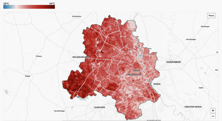
Image: Screenshot, BBC India
On May 1, ground temperatures near New Delhi’s main airport hit roughly 47 degrees Celsius (116 degrees Fahrenheit), while the tree-lined Akbar Road in the center of the city stayed closer to 35 degrees Celsius. India’s cities are getting hotter, but that heat isn’t felt equally, a disparity that will matter more as the country’s urban population is projected to reach 950 million by 2050. Drawing on Landsat satellite imagery from the US Geological Survey, the BBC’s visual and data journalism team mapped how ground temperature varies sharply within the same city, with a drop-down tool letting readers choose between Indian cities to compare land temperatures on a granular level, from areas dense with concrete to those shaded by trees and parks. Using land-use data from the University of Maryland’s Global Land Analysis and Discovery Lab, the piece also traced how Delhi’s landscape has shifted since 2000, with built-up areas swallowing what was once agricultural land.
How Trump’s Proposed Arch Could Impact Washington DC’s Airspace
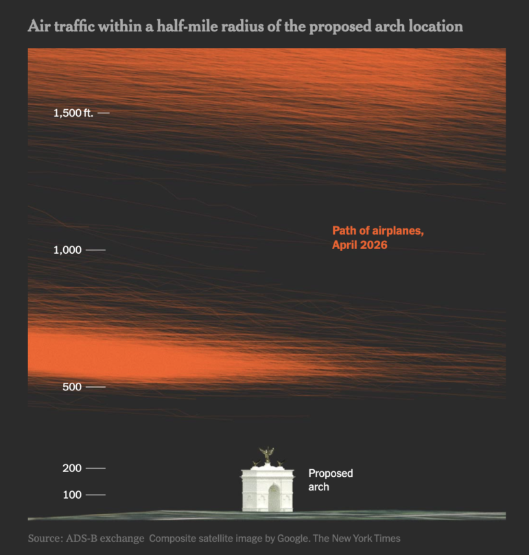
Image: Screenshot, The New York Times
US President Donald Trump wants to erect a “mammoth” 76-meter (250-foot) arch in Washington, DC to mark the 250th anniversary of American independence. According to plans, the arch would sit on Memorial Circle between Arlington National Cemetery and the Lincoln Memorial, and would tower over many of the capital’s other landmarks if given approval. But the proposed site sits directly in the flight path of Ronald Reagan National Airport and is not far from where a fatal air collision occurred in 2025. A New York Times analysis of federal regulations, traffic patterns, and flight procedures found that an arch built to the proposed height would penetrate the 40-to-1 obstacle clearance surface — an imaginary slope marking the baseline standard for evaluating nearby structures’ impact on departing aircraft. According to the Times, the structure could create problems in “a section of airspace already considered one of the nation’s most complicated.”
How Ukrainians are Portrayed in Film
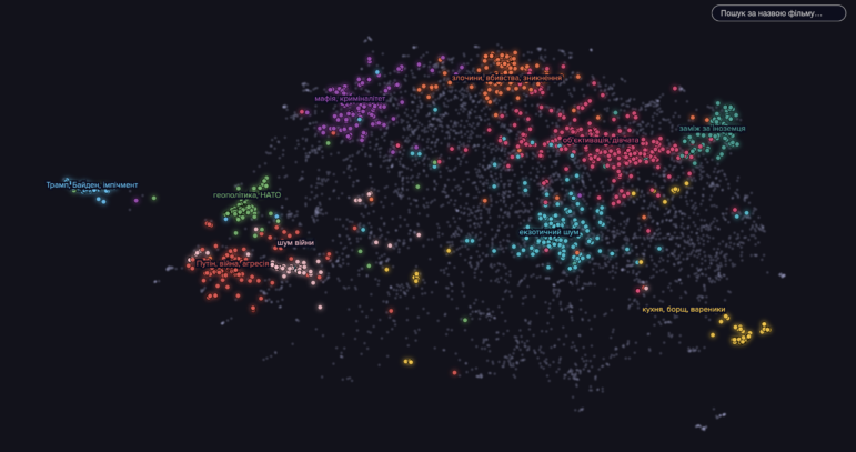
Image: Screenshot, Texty.org.ua
According to Texty, depictions of Ukraine are shifting in world cinema. Researchers mined a massive corpus of English-language subtitles to explore depictions of the country and its people in works of art: thrillers, dramas, comedies, reality shows, and even satirical news. They found examples in everything from Seinfeld (1995) to The Late Show (2022), and interviewed Ukrainian director Antonio Lukic about what the data revealed. Drawing on the OPUS OpenSubtitles corpus — which covers more than 62 gigabytes of English subtitles through to 2023 – researchers pulled every fictional reference to Ukraine and Ukrainians since 1991. Thematic clustering allowed them to surface over 50 distinct clusters across 1,500 films and TV shows. The analysis found Ukraine recurring in a handful of dominant tropes: sexualized stereotypes of Ukrainian women, the country as a hub for mafia activity and espionage, and its entanglement with Russia in geopolitical and war narratives. One of the clearest linguistic shifts the team tracked was the steady disappearance of the once-common phrasing of “the Ukraine” after 2010 in favor of “Ukraine.”
Increasing Tree Cover in Spain
Image: Screenshot, El Pais
Spain is heading into the hotter summer months, but according to this story by El País, in many cities across the country 60% of people lack access to the green spaces vital for keeping cool and battling urban heat. Environmental group Amigas de la Tierra, together with a research team from Madrid’s Universidad Politécnica, combined cartographic data, municipal planning records, aerial imagery, and OpenStreetMap data across 10 cities. The findings are visualized in interactive maps that apply urban forester Cecil Konijnendijk’s “3-30-300” rule to make cities healthier for urbanites: three visible trees from home, 30% tree canopy, and a park within 300 meters (990 feet). The maps reveal how unevenly green space is distributed: Valencia has just 3.48 square meters (37.5 square feet) of green space per resident; in Palma, the figure is 8.33. In Badajoz, near the border with Portugal, the city boasts 24.8 square meters per person. An additional map overlays incomes with green space access to flag “priority zones” for improvements in major cities.
Satellite Imagery of Japanese-Linked Energy Sites Damaged in US-Iran War
Image: Screenshot, Nikkei vdata
The fallout from the US-Israel-Iran conflict continues to have an impact on the energy infrastructure that powers economies in East Asia. Nikkei’s Visual Investigation team combined satellite imagery, on-site footage, information published by state-owned companies, and interviews with energy researchers to document the toll on seven oil and gas facilities linked to Japanese firms that have been caught in the crossfire. A satellite comparison anchors the piece, showing a collapsed heat exchanger and firefighting vehicles at an LNG complex in Qatar, alongside a map marking damaged facilities across the UAE, Iran, Qatar, Kuwait, and Bahrain. A timeline chart tracks more than 6,400 strikes by both sides since late February, paired with a chart estimating US$46-58 billion in regional repair costs.
How AI Emotion-Labeling Tools Misread Art
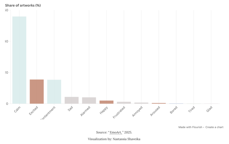
Image: Screenshot, Nightingale
In Nightingale, the journal of the Data Viz Society, data scientist Nastassia Shaveika set out to understand why AI systems tasked with identifying emotions in artwork keep landing on the same word: “calm.” Drawing on the EmoArt dataset of more than 132,000 paintings that researchers had GPT-4 label with emotions, Shaveika visualized in column charts that “calm” made up nearly 56% of all labels in the dataset. She also mapped which colors are statistically linked to which emotions and compared how varied emotional labels are across different art traditions, finding that Chinese ink painting gets called “calm” 89% of the time, while work from Western movements such as Surrealism are tagged with a much wider range of feelings. To test this further, Shaveika ran her own experiment, showing 23 artworks to AI models, including GPT, Claude, and Gemini, and asking each to label the emotion, once freely, and once while barred from defaulting to “calm” and “contentment.” She presented the results next to screenshots of each painting alongside every model’s label. Her conclusion was that these models project Western ideas about emotion and color onto art from other cultures, largely because they were trained on far more Western-labeled images.
How Couples Meet, and How They Feel About Happiness
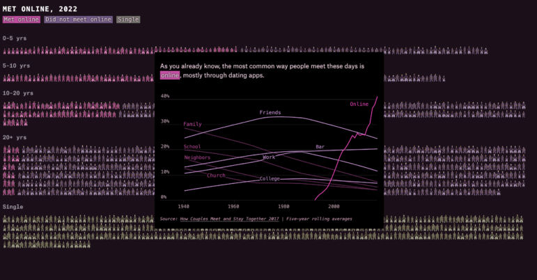
Image: Screenshot, The Pudding
Stanford University has been tracking couples for a survey called “How couples meet and stay together” since 2017. Thousands of couples across three different time cohorts since 2017 were asked how they would rate their relationship, especially during COVID-19. The Pudding used claymation icons to represent each respondent, and bar charts were generated to categorize their responses to survey questions, with the piece finding that couples already rating their relationship as “excellent” grew closer during the pandemic, while those who had a less optimistic rating responded that their relationship deteriorated further. It comes as more in the US are forgoing marriage and meeting fewer potential partners in person. Supporting line charts tracked how couples met, showing that dating apps have overtaken meeting a partner at church or through family and coworkers.
Hanna Duggal is a data journalist at AJ Labs, the data, visual storytelling, and experiments team of Al Jazeera and a GIJN contributor. She has reported on issues such as policing, surveillance, and protests using data, and reported for GIJN on data journalism in the Middle East, investigating algorithms onTikTok, and on using data to investigate what tribal lands in the US.

This work is licensed under a Creative Commons Attribution-NoDerivatives 4.0 International License
Republish our articles for free, online or in print, under a Creative Commons license.
Republish this article
This work is licensed under a Creative Commons Attribution-NoDerivatives 4.0 International License
Read Next
Data Journalism Top 10 Editor's Picks
Editor’s Pick: Best of Data Journalism from 2025
Our roundup of standout data journalism from the past year highlights projects that delve into conflicts in the Middle East, Ukraine, and Africa, that explore the rise of AI, and interrogate global trade wars.
Data Journalism Top 10
‘Super’ El Niño Threat, Myanmar Villages Razed, California’s Billionaire Tax Bill, and South Africa’s Murder Rate
Also highlighting exploitation of journalists in Egypt, Argentina’s returning World Cup squad, and the strain on Singapore’s aging caregivers.

Data Journalism Top 10
Rare Earth Rivalry, Falling Birth Rates, Violence in the Sahel, and 70 Years of Eurovision Lyrics
Also highlighting China’s squid fishing fleet off Argentina, how redistricting is shaping America’s midterms, and why 2.1 billion people still lack safe drinking water.