Image: Screenshot, The Markup
Data Journalism Top 10: Organ Donations, EU Drug Use, Layoffs Language, and Russian Censorship
Read this article in
If you’re a fan of the long-running medical drama series Grey’s Anatomy, you will be familiar with UNOS — the United Network for Organ Sharing. The Markup dug into UNOS’ liver allocation policy and found that a change made in February 2020 had negative effects on poorer US states. Our weekly NodeXL and human curation of the most popular data journalism stories on Twitter also features a look at drug usage in Europe based on wastewater analysis, a text analysis of layoff memos written by tech industry chief executives, and an examination of protests in Russia in 2022.
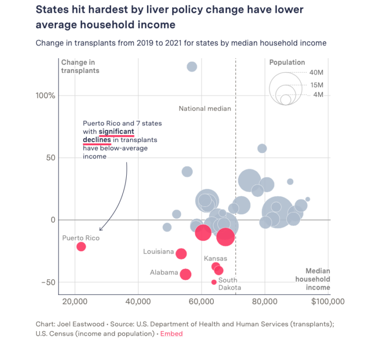
Who Gets Life-Saving Organs?
Last year, there were around 10,000 people in the United States waiting for a liver transplant. The waiting list policy changed in 2020, ostensibly to prioritize the sickest patients no matter where they live. But Malena Carollo, an investigative reporter for The Markup, and colleague Ben Tanen spent a year digging through public records requests on donated livers, liver recipients, and organ discards, to find that the policy change has led to poorer states losing out. Alabama – one of the hardest-hit states – saw a 44% drop in transplants under the policy. The story, co-published by The Washington Post, found that the policy change nearly doubled the average distance these donated organs are transported, and led to one in 10 donated livers becoming unviable after spending too much time in transit – the highest number in nearly a decade. Read the methodology for this investigation here.
Drug Use Rising in Europe
Scientists hit the sewers during the coronavirus pandemic, using human waste to estimate the prevalence of the COVID-19 virus in different populations and to identify hotspots. But the European Monitoring Center for Drugs and Drug Addiction has been using wastewater analysis to understand illicit drug use in Europe since 2011. The latest data, covering 104 cities in 2022, was analyzed by Der Tagesspiegel and the European research association ECIJA, and shows the use of drugs like cocaine, methamphetamine (crystal meth), cannabis, MDMA (ecstasy), and ketamine across the continent. Maps and graphics made by the eight-person team reveal which drugs are most prevalent, the quantities being consumed, and usage by day of the week (Sunday is reportedly a hotspot day for cocaine and MDMA in Berlin).
Layoff Memo Language
The leaders of the tech industry must be getting used to firing people. According to The Washington Post, tech companies have laid off a collective 148,000 workers in the past few months. But how do these chief executives – some of whom have gotten incredibly rich as a result of the work of their staff – let their employees know that their services will no longer be needed? Are they kind and sincere, or officious or arrogant? The Post looked at the language of 48 all-staff memos detailing job cuts to find a number of similarities: these notes rarely use the word “layoff” itself, and veer towards using corporate pet names, while some ask for those still in jobs to look after former colleagues. In half of the memos, tech leaders admit hiring too many people too quickly, and many blame the state of the US economy, even though it is not in a recession. Some – but not all – even say “sorry.” Also worth a look: Bloomberg’s look at layoffs across industries.
Russian Seizures of Ukrainian Businesses
Last summer, the manager of a granite quarry in Tokmak, southeastern Ukraine, was paid a visit by a group of armed men. The choice? Either back the Russians occupying the region, or leave and hand over the business. According to this data-based investigation by Novaya Gazeta Europe, around a thousand other companies in Mariupol, Melitopol, and other occupied Ukrainian cities have similarly been seized and listed on official Russian corporate registers. Among them are agricultural holding companies, mining plants, and even factories that have been adapted to serve Russian military needs. The team downloaded data on 1,150 companies in the occupied cities from Russia’s official business register, alongside information on the owners where available. By cross-referencing the information with the Ukrainian corporate lists, reporters were able to see which businesses had been potentially taken over and re-registered.
Tracking Dissent in Russia
Protesting in Russia today takes incredible bravery. IStories, a Russian investigative outlet in exile, analyzed a data leak from the country’s main censorship agency, Roskomnadzor, revealing that “even the smallest gathering of dissatisfied citizens of Russia” is being recorded, and data passed to security service agencies like the FSB. IStories analyzed hundreds of protest reports from the agency recorded in 2022 – covering everything from small-scale protests against the closure of the municipal baths, to rallies against the closure of a local school, to anti-war pickets – and created a color-coded map showing in which regions, and on what topics, Russians are protesting. Top of the protest list is Khabarovsk Territory, where people took to the streets in support of the former head of the region, who was sentenced to 22 years in prison for a crime he said he didn’t commit. According to the report, opposition to the war is widespread: last year there were protests on 305 out of 365 days, with people most active against the war in Moscow and St. Petersburg.
The Day Shireen Abu Akleh Was Killed
On the day that Shireen Abu Akleh, a Palestinian-American journalist with Al Jazeera, was killed by gunfire in the northern West Bank, other unrest was happening in the territory. Thirty-one homes in a southern West Bank settlement far from Abu Akleh’s killing were being demolished and cleared for an Israeli military firing range, while a 16-year-old boy was shot dead in a confrontation between youths and Israeli soldiers. The Guardian pieced together videos and images from that fateful day coupled with data on fatalities and demolitions in the year 2022 to show that, for Palestinians, the destruction of their homes and murders of their people are common occurrences during life under occupation.
Racial Disparities in Gun Arrests
Do gun possession arrests help to prevent violence? Authorities in the United States apparently believe so, but a data investigation by GIJN member The Marshall Project found no such correlation. The nonprofit media analyzed data from police arrests in the United States from 2010 to 2022 and discovered instead that there were racial disparities in this “crime-fighting strategy.” In Chicago, more than 8 in 10 people arrested for unlawful possession of guns were Black people although they comprised less than one third of the city’s population. The Marshall Project identified other cities with a similar trend. Reporter Lakeidra Chavis shared in a tweet thread the research and readings that inspired and informed this piece.
Manipulating UK’s Power Market
According to this Bloomberg investigation, some energy firms in the United Kingdom are manipulating the electricity market to gain hundreds of millions of profits at the expense of consumers. The companies use an “off-on tactic” — telling the public that they will switch off their generators ahead of expected peaks in demand, only to later agree to keep their plants running at much higher prices to fill the shortfall they created. For this story, Bloomberg analyzed millions of records from the Balancing Mechanism Reporting Service from 2018 to 2022 to count the number of times power stations engaged in this practice and calculated the amount of revenue they received. The investigation has already spurred reactions from the UK government, with the prime minister condemning such power trading behavior.
Mapping Education Levels in Spain
How educated is your city or neighborhood? And is a person’s level of education reflected in the way they vote? To look at these questions, data journalists at Spain’s El Confidencial decided to map the educational statistics of the entire country. Hover over any town, city, or district the site has mapped, and you can see the percentage of the population who finished secondary school, or the number that achieved a degree, an average income figure, and how people voted in the 2019 congressional elections. The data found educational attainment differences between those living in cities compared to those in the countryside, in city centers compared to the peripheries, and in the north of the country versus the south. In some places, just crossing a river or over the street changes local educational backgrounds and income levels. “Spain is full of borders,” the reporters found, with education just another “hidden inequality.”
A Look at the World’s Leaders
As Joe Biden, the oldest US president thus far, considers running for re-election, Pew Research Center examined trends in relation to the ages of current heads of government around the world. Among its findings: most global leaders are in their 50s and 60s, countries that have less freedoms tend to have older leaders, and women leaders are generally younger than their male counterparts.
Bonus: Charting the Cherry Blossom Peak
Ever wanted to see Japan’s famous cherry blossoms but not sure about your travel window? Robin Rohwer, a postdoc at the University of Texas at Austin, created a chart using 1,200 years of data and floral date markers to show how the blossom season has changed over time. According to the chart, recent years have seen the blossoms arrive earlier in the year, meaning the season tends to end earlier, too. Her chart – created for her mother – went viral, and was seen over two million times. Rohwer even wrote a haiku – a short Japanese poem of 17 syllables, to celebrate.
Thanks again to Marc Smith and Harald Meier of Connected Action for gathering the links and graphing them. GIJN’s Data Journalism Top 10 list is curated weekly.
 Laura Dixon is an associate editor at GIJN and a freelance journalist from the UK. She has reported from Colombia, the US, and Mexico, and her work has been published by The Times, The Washington Post, and The Atlantic. She has received fellowships from the IWMF and the Pulitzer Center.
 Eunice Au is GIJN’s global team manager based in Budapest, Hungary. Previously, she was a Malaysia correspondent for Singapore’s The Straits Times, and a journalist at Malaysia’s New Straits Times. She has also written for The Sun, Malaysian Today, and Madam Chair.
For a look at NodeXL’s mapping on #ddj and data journalism on Twitter, check out this map.

Guide to Mapping Analysis Using QGIS

Step-By-Step Guide for Journalists on the Basics of Google Sheets

Tipsheet for Using Ocean Data in Your Investigations

No Coding Required: A Step-by-Step Guide to Scraping Websites With Data Miner
How a WhatsApp Community Is Bringing India’s Data Storytellers Together

Turning the Threat to a Distant Glacier into a Local Story Through Data Visualization

One Name at a Time: How Die Zeit Built a Searchable Database of Nazi Party Members

Visualizing a Trillion Dollars, India’s Warming Cities, Russian Mercenaries at Sea, and World Cup Player Physiques

This work is licensed under a Creative Commons Attribution-NoDerivatives 4.0 International License
Republish our articles for free, online or in print, under a Creative Commons license.
Republish this article
This work is licensed under a Creative Commons Attribution-NoDerivatives 4.0 International License
Read Next
Data Journalism
How a WhatsApp Community Is Bringing India’s Data Storytellers Together
Recently, more than 400 people gathered in the Indian city of Bengaluru for VizChitra 2026, a conference on data visualization and storytelling — but that is only a small part of the story.
Climate Data Journalism
Turning the Threat to a Distant Glacier into a Local Story Through Data Visualization
New York Times climate and environmental graphics reporter Mira Rojanasakul discusses how her team visualized the sea level rise threat from the melting Thwaites Glacier in Antarctica.
Data Journalism
One Name at a Time: How Die Zeit Built a Searchable Database of Nazi Party Members
An online tool set up by the German newspaper Die Zeit, in cooperation with archives in Germany and in the United States, allows people to search several million Nazi Party membership cards.
Data Journalism Top 10
Visualizing a Trillion Dollars, India’s Warming Cities, Russian Mercenaries at Sea, and World Cup Player Physiques
Also highlighting how films portray Ukrainians, increasing tree cover in Spain, and how couples meet.