Data Journalism Top 10: Biased Missing Persons Coverage, Funding Election Deniers, Brazil Electoral Violence, Mapping Iran’s Protests
Read this article in

Step-By-Step Guide for Journalists on the Basics of Google Sheets

Tipsheet for Using Ocean Data in Your Investigations

No Coding Required: A Step-by-Step Guide to Scraping Websites With Data Miner

GIJC23 – The Future of Data Journalism: New Analytical Tools, Data Visualization, and AI
If you were an elderly person of color who went missing in a rural region of United States, chances are likely you won’t make much of a splash in the news: Columbia Journalism Review and an advertising agency examined data to find out the biases behind coverage of missing persons in the US. Our weekly NodeXL and human curation of the most popular data journalism stories on Twitter also looks at a news app tracking companies that fund 2020 US election deniers, an analysis of Brazil’s latest election results, six charts on measuring the climate emergency, and a timeline of the protests in Iran.
Bias in Missing Persons Coverage
The late American journalist Gwen Ifill once highlighted media bias against people of color in press coverage of missing persons, coining it “missing white woman syndrome.” Columbia Journalism Review partnered with ad agency TBWA\Chiat\Day to gauge the extent of the problem. They matched a sample of 3,600 news articles about disappearances in the US over the course of 11 months in 2021 with data from the country’s National Missing and Unidentified Persons System, to see which demographics — such as race, sex, and location — generated news coverage. Based on the data, they’ve created a tool for readers to see how newsworthy you would be if you went missing. A white young adult woman could be covered 10 times more than a Black man.
https://twitter.com/bokchoy_baobei/status/1589099731099488256
Funding Election Deniers
Following the mob attack at the US Capitol building on January 6, 2021, hundreds of big corporations vowed to stop donating to members of Congress who voted to question Joe Biden’s win in the 2020 presidential elections. ProPublica wanted to see if these companies kept their promises, so it built a news app to track the flow of funding from these companies to political leaders who were also election deniers. It found that at least 228 Fortune 500 companies have gone back on their word, channeling a combined total of nearly US$13.3 million into these politicians’ war chests.
Analyzing Brazil’s Election Results
How did former Brazilian president Luiz Inácio Lula da Silva, known as Lula, manage to defeat incumbent Jair Bolsonaro in this year’s Brazil elections? The Guardian dives into the voting data to find the patterns of support for both candidates across the country. Notably, Lula, who pledged to reduce deforestation in the Amazon, won in municipalities where more than a quarter of the population is Indigenous, while Bolsonaro, under heavy criticism for his anti-environmental policies, enjoyed support from heavily deforested regions of the country.
Six Ways to Measure the Climate Emergency
More than 100 national leaders are currently meeting at COP27, the 2022 United Nations Climate Change Conference, in Egypt. Ahead of the huge event, the French daily Le Monde charted six key data points for measuring the acceleration of climate change: surface temperature, atmospheric carbon dioxide, sea level, ocean heat content, ice sheets, and glacier mass. From warming temperatures to rising sea levels and retreating ice sheets, the charts show a grim reality.
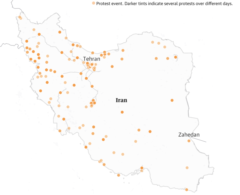
Mapping Iran’s Protests
It has been nearly two months since 22-year-old Mahsa Amini died in the custody of Iran’s morality police, but widespread protests sparked by her death show no signs of abating. Using data collected by the Armed Conflict Location and Event Data Project, the Guardian mapped the spread of the public demonstrations across the country between September 16 and October 21 in a scrollytelling timeline.
Electoral Violence in Brazil
Brazilian investigative newsroom Agência Pública has tracked electoral violence in the country since August 16 — the start of this year’s presidential election campaign. Journalists recorded at least 324 cases of such violence, averaging about four cases per day, with some involving the use of firearms. There were at least 15 murders and 23 assassination attempts.
Berlin Parking Spaces
Nobody knew how many parking spaces there are in Berlin and how they are distributed — until now. ParkplatzTransform, a Berlin citizen initiative, has mapped all available parking spots in Berlin’s inner city area. German daily Der Tagesspiegel presented the data in an interactive map and compared the areas taken up by parking spaces with green spaces.
Documenting Ukraine Heritage
Hundreds of cultural sites, buildings, and monuments in Ukraine have been damaged since Russia’s invasion in February. Bloomberg highlights Ukrainian efforts to document and protect the country’s cultural heritage and record the destruction using 3D modeling, as well as satellite and drone imagery.
Startup Layoffs
Internet entrepreneur Roger Lee has been compiling data on layoffs at US startups since the start of the COVID-19 pandemic. The database has resurfaced on Twitter recently due to massive job cuts at Twitter and Meta, Facebook’s parent company. The numbers show that a total of 118,023 employees have been let go from 766 startups this year.
https://twitter.com/mims/status/1588598999116058624
Tracking the Spread of Misinformation
Businessman Paul Pelosi, husband of the US Congress Speaker of the House Nancy Pelosi, was brutally attacked during a home invasion last month. Within hours of the incident, many baseless claims about the assailant and the motive behind the assault began circulating. The New York Times examined the elected officials, candidates, and prominent figures who expressed doubts on the attack and tracked how misinformation surrounding the attack spread in a timeline.
Bonus: Mapping Greenland
The #30DayMapChallenge kickstarted by geographer Topi Tjukanov in 2019 encourages people to make maps according to daily themes throughout the month of November. In response to this year’s Day 4 challenge theme “green,” Kate Berg, GIS Lead at the Michigan Department of Great Lakes, Environment, and Energy, produced a collection of Greenland country outlines according to different map projections.
Thanks again to Marc Smith and Harald Meier of Connected Action for gathering the links and graphing them. The Top Ten #ddj list is curated weekly.
 Eunice Au is GIJN’s global team manager. Previously, she was a Malaysia correspondent for Singapore’s The Straits Times, and a journalist at Malaysia’s New Straits Times. She has also written for The Sun, Malaysian Today, and Madam Chair.
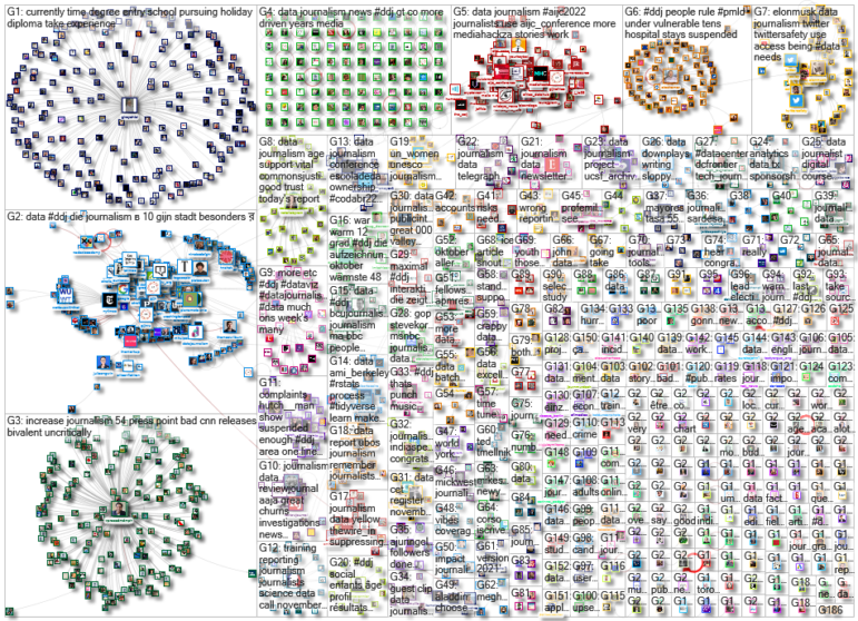
For a look at NodeXL’s mapping on #ddj and data journalism on Twitter, check out this map.
Step-By-Step Guide for Journalists on the Basics of Google Sheets
Tipsheet for Using Ocean Data in Your Investigations
No Coding Required: A Step-by-Step Guide to Scraping Websites With Data Miner
GIJC23 – The Future of Data Journalism: New Analytical Tools, Data Visualization, and AI
Late World Cup Goals, Foreigners Fueling Sudan’s War, Venezuela’s Deadly Double Earthquake, and Fatal SUV Blindspots

Turning the Threat to a Distant Glacier into a Local Story Through Data Visualization

One Name at a Time: How Die Zeit Built a Searchable Database of Nazi Party Members

Visualizing a Trillion Dollars, India’s Warming Cities, Russian Mercenaries at Sea, and World Cup Player Physiques

This work is licensed under a Creative Commons Attribution-NoDerivatives 4.0 International License
Republish our articles for free, online or in print, under a Creative Commons license.
Republish this article
This work is licensed under a Creative Commons Attribution-NoDerivatives 4.0 International License
Read Next
Data Journalism Top 10
Late World Cup Goals, Foreigners Fueling Sudan’s War, Venezuela’s Deadly Double Earthquake, and Fatal SUV Blindspots
Also highlighting the civilian casualties of the first 40 days of the US-Iran war, why carbon capture won’t solve climate change, and the 370,000-plus prisoners still awaiting trial in India.
Climate Data Journalism
Turning the Threat to a Distant Glacier into a Local Story Through Data Visualization
New York Times climate and environmental graphics reporter Mira Rojanasakul discusses how her team visualized the sea level rise threat from the melting Thwaites Glacier in Antarctica.
Data Journalism
One Name at a Time: How Die Zeit Built a Searchable Database of Nazi Party Members
An online tool set up by the German newspaper Die Zeit, in cooperation with archives in Germany and in the United States, allows people to search several million Nazi Party membership cards.
Data Journalism Top 10
Visualizing a Trillion Dollars, India’s Warming Cities, Russian Mercenaries at Sea, and World Cup Player Physiques
Also highlighting how films portray Ukrainians, increasing tree cover in Spain, and how couples meet.