Tips for Using Flourish to Visualize Elections Data
Read this article in
Election results and voter intentions can be tough to visualize for your audiences without a deep understanding of coding or a large design budget. However, independent journalists and small newsrooms can build appealing interactive visualizations ahead of elections using customizable templates available in Flourish, a data visualization tool built by a team of data journalists and web developers, which was acquired by Canva earlier this year.
The free version of Flourish is popular among journalism schools and media organizations as it requires little to no coding experience to build desktop and mobile-friendly interactive maps, animated charts, and more. While this is a commercial product and is not open source, it allows you to build an unlimited number of visualizations and embed them on your site at no cost. Another popular alternative to Flourish is Datawrapper. It, too, is a commercial product developed by journalists and coders, and offers a robust free as well as paid version.
In a recent webinar on using Flourish for effective visualization of elections data, data journalist Mafe Callejón, who also works as a content specialist for the site, shared essential tips to get reporters started on building an interactive map from election results. For this kind of election data visualization project, two types of files are needed: GeoJSON geographic data for the map (.json), and elections data, such as voter intention poll data or an election’s results in a spreadsheet (.csv).
Step 1: Find Trusted Geographic Data Sources for GeoJSON Files and Datasets
There are a variety of official and unofficial (but still helpful) data sources for political and administrative maps around the globe.
- Flourish’s own repository of tested and approved datasets, categorized by country, source (governmental site, international NGO, and more), and most recent update. An interactive map displays all datasets available by country and local level of granularity.
- The Humanitarian Data Exchange, which Flourish partially draws upon for its repository, is an open source platform built by the United Nations Office for the Coordination of Humanitarian Affairs to source international data from trusted organizations working in humanitarian crisis contexts.
- The US Census Bureau API provides files for US legal map boundaries by year, going as far back as 1992.
- The global administrative mapping project GADM, which is not a source of official geographic data, but a good resource to get started.
- Another popular site for maps, Cartography Vectors, offers GeoJSON files and other formats of historical maps, geological features, cities, municipalities, and more, per continent.
Finally, a reporter can opt to build and download their own custom map for free on GeoJSON Maps, which uses public domain data from the North American Cartographic Information Society.
Step 2: Get Elections-Related Data
This tutorial assumes that reporters already have a reliable data set to visualize. If they don’t or want to practice with different data, it’s possible to find data sets in the following repositories:
- Get the Data – An online forum to search for and share data sources.
- Politico’s Poll of Polls – An aggregation of polling data from numerous polling firms to assess general elections and political debates across European nations.
- The European Parliament shares party data from 1979 – 2014 and of the 2019 European elections.
- The European University Institute Library has a wealth of databases by international researchers and universities.
- The MIT Election Lab shares US electoral data sets.
- IPU Parline aggregates data from national parliaments worldwide on their structure, gender composition, and functioning.
In addition to visualizing election results, reporters may want to illustrate election rules in their country, political messaging and disinformation, or candidates’ hidden assets. Use the steps below together with GIJN’s guide to investigating elections to gather and visualize these additional data sets ahead of any election.
For this example, we’ll use data from the 2022 French Presidential elections, pitting incumbent President Emmanuel Macron against challenger Marine LePen, to show voting by department. While Flourish already provides a map projection of French departments, we’ll show how to upload self-created GeoJSON files in case one’s own country or area isn’t yet offered. We’ll be using Cartography Vectors’ map of France divided by departments.
Step 3: Input Data Into Flourish
Flourish only allows GeoJSON files under 5MB in size for optimized page loading time and user experience. If your file is too large, Callejón recommends using Mapshaper.org to simplify a map while maintaining its shape. The tool simplifies polygons, allowing the compression of the file by reducing the amount of detail in geographic outlines.
Once the chosen file is under 5MB, go to Flourish to get started. Begin with a New visualization, scroll through the templates to find the Projection Map section. Select Blank (upload your GeoJSON), then select the Data tab to start importing the map data.
- Data tab: This is where to view the GeoJSON data and select what to project on the map.
- Preview tab: Provides the ability to control the visual look of the map. First, identify the right map projection, in this case Eckert I, and zoom in to display the map at a convenient scale. Select “Auto Bounds” if working from a national or smaller scale map rather than worldwide.
See the instructional video for these steps below:
Next, you’ll need to inspect and clean the data to plot on the map. Follow these steps:
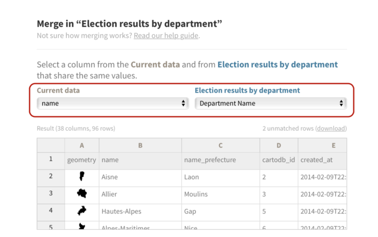
- Open the .csv file for voter data and identify or create a field identical to one of the GeoJSON file’s columns. Having these corresponding columns will allow merging and matching the data on both files.
- In this case, the department names match perfectly on both the GeoJSON file and the vote results spreadsheet, so we’ll use this column as the common denominator.
- If there is no matching column in the datasets, choose a data point that can be featured on both files, for instance, the department code (column A in our spreadsheet). Then add a “department code” column on the GeoJSON data in Flourish to match the existing column in the elections results spreadsheet.

In the .csv file, it’s necessary to identify or create a field identical to one of the GeoJSON file’s columns so that these corresponding columns will allow for merging and matching the data on both files. Image: Screenshot

This GeoJSON data file has a column ‘Department Name’ that matches a column in the .csv voter data spreadsheet, which allows the two files to be easily merged later. Image: Screenshot
Step 4: Further Prep the Data Before Merging With Flourish Map
Determine what data is to be visualized: The winner of the election in each department? The ratio of blank votes in comparison to votes given to either of the candidates? This focus will help set up the spreadsheet to ease working in Flourish.
In this case, we chose to follow Callejón’s example and display the winner of the election by department, while indicating the percentage of votes each candidate obtained.
To this end, we added the “Winner” and “Party” columns in our spreadsheet before merging it with the GeoJSON file on Flourish.

Columns listing the “Winner” and “Party” are added to the spreadsheet before merging with the GeoJOSN file on Flourish, for later reference in the interactive map. Image: Screenshot
Step 5: Merge the Two Files on Flourish to Plot the Data
Now that there is a dataset to visualize and a map to plot the data on, we’ll merge the two files to populate the map.
- Select Upload Data and Merge to combine the GeoJSON and election results spreadsheet.
- Select the columns to match between Current data and the spreadsheet – in this case, the columns containing names of departments in the .csv and .json files.
- Toggle between the Preview and Data tabs to see how your data is visualized on the map.

Once the datasets are complete, combine the GeoJSON and election results spreadsheets using the ‘Upload data and merge’ function. Image: Screenshot
Select the columns to match between Current data and the spreadsheet – in this case, the columns containing names of departments in the .csv and .json files. Image: Screenshot

Once the datasets are merged, the resulting interactive map will show the party winner by color as well as the department and election winner by name. Image: Screenshot
Step 6: Customize Colors and Data Displays
Flourish offers extensive ways to customize the display of data on a map. From the dropdown menu to the right of your map, you can change the layout, colors, fonts, and any other visual element of the visualization, with or without knowledge of HTML and CSS code.

Adjusting the colors showing the different parties in election results can be done in the ‘Layout’ section of the map template. Image: Screenshot
You can use Flourish’s proposed palettes or build your own using Adobe Color to match your publication’s visual identity.
To build your own palette to match your publication’s visual identity do the following:
- Go to Preview – Regions Layer, and click on the color palette to access customization options. Insert your chosen Hex codes (i.e. #F5B376) to set up a custom palette.
- In addition to the palette, you can use the Custom overrides box to impose additional colors on certain data points.
We’ll display Emmanuel Macron and his party, La République En Marche (LREM) in a bluish-green color (#2F8FA8) and Marine Le Pen and her party, Rassemblement National (RN) in a pale orange (#F5B376).

Choosing the palette for the map involves selecting specific hex codes for the colors corresponding to the data being shown. It’s possible to override the choices and choose a custom color as well. Image: Screenshot
Step 7: Add Map Charts and Pop-Ups
During the webinar, Callejón also covered ways of displaying charts and pop-ups on an interactive map, for instance, to show the percentage of votes each candidate obtained in a region.
She recommends working with Flourish’s pre-written code, unless reporters are familiar with HTML and CSS and want to customize the look and functionality of the charts.
Here’s how to edit the HTML code to display your data:
-
- The HTML portion of the code begins with <div> and ends with </div>. This is what renders the bar charts.
- To implement the code, go to Popups & Panels – Custom
- You can leave the header empty, or assign one of your values to it using curly brackets:
- Under Popup custom main content, paste Flourish’s pre-written code.
- Replace sections of the code in between curly brackets {{column}} with the spelling of your column headers, the hex codes with your own color codes, and the party names to reflect your data.
- Due to the code’s set up, you may need to add percentage signs after each section calling on a column with voting numbers. If the percentage sign isn’t featured in your data set, add it right after calling on your column, like this {{column}}%.
- We added a line of code to have the department’s name display in the popup, below the winning candidate’s name.

To have additional data display in the interactive map’s popup field, insert a small bit of pre-written HTML code in the ‘Popup custom main content’ section of the map template. Image: Screenshot
Here’s what the updated HTML portion of the code looks like after we’ve replaced our column headers and hex codes (displayed in bold):
______
<div id=’data-popup’>
<ul style=’width: 140px;’>
<strong><span style=’color:{{Winner Color}}’>{{Winner}}</span></strong><br><br>
<b>{{name}}</b><br>
<b>2022 voter share</b><br>
<li> <span class=’party-name’>LREM</span> <span class=’party-bar’
style=’width: {{Macron votes pct}}%; background-color: #2f8fa8;’></span> <span class=’party-value’
style=’color: #2f8fa8;’>{{Macron votes pct}}%</span> </li>
<li> <span class=’party-name’>RN</span> <span class=’party-bar’
style=’width: {{Le Pen votes pct}}%; background-color: #f5b376;’> </span> <span class=’party-value’
style=’color:#f5b376;’>{{Le Pen votes pct}}%</span> </li>
</ul>
</div>
__________
Finally, head back to the Data panel to list relevant columns in Metadata for popups so the map draws on data from those columns.

To ensure the additional popup information renders properly, select all the relevant columns in Data panel. Image: Screenshot
These steps will help build a simple yet effective interactive map to display election results, voter intent, or any geographically distributed polls.
You can watch the recording of Mafe Callejón’s demonstration for Flourish or view her presentation on Canva. She shares additional tips on visualizing other election-related data such as voting intention, margin of victory, and coalitions in her story Four Metrics to Visualize in Your Elections Coverage.
Additional Resources
Elections Guide for Investigative Reporters
Data Journalism: The GIJN Collection
GIJN Webinar: Investigating Elections
 Smaranda Tolosano is GIJN’s Editorial Coordinator for Partnerships & Translations and a French-Romanian freelance journalist. She has lived and reported in the U.S., France, Canada, and Morocco. In 2016-17, she covered the last days of France’s largest refugee camp, the “Jungle” in Calais.

Step-By-Step Guide for Journalists on the Basics of Google Sheets

Investigating the Israel Hamas Conflict

Tipsheet for Using Ocean Data in Your Investigations

Investigative Journalism and Digital Threats in 2024 Elections
How a WhatsApp Community Is Bringing India’s Data Storytellers Together

Turning the Threat to a Distant Glacier into a Local Story Through Data Visualization

One Name at a Time: How Die Zeit Built a Searchable Database of Nazi Party Members

Making Trillions Make Sense: How Reuters Visualized the AI Economy

This work is licensed under a Creative Commons Attribution-NoDerivatives 4.0 International License
Republish our articles for free, online or in print, under a Creative Commons license.
Republish this article
This work is licensed under a Creative Commons Attribution-NoDerivatives 4.0 International License
Read Next
Data Journalism
How a WhatsApp Community Is Bringing India’s Data Storytellers Together
Recently, more than 400 people gathered in the Indian city of Bengaluru for VizChitra 2026, a conference on data visualization and storytelling — but that is only a small part of the story.
Climate Data Journalism
Turning the Threat to a Distant Glacier into a Local Story Through Data Visualization
New York Times climate and environmental graphics reporter Mira Rojanasakul discusses how her team visualized the sea level rise threat from the melting Thwaites Glacier in Antarctica.
Data Journalism
One Name at a Time: How Die Zeit Built a Searchable Database of Nazi Party Members
An online tool set up by the German newspaper Die Zeit, in cooperation with archives in Germany and in the United States, allows people to search several million Nazi Party membership cards.
Data Journalism
Making Trillions Make Sense: How Reuters Visualized the AI Economy
How do you make a trillion dollars feel real to someone who has never seen that much money? Vineet Khare and Mayank Bhatt faced that very challenge for their data-driven investigation into AI investment.