
Data Journalism Top 10: Queen Elizabeth’s Reign, Arctic Fires, Taiwan Street Food, Brain Drain
Read this article in

Step-By-Step Guide for Journalists on the Basics of Google Sheets

Tipsheet for Using Ocean Data in Your Investigations

No Coding Required: A Step-by-Step Guide to Scraping Websites With Data Miner

GIJC23 – The Future of Data Journalism: New Analytical Tools, Data Visualization, and AI
As thousands of people wait in a very long queue in London to pay their respects to recently deceased Queen Elizabeth II, newsrooms around the globe have been publishing new charts, or updating old ones, about the monarch’s 70-year-long reign. Our weekly NodeXL and human curation of the most popular data journalism stories on Twitter features The Financial Times’ 10 charts visualizing developments in the United Kingdom during Elizabeth’s reign, The Marshall Project’s look at how government COVID-19 relief funds were used, The New York Times’ investigation of Hasidic religious schools, and Taiwan Data Stories’ scrollytelling project about iconic street food.
Charting the Reign of Queen Elizabeth II
Queen Elizabeth II, the longest reigning monarch in British history, died on September 8, 2022, at 96 years old. In her seven decades on the throne, there have been significant changes in the UK’s economy, politics, and society. The Financial Times presents these developments in 10 charts. Among their findings: migration became the dominant reason for population growth after 2000, family structures evolved to include more divorced people, single-parent families, and same-sex civil partnerships, and female graduates, once a rarity, have now become the majority. Meanwhile, French daily LeMonde visualized all the political leaders in power in the UK, US, Germany, France, Russia, and China during Elizabeth’s reign. Also popular: Amy O’Kruk, NBC’s data visualization and multimedia producer, posted a tweet thread of the different ways several newsrooms visualized the British royals’ line of succession.
Where COVID-19 Relief Funds Went
US President Joe Biden’s administration earmarked US$350 billion as COVID-19 relief and recovery funds for state and local governments as part of the American Rescue Plan Act (ARPA). A year later, data analysis by The Marshall Project found that billions of these dollars were directed to the criminal justice system: the police, prisons, and courts. Some local governments justified such spending by explaining that the purchase of equipment and investment in construction or renovations would help to better isolate or segregate individuals in order to curb the spread of COVID-19.
New York’s Failing Hasidic Schools
Hasidic Jewish religious schools in New York City are private institutions that are subject to little government oversight. In 2019, one such school gave more than 1,000 of its students state standardized tests in reading and mathematics. Every student failed. A troubling year-long investigation by The New York Times found that city Hasidic schools receiving public funds were not providing adequate education in secular subjects, resulting in graduates who were not taught basic science principles and were unable to speak or write in English. For this story, which the Times also translated into Yiddish, journalists interviewed 275 people, reviewed thousands of pages of public records, and analyzed dozens of internal Yiddish-language school documents.
Growing Arctic Fires
Climate change is causing temperatures in the Arctic to rise faster than the global average, and wildfires in the region release a disproportionately large amount of greenhouse gases because of the carbon-rich organic soil. An analysis by Reuters found that the share of emissions from wildfires in high latitudes or northern areas has been growing since monitoring began in 2003, accounting for almost one-third of the global wildfire emissions last year.
Ukraine Counteroffensive Reclaims Territory
Last week, Ukraine’s army made its most significant advance against Russian forces in months, since the invasion in February. According to military analysts and satellite imagery, as well as the geolocation of photos and videos from Ukrainian forces, the Ukrainian military has reclaimed the northeastern city of Izium — a critical logistics hub for the region. The New York Times mapped the approximately 3,400 square miles regained by Ukraine in one week, which is significantly more than the 2,000 square miles captured by Russia in the last five months.
140 Years of The Daily Princetonian
Inspired by The Pudding’s 100 years of The New York Times’ headlines project, student journalists at The Daily Princetonian — the second-oldest college newspaper in the US — dove into its 140-year-old archives. They counted and compared the frequency of terms to determine what was trending every decade. In the 1880s, terms such as tailors, bookbinders, and tobacco dominated, but have since given way to Facebook, Trump, gender, and diversity in the 2010s.
Taiwan Street Food Project, Recreated
Welcome to the world of Taiwan’s iconic street food snacks, featuring popcorn chicken, stinky tofu, boba tea, and more. This colorful scrollytelling project, by Taiwan Data Stories, was first published in June this year. Data visualization designers Julia Han Janicki and Leandro Collares have recently recreated it using D3.js and the Svelte web framework, and shared the resources they used in this tweet thread.
Brain Drain or Gain?
Which US states are better at retaining local graduates? And which ones are the biggest poachers? Andrew Van Dam, who writes the weekly Department of Data column for The Washington Post, tracks the brain drain, or gain, in each state. He found that Vermont, West Virginia, and New Hampshire were least likely to retain their graduates, while Washington, DC, was the biggest talent draw by far. Van Dam also looked into films and directors most assigned in college classes. The experimental 1929 Ukrainian Soviet silent documentary film “Man with a Movie Camera” and director Alfred Hitchcock, respectively, took the top spots.
Germany’s Income Distribution
Salaries in Germany vary from city to city. To find out how salaries are distributed across the country, ZEIT ONLINE analyzed salary data over 20 years from the nation’s Federal Employment Agency. It found that high-income and middle-income communities are often located only a few kilometers apart. And though employees who live in former East Germany (excluding Berlin) still earn significantly less, at a median of €2,943 (US$2,945) per month compared to employees in the west (€3,630; US$3,640), the east is catching up. Julius Tröger, head of data and visualization at ZEIT ONLINE, summarized the key findings in this tweet thread (in German).
Polarized US Congress
American politicians have become increasingly polarized in the past ten years. USA TODAY’s analysis of tweets by members of the US Congress from 2011 shows just how much lawmakers from the two parties — Republicans and Democrats — have diverged from each other in discourse over the years. Using a technique known as hierarchical clustering, journalists compared the words used on Twitter by these political leaders to reveal which individuals share a common language and how those patterns shifted over time. Find the code for the story here.
Bonus: Tool to Visualize Big Networks
Cosmograph is a web-based app for visualizing network graphs with up to a million nodes and edges. It is a free tool that runs in your browser. Its co-author Nikita Rokotyan demonstrates how to use it in a piece for Nightingale, the journal of the Data Visualization Society.
Thanks again to Marc Smith and Harald Meier of Connected Action for gathering the links and graphing them. The Top Ten #ddj list is curated weekly.
 Eunice Au is GIJN’s program manager. Previously, she was a Malaysia correspondent for Singapore’s The Straits Times, and a journalist at Malaysia’s New Straits Times. She has also written for The Sun, Malaysian Today, and Madam Chair.
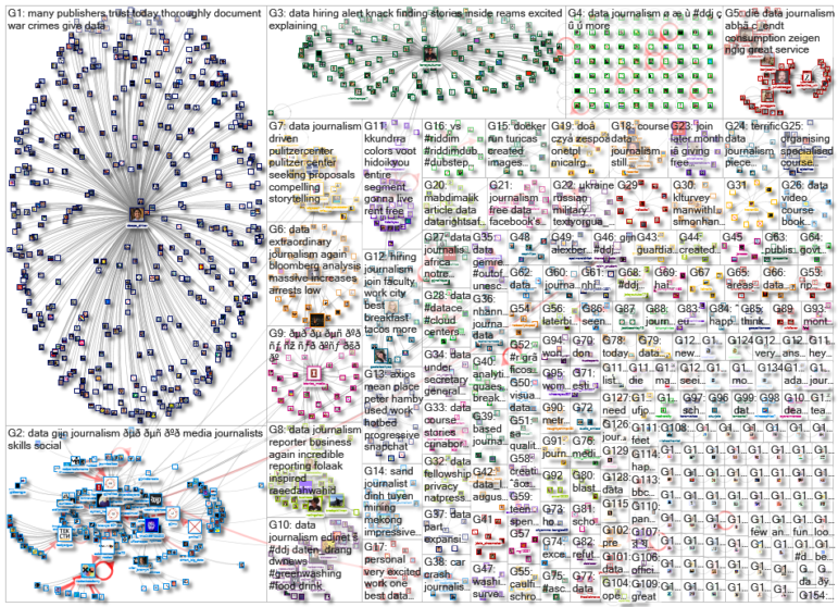
For a look at NodeXL’s mapping on #ddj and data journalism on Twitter, check out this map.
Step-By-Step Guide for Journalists on the Basics of Google Sheets
Tipsheet for Using Ocean Data in Your Investigations
No Coding Required: A Step-by-Step Guide to Scraping Websites With Data Miner
GIJC23 – The Future of Data Journalism: New Analytical Tools, Data Visualization, and AI

Turning the Threat to a Distant Glacier into a Local Story Through Data Visualization

One Name at a Time: How Die Zeit Built a Searchable Database of Nazi Party Members

Visualizing a Trillion Dollars, India’s Warming Cities, Russian Mercenaries at Sea, and World Cup Player Physiques
‘Super’ El Niño Threat, Myanmar Villages Razed, California’s Billionaire Tax Bill, and South Africa’s Murder Rate

This work is licensed under a Creative Commons Attribution-NoDerivatives 4.0 International License
Republish our articles for free, online or in print, under a Creative Commons license.
Republish this article
This work is licensed under a Creative Commons Attribution-NoDerivatives 4.0 International License
Read Next
Climate Data Journalism
Turning the Threat to a Distant Glacier into a Local Story Through Data Visualization
New York Times climate and environmental graphics reporter Mira Rojanasakul discusses how her team visualized the sea level rise threat from the melting Thwaites Glacier in Antarctica.
Data Journalism
One Name at a Time: How Die Zeit Built a Searchable Database of Nazi Party Members
An online tool set up by the German newspaper Die Zeit, in cooperation with archives in Germany and in the United States, allows people to search several million Nazi Party membership cards.
Data Journalism Top 10
Visualizing a Trillion Dollars, India’s Warming Cities, Russian Mercenaries at Sea, and World Cup Player Physiques
Also highlighting how films portray Ukrainians, increasing tree cover in Spain, and how couples meet.
Data Journalism Top 10
‘Super’ El Niño Threat, Myanmar Villages Razed, California’s Billionaire Tax Bill, and South Africa’s Murder Rate
Also highlighting exploitation of journalists in Egypt, Argentina’s returning World Cup squad, and the strain on Singapore’s aging caregivers.