Image: Shutterstock
Supercharge your Environmental Investigative Stories with Data and Visuals
Read this article in

Step-By-Step Guide for Journalists on the Basics of Google Sheets

Tipsheet for Using Ocean Data in Your Investigations

No Coding Required: A Step-by-Step Guide to Scraping Websites With Data Miner

GIJC23 – The Future of Data Journalism: New Analytical Tools, Data Visualization, and AI
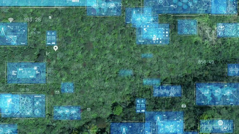
As the glaciers melt and forests burn, and Europe joins the list of places experiencing hottest-ever temperatures, the need for environmental stories that dig into climate change is more pressing than ever.
At the Pulitzer Center’s recent environmental investigative conference, Interconnected: Reporting the Climate Crisis, a panel of environmental reporters and designers explained that one way to make environmental stories more compelling involves using data and data visualization.

Image: Screenshot
Patchar Duangklad, co-founder of Punch Up, a media house in Thailand that works with storytellers, designers, data specialists, and developers, says data-driven storytelling is key to attracting and engaging audiences.
“Data by itself cannot say anything, but with design and storytelling, it can say a thousand words,” she told the attendees.
One recent Punch Up project, “Encroaching Forests and Encroaching People,” reported on the Thai government’s deforestation policies. The project used forest area data, government reports, and forest reclamation cases to reveal that over just two years — 2014 and 2015 — the government’s policies had resulted in more than 30,000 legal cases related to forestry violations.
Duangklad said they started the project by questioning the Thai government’s stated goal of restoring forest cover to 40% of the nation’s territory. This goal was the focal point of the forest reclamation policy. “When we started looking for data it led us to another question: ‘Why hasn’t the overall forest area in Thailand significantly changed with such an intensive reclamation policy?’” she asked. “So our question was if the forest reclamation policy really worked.”
She explained that this investigation taught her team a number of valuable lessons, the first being to look at the data “until you have better questions.” But data alone does not bring your reader along, she said.

Punch Up’s Encroaching project featured an interactive map that allowed users to explore how deforestation policies affect dozens of location across Thailand. Image: Screenshot
Alongside the data, the Encroaching project also featured an interactive map so that readers could explore how people in different areas have been affected by deforestation policies.
Combining human stories and data was a vital part of the project, Duangklad said. She emphasized how the team shot 360-degree camera footage showing local people’s low-impact use of the forest area. “We did interviews with villagers, Indigenous people, and national park officers to explain and show their perspectives on whether they think that people can live in harmony with the forest.”
Lessons from the Amazon
Hyury Potter is a Brazilian journalist who specializes in corruption and the environment. He is the founder of Amazônia Minada, which maps illegal mining requests within Indigenous lands and protected areas in real time.
Potter said he always asks himself the same question when starting a project: “What can I see in this map or in these numbers?”

The Amazônia Minada project tracks illegal mining requests in real time, using government data. Image: Screenshot
“If you have a spot on a map, you have to try to find out which name is connected to this spot, to this illegal mining project: Is it a person, a businessman, could it be a company, or could it be the government?” he told the attendees.
Amazônia Minada’s central map is drawn using public data provided by the government, but even though the information is public and official, Potter warns that reporters need to be cautious.
“This is the kind of data that is open but it’s not too trustable,” he said. “You have to be very careful. You have to double-check.”
Even with all the data, “old journalism” — interviewing the people affected by an environmental story and the non-governmental organizations that work with them — remains key, Potter said. For one investigation, he spoke with various pilots because the illegal mining schemes being investigated used airplanes to transport their illicit goods.
But he added there are also nuggets to be found on maps and in the data that can lead investigative journalists to great stories. Through one map, he discovered the presence of the Gana Gold Mining Company, a firm that has been investigated by the Brazilian police. A year later he did a second piece and found that the company had made a deal to refine their gold in a new plant financed by Sylvain Goetz, a Belgian tycoon convicted for money laundering and fraud.
Potter explained that “with the name of these guys, we could track the companies related to them.” Since information about gold buyers is public in the US, he could learn who the buyers were: potentially, major US corporations. “And these documents told us that.”
Creating a Data Journalism Network
In East Africa, a cross-border group of geo-journalists is using data to investigate what is happening along the Nile River as climate change, hydropower dams, population growth, and other challenges take their toll.
The Nile basin also supports millions of people, but it’s now facing an environmental crisis due to water scarcity, says InfoNile’s Annika McGinnis, a US journalist based in Uganda.
Since 2017, the InfoNile team has worked on more than 250 projects with themes involving biodiversity in the different lakes in the region, plastic pollution, and water scarcity during COVID-19. The organization provides grants to help journalists publish, encourages collaboration with reporters, and helps connect them to reliable sources. Some 150 reporters have been trained in how to use data to report in the 11 countries that the Nile runs through.

InfoNile’s Pandemic Poachers reporting project used data to monitor illegal wildlife trafficking. Image: Screenshot
Some of the projects include The Pandemic Poachers, about wildlife traffic and conservation in East Africa; Sucked Dry, on land and water grabs by foreign companies; and Plastic Victoria, a story on plastic pollution around Lake Victoria.
“All of the journalists in our programs go through a mentorship and training program, which lasts for three to six months in data journalism and science reporting. So by the end of this program, we aim that all of them are able to actually produce a visualization for their own story, which is published in their local media house,” McGinnis explained.
McGinnis said it is sometimes hard to know which data visualizations will be effective. “A lot of journalists who start out with data, they say, ‘Okay, my story is on this topic and I found this data.’ And when you visualize it, you realize that chart is not adding much to the story.”
But both Duangklad and McGinnis added that sometimes free tools are all you need to tell a compelling story, and mentioned DataWrapper, Flourish, and Google Sheets as good examples. “Try using free tools, learn about them, play with the data,” Duangklad said. Potter said he frequently uses QGIS, an open-source geographic information system.
One thing the panelists all agreed on is that data journalism and visualization tools can only help in reporting on what some call the most important “story of our time” — climate change. Or consider the perspective of panel moderator Yao-Hua Law — an award-winning freelance science journalist based in Malaysia. “Every story,” said Law, “is an environmental story.”
Watch the full Pulitzer Center panel below:
Additional Resources
Remote Sensing and Data Tools for Environmental Investigations
How Environmental Journalists Can Use NASA’s New Landsat 9 Satellite
Powering Up Geo-Journalism for Investigative Environmental Reporting
 Mariel Lozada is associate editor of GIJN en español and a Venezuelan freelance journalist based in New York City. She has a Master’s Degree in Engagement Journalism from the Craig Newmark Graduate School of Journalism at CUNY, and has reported on health, gender, migration, and human rights issues in three countries. For two years she worked with Efecto Cocuyo, a Venezuelan independent news site.
Step-By-Step Guide for Journalists on the Basics of Google Sheets
Tipsheet for Using Ocean Data in Your Investigations
No Coding Required: A Step-by-Step Guide to Scraping Websites With Data Miner
GIJC23 – The Future of Data Journalism: New Analytical Tools, Data Visualization, and AI

This work is licensed under a Creative Commons Attribution-NoDerivatives 4.0 International License
Republish our articles for free, online or in print, under a Creative Commons license.
Republish this article
This work is licensed under a Creative Commons Attribution-NoDerivatives 4.0 International License
Read Next

Data Journalism
Making Trillions Make Sense: How Reuters Visualized the AI Economy
How do you make a trillion dollars feel real to someone who has never seen that much money? Vineet Khare and Mayank Bhatt faced that very challenge for their data-driven investigation into AI investment.

Data Journalism
How the Hindu Is Embedding AI Into Its Data Journalism
LLMs are quietly reshaping data journalism workflows at The Hindu, helping reporters process vast document sets, write scripts and build interactive tools.

Data Journalism
Developing a Data State Of Mind: Key Tips for Editors
Data is woven into how journalists cover everything from local government spending to global climate change patterns, but for editors without a specialist background, it can be daunting.

Data Journalism
2026 Sigma Awards for Data Journalism Open for Entries – Deadline Extended
The Sigma Awards celebrate the best data journalism from around the world. Submissions are now open for data projects published in 2025.